Can the gas model theory explain recent satellite observations?

In summary, the conversation discusses the patterns seen in solar running difference and doppler images, specifically in relation to differential rotation and the boiling patterns observed in the photosphere. The conversation also touches on the possibility of structures rotating contrary to differential rotation and the difficulty in quantifying the rotation rate of these features. There is also mention of the 'iron sun' theory and the limitations of discussing it on public forums.
  • #1
Michael Mozina
145
0
I am curious what specific gas model theories would be useful in explaining the consistent "patterns" we see in solar "running difference" and doppler images such as these:

Trace running difference image:
http://trace.lmsal.com/POD/movies/T171_000828.avi
http://trace.lmsal.com/POD/TRACEpodarchive4.html

This video spans more than an hour yet the "patterns" remain relatively fixed compared to the plasma activity at the surface of the photosphere where structures come and go every 8 minutes or so. Why aren't these structures showing any signs of differential rotation, or the boiling patterns that are typically seen in the plasma of the photosphere?

Here is some background information and the supporting SOHO Doppler image that was put together by Alexander Kosovichev from Stanford:

http://www.findarticles.com/p/articles/mi_m1571/is_n25_v14/ai_20884033
http://thesurfaceofthesun.com/images/vquake1.avi
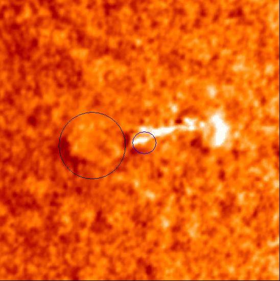
tsunami1.JPG


I'm specifically curious about the angular structure we see under the wave to the left of the center of the wave. Why is that structure more "rigid" than the plasma that carries the wave? How is that structure holding it's angular shape as the wave passes over it?
 
Astronomy news on Phys.org
  • #2
The video you linked is two seconds long.
 
  • #3
SpaceTiger said:
The video you linked is two seconds long.

That is actually quite true, but it also represents solar activity over more than an hour and a half. :smile:

Compared to the granular patterns of the photosphere that sort of "boil" themselves out of existence every 8 minutes or so, that's nearly an eternity.

There are also SOHO running difference images that show the same consistency of pattern over the span of many days.
 
Last edited:
  • #4
This image shows the movement that is typical in the granular cells of the photosphere over even relatively short timelines. There is a great deal more movement going on in the plasma of the photosphere than we see in the RD images using the iron ion filters of 171A, 195A, and 284A on the Trace and SOHO satellites.
 
  • #5
Michael Mozina said:
Compared to the granular patterns of the photosphere that sort of "boil" themselves out of existence every 8 minutes or so, that's nearly an eternity.

There are also SOHO running difference images that show the same consistency of pattern over the span of many days.

I'm afraid that's not particularly helpful. Could you be a bit more quantitative? For example, could you give the rotation rate of these features as a function of latitude and compare it to the expected differential rotation rate?
 
  • #6
Looks like more of the same old [and thoroughly refuted] 'iron sun' proposition to me.
 
  • #7
Indeed Chronos. From memory Michael Mozina is the creator of that http://www.thesurfaceofthesun.com/" website.
 
Last edited by a moderator:
  • #8
That's right, and he's not permitted to discuss his theory on these fora (only in IR), but we are allowed to address questions about the mainstream model. If it's true that structures are rotating contrary to differential rotation, it will be interesting to explore how the mainstream model deals with it. I honestly find it hard to tell one way or the other from those PR videos.
 
Last edited:
  • #9
SpaceTiger said:
I'm afraid that's not particularly helpful. Could you be a bit more quantitative? For example, could you give the rotation rate of these features as a function of latitude and compare it to the expected differential rotation rate?

I can try to be a "bit" more quantitative, but Lockheed has not given me many details related to this image. I do believe the image in question covers more than an hour and a half, and potentially longer, depending on which specific images were used to subtract from. Unfortunately I didn't create this image personally, and Lockheed has not provided much in the way of specific details about this image to date.

I'm also not sure a single rotational "number" tells us the "whole" picture, certainly not of both images. For instance, even though the "average" rotation in the photosphere might only be a few pixels over an hour and half timeline, the "boiling" affect is rather noticeable on a smaller scale. The plasma tends to move on a "per pixel" basis, with the "average" pixel drifting "x" amount over a give time at a given distance from the equator. At a smaller scale however, the "boiling" granular nature of the photosphere is reshaped regularly, and smaller "structures" tend to come and go in 8 minute intervals.

The patterns in these RD and Doppler images are a bit more complex. While the lighting on the patterns in the RD image changes during the timeline in question, the patterns themselves remain in a pretty "fixed" relationship to one another. In other words the "lines" on the central structure remain pretty much in the same distance from one another at the start of the sequences as the are at the end of the sequence, even though the sequence includes a flare scenario that should cause quite a "blow out" in plasma. Even still, the patterns remain much more "rigid" in relationship to one another than we see in granular views of the photosophere.

There are some mathematical specifics I can tell you about these images. The RD image spans from 11.87°S to 30.52°S. According to Lockheed's website, this image covers a timeline that is in excess of an hour. Based on the changes I see in the Lockheed image and comparing these changes to changes I see in the original FITS files, I would say this sequence is at least an hour and a half long. Depending on which images were used to subtract from, the whole sequence could span over two hours.

The Doppler image is somewhat harder to quantify using simply differential rotation principles since there is a giant wave passing over the photosphere which has no affect on the angular structures seen below the photosphere.
 
  • #10
SpaceTiger said:
That's right, and he's not permitted to discuss his theory on these fora (only in IR), but we are allowed to address questions about the mainstream model. If it's true that structures are rotating contrary to differential rotation, it will be interesting to explore how the mainstream model deals with it. I honestly find it hard to tell one way or the other from those PR videos.

I will not attempt to explain these images using a Birkeland solar model or any other solar model. I am simply curious how the gas model would attempt to explain these images. Anyone interested in discussing these or any other solar images using a Birkeland solar model is welcome to join an ongoing discussion of these issues at http://uplink.space.com/showflat.ph...=0&view=collapsed&sb=5&o=0&fpart=8#Post489411.
 
Last edited by a moderator:
  • #11
Michael Mozina said:
I can try to be a "bit" more quantitative, but Lockheed has not given me many details related to this image. I do believe the image in question covers more than an hour and a half, and potentially longer, depending on which specific images were used to subtract from. Unfortunately I didn't create this image personally, and Lockheed has not provided much in the way of specific details about this image to date.

I don't see anything unusual in the images and, lacking information about how it was processed, it's kinda silly to consider it a challenge to the standard solar model. As such, there's nothing left to discuss here. If you wish to do a more detailed analysis of the images (for example, correlation functions, timing power spectra), feel free to submit your work to IR, but even that is probably a bad idea if you don't know how it was processed.
 

1. What is the gas model theory?

The gas model theory is a scientific explanation of how gases behave under different conditions, such as temperature and pressure. It is based on the Kinetic Molecular Theory, which states that gases are made up of tiny particles that are in constant motion.

2. Can the gas model theory explain recent satellite observations?

Yes, the gas model theory can explain many of the observations made by satellites. For example, it can explain the changes in atmospheric pressure and temperature that are observed in different regions of the Earth's atmosphere.

3. How does the gas model theory explain satellite observations?

The gas model theory explains satellite observations by describing how gases behave and interact with each other. It can account for changes in gas density, temperature, and pressure, which are important factors in understanding satellite data.

4. Are there any limitations to the gas model theory?

Yes, there are some limitations to the gas model theory. For example, it does not take into account the effects of gravity or the behavior of gases at extremely high pressures. Additionally, it may not fully explain certain anomalies or complex gas interactions.

5. How does the gas model theory compare to other theories?

The gas model theory is one of the most widely accepted and used theories in the field of gas behavior. It has been extensively tested and has been shown to accurately explain many observations and phenomena. However, it is not the only theory that can explain gas behavior, and there may be other theories that can better explain certain observations or scenarios.

Similar threads

  • Astronomy and Astrophysics
2
Replies
35
Views
8K
  • Astronomy and Astrophysics
Replies
8
Views
4K
  • Beyond the Standard Models
Replies
10
Views
2K
  • Astronomy and Astrophysics
Replies
11
Views
4K
  • MATLAB, Maple, Mathematica, LaTeX
Replies
1
Views
2K
Back
Top