Exploring the Spectral Paradox in Physics
In terms of wavelength, peak solar radiation occurs at about 500 nm. Interestingly, this is well within the range of human vision. When solar radiation is plotted against frequency instead of wavelength, the peak is found to be at about 340 THz. It may come as a shock that when 340 THz is converted to wavelength, the result is not 500 nm, but 880 nm! That is well beyond what humans can detect! How can that possibly be? The Sun’s output is an objective physical phenomenon. Surely it cannot depend on the units used to measure it!
This paradox is explored at length in an oft-cited 1999 paper by Bernard Soffer and David Lynch,##^1## as well as in later articles by Mark Heald##^2## and by Jonathan Marr and Francis Wilkin.##^3## Although these sources are quite detailed and comprehensive, the explanations they offer are rather technical in terms of the mathematics and physics involved. As with any good paradox, such presentations may leave the reader with an uneasy feeling that the essential contradiction remains.
This article will take a more leisurely and elementary approach, using some simplified examples, in an attempt to provide some basic insight into this apparent mystery and perhaps reduce the puzzlement it causes. We will also briefly consider how the human visual range matches up against the solar spectrum. Keep in mind, though, that many of the ideas discussed below apply to any electromagnetic spectrum and, in fact, too many other situations where physical quantities are distributed.
Table of Contents
The Solar Spectrum
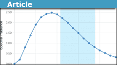
There are many different ways of measuring solar radiation, and although the choice can affect the shape of the spectral curves, it doesn’t fundamentally matter to the issue we are exploring. The numbers given in the introduction above assume the radiation is expressed in terms of intensity (power per unit area) just above the Earth’s atmosphere, which is the most common measurement one sees. When plotted against wavelength, this results in a graph like the following:
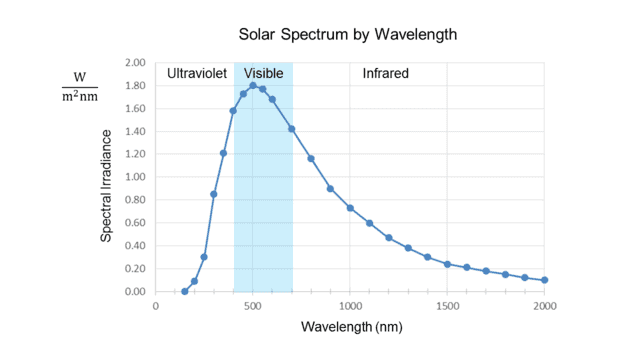
Fig. 1.
Note the units on the vertical axis. “Watts per square meter” measures solar intensity, usually called “irradiance” in this context, but what is the “per nanometer” for? The answer is that the irradiance at any exact value on the horizontal axis is zero. It only makes sense to speak of radiation that occurs within an interval of wavelength. Thus the quantity on the vertical axis is “spectral irradiance,” which measures radiation intensity per unit bandwidth, in this case, measured by wavelength.
In other words, the height of each point on the curve represents the radiation intensity per unit wavelength in a small interval about the wavelength value of that point. This is why Soffer and Lynch call such a curve a “density distribution function.”##^4## Given a wavelength, it tells, loosely speaking, how much radiation is packed into the vicinity of that wavelength, i.e., the spectral density about that point. Note that the curve in Fig. 1 peaks at about 500 nm, well inside the visible range, shown shaded in blue.
The following graph shows the same data as that above, but this time in terms of frequency instead of wavelength:
Fig. 2.
The irradiance is now measured per unit frequency (Hz). We see that the peak is at about 340 THz, well below the visible range.
The two graphs thus appear to contradict each other, even though the frequency (##f##) and wavelength (##\lambda##) of light are rigidly tied together by the formula ##f=\frac c \lambda## (where ##c## is the speed of light.) In fact, the peak ##\lambda\cong## 500 nm from the first graph converts to ##f\cong## 600 THz, while (as noted in the introduction) the peak ##f\cong## 340 THz from the second graph converts to ##\lambda\cong## 880 nm!
A Dozen Marbles
To try to understand what’s going on, let’s consider a simpler example involving density distributions. Suppose there is a large bin containing hundreds of marbles of various sizes between 1 and 10 cm in diameter (inclusive.) Furthermore, assume that the mass of each marble, ##m##, is related to its diameter, ##d##, by the formula, ##m=d^3##, where ##m## is measured in grams and ##d## in centimeters.
A friend of ours selects 12 marbles from the bin (perhaps randomly, perhaps not) and gives them to us. What we would like to know is whether this sample is skewed towards larger, heavier marbles or whether smaller, lighter marbles predominate.
First, we measure the diameters of the 12 marbles and compute their masses by simple cubing. Suppose this results in the following table:
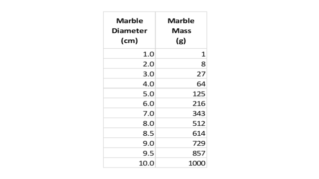
Table 1.
Next, deciding to approach our question graphically, we draw an axis to indicate marble diameter and mark on it (with blue spheres) the values from the first column of our table, as shown here:
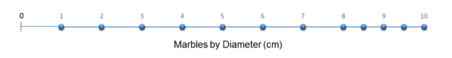
Fig. 3.
Where does the diameter density (marbles per cm) peak? Even without bothering to draw a vertical axis and plotting a density curve, it is easy to see that the density is one marble per cm between 1 and 8 cm, then jumps to 2 marbles per cm between 8 and 10 cm. So we can say the “peak” is at 9 cm. Since the range of diameters in the bin was 1 to 10 cm, it appears that our selection is somewhat skewed towards larger/heavier marbles.
However, as an additional test, we decide to make a similar graph from the second column of the table. This shows how the masses of our 12 marbles are distributed:
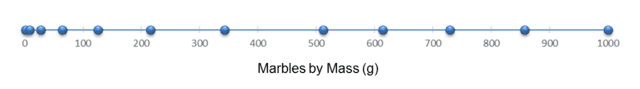
Fig. 4.
In this case, the mass density (marbles per gram) clearly decreases with increasing mass; it “peaks” at the lowest mass value, 1 gram, even though the scale goes up to 1000 grams! By this measure, our sample is dramatically skewed towards smaller/lighter marbles!
Note that the 9 cm peak in Fig. 3 corresponds to ##9^3=729## grams, nowhere near the 1 gram peak in Fig. 4. Yet the diameters and masses of these marbles are bound together by the ironclad relation, ##m=d^3##! Incidentally, the averages from the two graphs appear contradictory, as well. The mean diameter of the 12 marbles is 6.08 cm, whereas the mean mass is 375 grams, not at all close to ##(6.08)^3\cong225##.
Perhaps the most astonishing way to describe the situation is as follows. If you divide the scales in Fig. 3 and in Fig. 4 into equal fifths, then select a marble at random from the sample, the chosen marble will most likely fall in the top fifth of the diameter scale and in the bottom fifth of the mass scale! And this despite the fact that ##8^3=512##!
So is our sample weighted towards larger/heavier marbles or smaller/lighter ones? It can’t be both — or can it?
Investigating the Marble Paradox
Let’s think of the blue spheres in Fig. 3 and Fig. 4 as the actual marbles (although they are all depicted as the same size.) The 12 marbles appear in both figures, just arranged differently. However, it is easy to see that the order of the marbles (left to right) is the same in both figures.
We first note that the diameter density peak and the mass density peak actually have nothing to do with each other! The 5 marbles on the right that form the peak in Fig. 3 are stretched apart in Fig. 4 to nearly half the scale. Instead, the peak in Fig. 4 is formed by the marbles on the left, which are widely spaced in Fig. 3 but squashed together in Fig. 4. That is why cubing the diameter peak does not give the value of the mass peak.
Thus it is clear that the diameter peak occurring high and the mass peak occurring low is not a contradiction. Furthermore, the “squashing” to the left in Fig. 4 is what causes there to be so many marbles in the lowest fifth of the mass range, in contrast to how the diameters are distributed.
We have to conclude that even when two properties of the same objects are related by a simple formula, their distributions can look very different. The key factor behind the disparities in the marble distributions is that the function tying the two properties together, ##f(x)=x^3##, is not linear. This distorts the diameter scale and the mass scale relative to each other, which causes the differences in the two distributions.
On the other hand, ##f(x)=x^3## is a strictly increasing function of ##x##, which is what causes the marbles to be in the same order on both scales. From this agreement in order, it is easy to see that given any interval on the marble diameter axis (Fig. 3,) the corresponding interval on the mass axis (Fig. 4) contains the same number of marbles. For example, the interval 6.5 to 9.2 cm corresponds (by cubing) to the interval 275 to 779 grams, and we see that both intervals contain 4 marbles. In this sense, the two distributions do agree.
It follows from this observation, as a special case, that the median marble diameter and the median marble mass must be related by ##f(x)=x^3##. Indeed, taking 6.5 cm as the median diameter (because there are 6 marbles below and 6 marbles above that value) and cubing it, we get 275 grams, which we can see is valid as the median mass.
The values of the medians indicate that in our marble sample, diameter is indeed skewed high and mass is indeed skewed low, relative to their respective scales. In addition, the medians provide a better sense of how both properties are distributed than do the more extreme values of the density peaks (9 cm and 1 gram!) Finally, unlike the peaks and averages, the medians are related by ##f(x)=x^3##, so they do not lead to any “paradox.”
A Dozen Photons
Let’s now look at a second example that, while closely analogous to the marble case, is physically more similar to the solar spectrum problem. Suppose we are conducting some sort of physics experiment that detects 12 photons, with wavelengths and frequencies as follows:
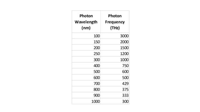
Table 2.
Of course, the two columns are related by ##f=\frac c \lambda## (where ##\lambda## is wavelength and ##f## is frequency.) Similar to what we did with the marbles, let’s display these 12 photons on two scales, one for wavelength and one for frequency, as shown in the following two figures:
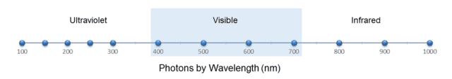
Fig. 5.
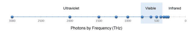
Fig. 6.
(I reversed the axis in Fig. 6 so that the photons are ordered the same way left to right as in Fig. 5.)
From Fig. 5, we see that the wavelength density (photons per nm) “peaks” at, say, 200 nm. From ##f=\frac c \lambda##, this corresponds to 1500 THz. Yet from Fig. 6, the frequency density (photons per THz) is clearly greatest at 300 THz. But this should no longer surprise us. As with the marbles, the discrepancy is caused by the nonlinearity of the conversion function, in this case, ##f(x)=\frac c x##.
However, this function is strictly decreasing, so — similar to the marble case — we conclude that any wavelength interval must contain the same number of photons as the corresponding frequency interval. For example, we can see from the figures or from Table 2 that the visible spectrum, roughly 400 to 700 nm, which is equivalent to 750 to 429 THz, contains 4 photons on either scale. In fact, we can also see from either scale that there are 5 photons on the ultraviolet side of the visible spectrum and 3 photons on the infrared side. Note also that the median wavelength of the photons, 450 nm, is equivalent to 666 THz, which indeed is the median frequency.
Thus there actually is no contradiction between wavelength and frequency about how these photons are distributed. It’s just that the two scales are severely distorted relative to each other, which causes the peak wavelength density and peak frequency density to be rather meaningless measures.
Understanding the Solar Spectrum
We are now in a much better position to confront the “mystery” of the solar spectrum. In fact, the situation depicted in Figures 1 and 2 is almost the same as the example with the dozen photons. One difference, which does not materially affect our analysis, is that because irradiance involves power, the solar graphs implicitly take into account the fact that photons that differ in frequency (or wavelength) also differ in energy (according to the formula, ##E=hf##, ##h## being Planck’s constant.)
For the purposes of this article, a more significant difference from the dozen-photon case is that the solar spectrum is effectively continuous. So instead of counting photons within an interval of wavelength or frequency, we must determine the area under the spectral curve within the interval. That is because, if you imagine such an area being composed of many tall, thin rectangles of width (in the wavelength case) ##d\lambda## and height ##\frac I {d\lambda}##, where ##I## is the irradiance within ##d\lambda##, the area of each rectangle is simply ##I##. Thus the area under the curve within the interval is the total irradiance inside that interval.
For example, the irradiance within the visible range, as measured (laboriously) from the spectral graphs above, is about 500 watts per square meter. The important point here is that you get that same value whether you measure the area under the wavelength curve (Fig. 1) or under the frequency curve (Fig. 2), even though the two curves have different shapes! There is no ambiguity or paradox! This is analogous to our 12-photon example when we counted photons within the visible spectrum.
The published figure for total solar irradiance (that is, across the entire spectrum) at Earth’s distance from the Sun is about 1360 watts per square meter. That is the total area under either the wavelength curve or the frequency curve. Note that the irradiance within the visible range is about 37% of the total irradiance. That is remarkably high, considering that the visible range is a very small slice of the full electromagnetic spectrum.##^5## Again, this figure is independent of whether wavelength or frequency is used to measure it, and it demonstrates how well the solar spectrum matches the human visual range.##^6##
As in our simple examples above, another good measure of the solar spectral distribution is the median, in this case, the point in the spectrum (wavelength or frequency) where half of the total irradiance falls on either side. Heald’s paper recommends it as the “most physically meaningful” number describing the solar spectrum. Certainly, unlike the spectral peaks, the median point is unambiguous. Heald states its value to be 710 nm, which is equivalent to 422 THz. That is at the very edge of the visual range, on the infrared side.
Conclusion
In addition to the ideas described above, there are numerous other ways of analyzing and assessing spectral distributions. Many of these are explored in the references I have cited, which display a wide range of opinions and recommendations. Overall, the key point to remember is that one must be careful when interpreting spectral curves, especially their peaks. I hope that the discussion and examples in this article have been helpful to anyone who has been mystified by spectral curves or baffled by their seemingly paradoxical nature.
References and Notes
##^1##Soffer, B. H.; Lynch, D. K. (1999). “Some paradoxes, errors, and resolutions concerning the spectral optimization of human vision”. American Journal of Physics. 67 (11): 946–953.
##^2##Heald, M. A. (2003). “Where is the ‘Wien peak’?”. American Journal of Physics. 71 (12): 1322–1323.
##^3##Marr, J. M.; Wilkin, F. P. (2012). “A better presentation of Planck’s radiation law”. American Journal of Physics. 80 (5): 399–405.
##^4##A probability distribution, such as the normal curve, is another example of a density distribution function.
##^5##Although published figures vary, the percentage as measured from actual solar data is even higher, closer to 45%. The disparity arises because the smooth curves in Figures 1 and 2 are based on the theoretical Planck functions for blackbody radiation at 5800 K, the temperature of the Sun’s photosphere. These idealized curves are a good fit to the observed data overall, but the agreement is far from perfect in certain portions of the spectrum, including the visible range.
##^6##Of course, the truly relevant irradiance numbers for humans are those at ground level, not those above the atmosphere. As it happens, though, the atmosphere has a “window” that lines up almost exactly with the visible spectrum! By contrast, most of the Sun’s output in the ultraviolet and much of it in the infrared is severely attenuated.
B.S. in Mathematics, M.S. in Mathematics, M.S. in Computer Science.
I enjoy mathematics, physics, astronomy, and natural history. I was thrilled to discover Physics Forums, a place where I can learn more about these subjects and share my enthusiasm with other like-minded people around the world!


Leave a Reply
Want to join the discussion?Feel free to contribute!