BadgerBadger92
- 200
- 128
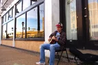
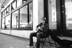
There is something so sad about seeing an instrument left unloved. Was this in situ? An abandoned club?BadgerBadger92 said:And this one vs the black and white versionView attachment 371836View attachment 371838
BadgerBadger92 said:
BadgerBadger92 said:And this one vs the black and white version
I just took it at face value. Didn't really consider the back-story. But yeah, why not really?pinball1970 said:There is something so sad about seeing an instrument left unloved. Was this in situ? An abandoned club?
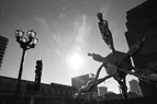
Yes! I used a long shutter speed to make that blurred movement effect!sbrothy said:I don't know much about photography but isn't the first one shot with an "extented shutter time"?
EDIT: The piano looks really artsy to me. I like it. It reminds me about death and decay, but in an abstract way.
EDIT2: And for once I think the color drives the point home better.
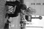
My favs are the first one and as mentioned here, the color image and also the decayed piano, again avec couleurs.Andy Resnick said:Since you are soliciting feedback... I have some (hopefully) helpful suggestions/comments for these three.
The middle (color) image is really great- the shadow connecting basketball hoop with doorway leads the eye really effectively, and by keeping the ground not-level, you maintain a sense of tension and uncertainty in the whole image. Nice job!
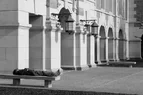
By contrast, the 2 architectural photos suffer from not being perfectly rectilinear. The bottom image also has noticeable pincushion distortion (the top one may as well but it's harder to see). I'm personally not a fan of "fixing in post", but that's me. Similarly, the top image has some problem with contrast- the sky is posterized (at least on my display) and there is evidence of glare at the top of the building has glare.
I’ve used the golden ratio numerous times! It’s one of the things I’ve taught myself and different other compositional techniques.sbrothy said:My favs are the first one and as mentioned here, the color image and also the decayed piano, again avec couleurs.
Speaking about drawing the eye:
https://photographyhero.com/golden-ratio-photography/
I don't doubt you. I just wanted to follow trough with my other post. (And hopefully get a little STEM into the thread.BadgerBadger92 said:I’ve used the golden ratio numerous times! It’s one of the things I’ve taught myself and different other compositional techniques.
 )
)I temember being able to play the piano or was it the timbal?jedishrfu said:I like these two photos:
- the subway: A lone person looking on as the world speeds by.
- the broken piano: All musicians and their instruments fade away becoming song we temember.