Plotting experimental data points and theoretical model curve together in Excel

  • Thread starter Thread starter dRic2
  • Start date Start date
  • Tags Tags
    Excel Graph
Join the discussion
Registration is free. Ask a follow-up in this thread, or start your own.
6 replies · 2K views
dRic2
Gold Member
Messages
887
Reaction score
225
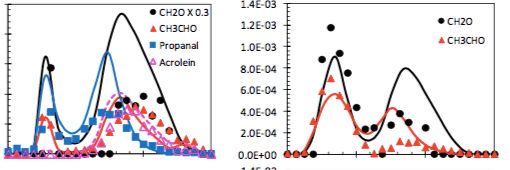
I have a set of n point (x, y) of experimental data and a function y=f(x) which is the theoretical model. I want to plot them in the same graph and see the difference. My problem is that f(x) has to be a continuous line while my n point has be just dots. I need to get something like this:
gr.png


I don't know how to plot dots and line simultaneously. Can anybody help me?
 

Attachments

  • gr.png
    gr.png
    13.6 KB · Views: 576
Physics news on Phys.org
In the Excel "Insert" tab, try Scatter Plot, and choose what kind of lines you want to connect your dots with... :smile:
 
Yes you can format each data series individually, so use
"Marker Options = Automatic" and "Line Color = no line" for the recorded data, and
"Marker Options = No marker" for the function.
 
  • Like
Likes   Reactions: dRic2
How do I use Marker Options ? I'm not very good with excel
 
OK I did it. Thank you very much!
 
  • Like
Likes   Reactions: berkeman
wow that was quick ! I hope it looks as you wanted.
 
Ahahahah I tried with some random numbers. Now I'm going to do the real stuff ;)