PF Style 2026

  • Context: Announcement 
  • Thread starter Thread starter Greg Bernhardt
  • Start date Start date
Join the discussion
Ask a follow-up here, or get your own question answered by working scientists, mathematicians and engineers — people, not an autocomplete.
Real named experts · corrections over time · the nuance an AI answer skips
88 replies · 2K views
Messages
19,943
Reaction score
11,029
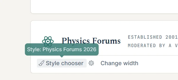
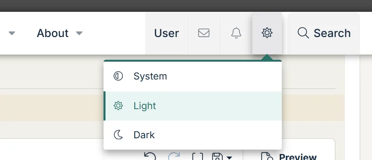
PF style 2026 has been released. It's a warmer, more modern and academic theme. Please thread in your feedback and suggestions. I'll be making numerous tweaks over the coming weeks. We have a dark style to try out. If you select system in the mode selector it will sync with your system settings for dark/light. If you prefer the old style, you are welcome to continue using it till the end of the year by using the style selector at the bottom left of the footer. I've been enjoying using the new style over the past week. I hope you do too!
1783943887943.webp


1783943983806.webp
 
Last edited:
Reply
  • Like
Likes   Reactions: chwala and jedishrfu
on Phys.org
Greg Bernhardt said:
PF style 2026 has been released. It's a warmer, more modern and academic theme. Please thread in your feedback and suggestions. I'll be making numerous tweaks over the coming weeks. We have a dark style to try out. If you select system in the mode selector it will sync with your system settings for dark/light. If you prefer the old style, you are welcome to continue using it till the end of the year by using the style selector at the bottom left of the footer. I've been enjoying using the new style over the past week. I hope you do too!

View attachment 372988

View attachment 372989
Does the new style meet the ADA requirements for accessibility?
 
Reply
  • Like
Likes   Reactions: jedishrfu
Dale said:
Does the new style meet the ADA requirements for accessibility?
I targeted WCAG 2.1 AA and it should be mostly compliant. If you see something you suspect isn't, let me know.
 
Reply
  • Like
Likes   Reactions: slider142, jedishrfu and Dale
Greg Bernhardt said:
I targeted WCAG 2.1 AA and it should be mostly compliant. If you see something you suspect isn't, let me know.
Excellent, that is a tough set of criteria.
 
Reply
  • Like
Likes   Reactions: jedishrfu
It's fine. A bit prettier than the old style and, of course, I thought I had wandered into the wrong place when I first saw it. It has an open, optimistic quality; well done.
 
Reply
  • Like
  • Haha
  • Agree
Likes   Reactions: PhDeezNutz, symbolipoint, Greg Bernhardt and 2 others
I think it's fine. And about time. Very modern.

Funnily, first I thought I'd arrived at some site which used a domain name close to yours. Took me a couple of tries to understand I was at the right place. Good job.

EDIT: And a new font too. Is this a michieveous attempt to introduce it everywhere? :smile:
 
Reply
  • Agree
  • Like
Likes   Reactions: jedishrfu and robphy
I suspect it's basically still the old site. They just edited the stylesheet! :woot:

EDIT: Oh, and the front page.
 
Reply
  • Like
Likes   Reactions: jedishrfu
jedishrfu said:
Wow you even have citations. Are there plans to connect to Zotero?
I don't know about Zotero. Is this a popular tool? Do you use it?
FactChecker said:
The font seems significantly smaller to these old eyes. Did it get smaller, or am I just imagining things?
Some area may be technically smaller and tighter. Still accessibility compliant. After a couple weeks I can adjust if we're still feeling like areas are too small. Post content font should be the same if not larger.
 
I wonder if this will fix that issue I had a few weeks ago where I needed to reload several times before I got everything. PF is the only site that I have this issue with.
 
Reply
  • Like
Likes   Reactions: Dale
Greg Bernhardt said:
I don't know about Zotero. Is this a popular tool? Do you use it?

Some area may be technically smaller and tighter. Still accessibility compliant. After a couple weeks I can adjust if we're still feeling like areas are too small. Post content font should be the same if not larger.

Zotero is a citation tracker that grad students are encouraged to use. It's either an app or plug-in that captures a citation.

It's great for when you need citations for papers you're writing. It keeps them in one place and can generate different citation styles.

I use it to track references I've found for my CS graduate project.
 
Reply
  • Like
Likes   Reactions: Greg Bernhardt
Ugh! Not a fan of the forest green and earth tones. Also, the font used for "Today, 7:31 AM" in light gray, maybe Courier, is hard on the eyes.

Disagree that it looks modern. More like early 1970s or retro sci-fi.
 
Reply
  • Like
Likes   Reactions: PeroK, PhDeezNutz, Frimus and 1 other person
Greg Bernhardt said:
Jetbrains Mono
Unfortunately this font is very hard for me to read when surrounded by the other fonts. (I think monospace fonts in general are a bad choice except for very specific applications, like terminal windows or displaying and editing source code, where exactly lining up characters in columns is important.)

Also, I see way too much variation in font size. The font size for displaying ordinary text in individual posts looks OK to me. But all the other font sizes are too small. When I read a post in a thread, the name of the poster is hard to read because it's such a small font compared to the post itself. The same is true for text inside quotes.
 
Reply
  • Like
  • Informative
Likes   Reactions: Lnewqban, ohwilleke and Greg Bernhardt
Looks great. Good job!
 
Reply
  • Love
Likes   Reactions: Greg Bernhardt
FactChecker said:
The font seems significantly smaller to these old eyes. Did it get smaller, or am I just imagining things?
Same here - the font seems a lot harder to read.
 
Reply
  • Like
Likes   Reactions: Frimus, Lnewqban and ohwilleke
One other comment: it's hard for me to tell now which forums have unread posts. In the old style, there was a color change that made it easy to spot. Now it seems like there's just a weight change that is not at all obvious.
 
Reply
  • Like
  • Agree
Likes   Reactions: BillTre, Frimus, ohwilleke and 1 other person
ohwilleke said:
Ugh! Not a fan of the forest green and earth tones. Also, the font used for "Today, 7:31 AM" in light gray, maybe Courier, is hard on the eyes.

Disagree that it looks modern. More like early 1970s or retro sci-fi.
Well OK. Honest opinion. I may be too hardened from reading the weird font on my own site.
 
PeterDonis said:
it's hard for me to tell now which forums have unread posts.
Same comment about individual threads in a forum view: it's hard for me to tell which ones are unread now.
 
Reply
  • Like
Likes   Reactions: BillTre, Frimus and ohwilleke
Something about the new style makes it much less readable. I don't know if it's the font? Do we have any control over these things? So far I don't like the change.
 
Reply
  • Like
Likes   Reactions: Frimus, ohwilleke and FactChecker
Greg Bernhardt said:
Yep, mostly a new slap of paint
Well, no. I am not able to find the grid of the various sections. It used to be that when you clicked on "Physics Forums" at the upper left, it would take you to the grid that showed all the sections.

Edit: OK, now I've found it. You need to scroll down toward the bottom of the opening page.
 
Reply
  • Like
Likes   Reactions: ohwilleke