PF Style 2026

  • Context: Announcement 
  • Thread starter Thread starter Greg Bernhardt
  • Start date Start date
Join the discussion
Ask a follow-up here, or get your own question answered by working scientists, mathematicians and engineers — people, not an autocomplete.
Real named experts · corrections over time · the nuance an AI answer skips
106 replies · 3K views
Halc said:
2nd gripe, discovered while composing this post. I highlight a bit of text and cannot tell the difference. It's there, but barely different. For the record, I'm using dark mode, white text on all variations of dark blue everything. Highlighting text makes it a slightly different white with no change in background.
I am using Style Variation = System, and I believe it is yielding for me the same as "Light". Upon highlighting before clicking on "Reply", the quoted text showed as white and background was blue. That met me as good visibility.
 
on Phys.org
Works fine in regular (non-dark mode):

1784066554344.webp
 
Greg Bernhardt said:
I made a couple tweaks. Let me know if you think it's better.
Absolutely no concerns on light mode now. In dark mode, differentiation is still difficult.
 
Reply
  • Informative
Likes   Reactions: symbolipoint
I have great difficulty seeing highlight in the edit box, in both light and dark modes.
Is there 1 difference between lower L and upper i.
Is there 1 difference between lower l and upper I.
 
Reply
  • Wow
Likes   Reactions: symbolipoint
----
Is there 1 difference between lower L and upper i.
Is there 1 difference between lower l and upper I.
----

I am only trying to see what you do.
I am assuming my "System" mode is the same as "Light" mode.
Upon highlighting those, I find a very light gray background and no color change to the text. My reckoning is that any highlighting should not affect the distinction between those letters. What is your second sentence, exactly? Just so I do not confuse anything? Context of what is being printed should adequately allow identity of the characters.
 
symbolipoint said:
My reckoning is that any highlighting should not affect the distinction between those letters.
Two separate issues.
1. Highlighting fail in the edit box.
2. The ability to differentiate "I'll" without cut and paste to a text file.
 
berkeman said:
Works fine in regular (non-dark mode):
Yea, it does, but in dark mode, it should show as dark text on light background, or any other color that doesn't match the dark background. My eyes burn enough without websites trying to imitate a piece of paper under a 400 watt light.
 
I like it.

My personal thoughts, I've only looked at light mode for the moment:
  • Thread page
    • The thread display – 16px Inter – is a great choice for main content.
    • 13px is too small for quoted text, why override the default 15px?
    • 12px is too small for the signature – 13px is OK here.
    • The Prism theme for code boxes is great (did this already change a while ago?)
  • Individual forum page
    • Why not use 16px for the thread titles (currently 15px)?
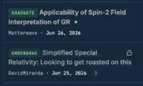
    • I find the topic badges hard to read – the combination of color, background-color, font-size and font-weight are not good. Font-weight: 900 works for me (and possibly font-size 11px if you go for 16px for the titles).
  • Home page
    • I don’t mind the topic badges here – the contrast in .prefix-green and .prefix-brown is better than .prefix-grey on the individual forum page so you could just tweak that (are there other colours used for badges?).
    • Again I prefer 16 px for the thread titles in Active Discussions and New Discussions
    • The font sizes in Today’s Signal and Unanswered-help out boxes are too small: I'd change 9.5px->11px (eybrow), 14px->15px title and 12->13px snippet
  • Why use different styles for the Unanswered – help out box? This is additional cognitive load: I’d go for eyebrow and title (but no snippet) in the same styles as Today’s Signal
  • Again in the Browse by Field box I’d bump the forum and thread titles up a pixel.
 
Reply
  • Informative
Likes   Reactions: Greg Bernhardt
Halc said:
That's gone. I can no longer at a glance find topics in which I've been active.
Added an icon for now
Halc said:
2nd gripe, discovered while composing this post. I highlight a bit of text and cannot tell the difference.
Legit and fixed
Baluncore said:
I have great difficulty seeing highlight in the edit box, in both light and dark modes.
Legit and fixed
 
In the Homework Help forums the two-column layout for Homework Statement and Relevant Equations crowds all the content into half of the screen of a mobile phone. Either stop using the two-column layout altogether or put it in a media query for >= desktop.
 
Reply
  • Informative
Likes   Reactions: Greg Bernhardt
hello how are you?
pbuk said:
In the Homework Help forums the two-column layout for Homework Statement and Relevant Equations crowds all the content into half of the screen of a mobile phone. Either stop using the two-column layout altogether or put it in a media query for >= desktop.
I'll try stacking instead
 
pbuk said:
Individual forum page
  • I find the topic badges hard to read – the combination of color, background-color, font-size and font-weight are not good. Font-weight: 900 works for me (and possibly font-size 11px if you go for 16px for the titles).
  • Home page
    • I don’t mind the topic badges here – the contrast in .prefix-green and .prefix-brown is better than .prefix-grey on the individual forum page so you could just tweak that (are there other colours used for badges?).

I've looked at a few more of these: red, green, blue, brown, purple are all OK for me, it's just the grey. Maybe it's just me? They are all OK in dark mode.
 
pbuk said:
I like it.

My personal thoughts, I've only looked at light mode for the moment:
  • Thread page
    • The thread display – 16px Inter – is a great choice for main content.
    • 13px is too small for quoted text, why override the default 15px?
    • 12px is too small for the signature – 13px is OK here.
    • The Prism theme for code boxes is great (did this already change a while ago?)
  • Individual forum page
    • Why not use 16px for the thread titles (currently 15px)?
    • I find the topic badges hard to read – the combination of color, background-color, font-size and font-weight are not good. Font-weight: 900 works for me (and possibly font-size 11px if you go for 16px for the titles).
  • Home page
    • I don’t mind the topic badges here – the contrast in .prefix-green and .prefix-brown is better than .prefix-grey on the individual forum page so you could just tweak that (are there other colours used for badges?).
    • Again I prefer 16 px for the thread titles in Active Discussions and New Discussions
    • The font sizes in Today’s Signal and Unanswered-help out boxes are too small: I'd change 9.5px->11px (eybrow), 14px->15px title and 12->13px snippet
  • Why use different styles for the Unanswered – help out box? This is additional cognitive load: I’d go for eyebrow and title (but no snippet) in the same styles as Today’s Signal
  • Again in the Browse by Field box I’d bump the forum and thread titles up a pixel.

Fixed:
  • Quotes: you were right, they really were rendering at 13px. Our style sets 15px but a parent theme rule was overriding it later in the CSS compile. We only caught it by inspecting the served CSS. Now a true 15px.
  • Signature is now 13px. We had never set a size, so an inherited 12px was winning.
  • Signal box gets your exact numbers: 11px eyebrow, 15px title, 13px snippet.
  • Unanswered box now uses the same serif style as Signal, just a half step quieter (14px medium vs 15px semibold) so the curated picks still rank above the utility list.
  • Badges went to 11px and weight 500 to 600. I stopped short of 900 since uppercase monospace at that weight turns into solid bricks. If the grey one still reads weak, the next move is darkening its text color, so let me know.
Your questions:
  • Yes, the Prism code theme landed with the redesign.
  • Badge colors in use: green for the level trio, plus amber, brown, blue, teal, purple, olive, red and grey.
Still considering:
  • 16px thread titles. It's the biggest density change on your list, so if it ships, it ships separately.
 
Reply
  • Like
Likes   Reactions: pbuk
Greg Bernhardt said:
I'm not completely sure I understand. Can you rephrase and tell me what page template you're talking about?
Greg, when I click formus in the left nav. I see the Active Discussions section at the top with a list of posts. The third or fourth line has the forum name with slightly larger text.

I thought it would stand out more of bolded. But it looks a bit clearer today.
 
Reply
  • Like
Likes   Reactions: Greg Bernhardt
Greg Bernhardt said:
hello how are you?

I'm great thanks, been mostly away for a while with family issues.

Greg Bernhardt said:
Badges went to 11px and weight 500 to 600. I stopped short of 900 since uppercase monospace at that weight turns into solid bricks. If the grey one still reads weak, the next move is darkening its text color, so let me know.

This seems to have done the trick.

Greg Bernhardt said:
Still considering:
  • 16px thread titles. It's the biggest density change on your list, so if it ships, it ships separately.

I'll just move closer to the screen on the home page :-p