Some questions about absorption lines

  • Context: Undergrad 
  • Thread starter Thread starter PainterGuy
  • Start date Start date
  • Tags Tags
    Absorption Lines
Click For Summary
SUMMARY

This discussion focuses on the understanding of absorption lines in the context of stellar spectra. Key points include the clarification that dark lines in a spectrum indicate low-intensity frequencies rather than total absence, and that different elements produce unique absorption lines based on their energy levels. It is established that while atoms can absorb photons of non-visible frequencies, the visible spectrum is the most commonly studied due to its accessibility. The conversation also emphasizes the importance of understanding how photons are absorbed and re-emitted in various directions, affecting the observed spectrum.

PREREQUISITES
  • Understanding of stellar spectra and absorption lines
  • Familiarity with the electromagnetic spectrum, including visible and non-visible frequencies
  • Knowledge of atomic energy levels and photon interactions
  • Basic grasp of spectroscopy techniques and their applications in astrophysics
NEXT STEPS
  • Research "Stellar Spectroscopy Techniques" to understand how absorption lines are measured
  • Explore "Atomic Energy Levels and Photon Absorption" to deepen knowledge of how elements interact with light
  • Study "Electromagnetic Spectrum and Its Applications" to learn about different frequency ranges beyond the visible spectrum
  • Investigate "Emission vs. Absorption Spectra" to differentiate between these two types of spectral observations
USEFUL FOR

Astronomers, astrophysics students, and anyone interested in the study of stellar atmospheres and the interpretation of spectral data will benefit from this discussion.

PainterGuy
Messages
938
Reaction score
73
Hi,

I was watching the following video. I need your help to clarify few important points. Thanks a lot in advance!

Question 1:
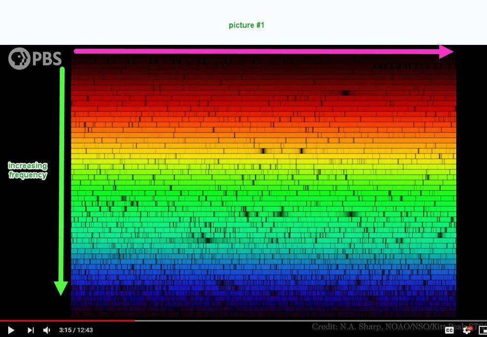
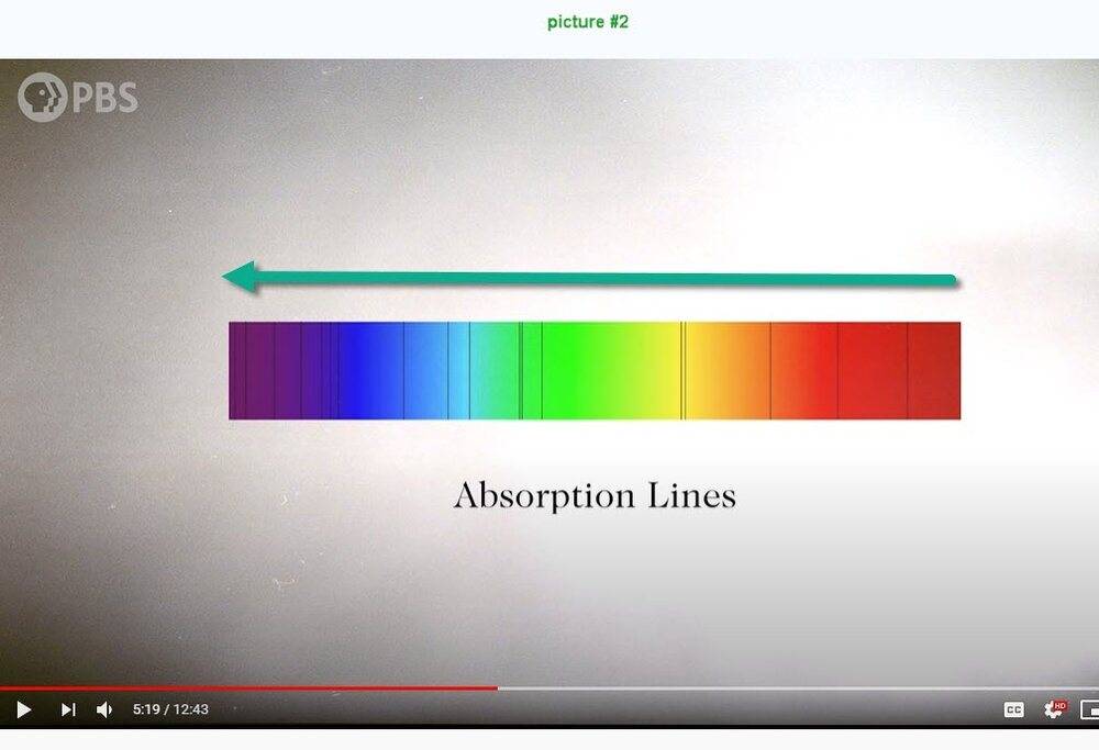
I'm not able to understand picture #1 below. I think that the frequency increases vertically downward but what about the horizontal scale? Compared to picture #1, picture #2 is quite understandable.
pbs_sun_1.jpg
pbs_sun_2.jpg


Question 2:
I don't think that dark lines represent total absence of certain frequencies rather the dark lines represent more of very low intensity frequencies compared to other brighter frequencies surrounding them. Do I have it correct?

Question 3:
Around 4:28 the following is said:

By the time a photon reaches the photosphere it has a 50-50 chance of traveling the final 100km to space without bumping into anything. At least, that’s true for most of the light. But some photons encounter a new obstacle. As temperature drops, it becomes possible for some electrons to be captured by nuclei to form atoms. And if free electrons are good at stopping photons in their tracks, these atoms are even better. An atom can absorb a photon if doing so would cause one of its electrons to jump up to a higher energy level. The energy of the photon and the energy of the electron jump have to be exactly the same. So any photons trying to escape the Sun that happen to have one of these particular energies are going to get sucked up on its way out. And that’s what these dark lines are - we call them absorption lines. Each element on the periodic table produces a different set of lines corresponding to its unique energy levels. Just seeing which absorption lines are present tells you which elements are present inside the Sun.

But wouldn't those atoms re-emit the photons after some time to get back to their ground state?

Question 4:
Don't atoms of elements also absorb photons of non-visible frequencies such as radio waves, infrared, ultraviolet, etc? As a layperson I have always seen visible spectrum being used when discussing absorption lines. Don't non-visible frequency photons also get absorbed?
 
  • Like
Likes   Reactions: hutchphd and lomidrevo
Astronomy news on Phys.org
Q1 the spectrum is cut up and stacked. Take the right hand edge of the strip below and attach it to the left hand edge to the one above and so on.

Q2 yes the is normally some signal in the dark bands.

Q3 Yes it remitted but in all directions and not all back to it's original trajectory.

Q4 yes different atomic and molecular processes absorb and emit outside the visible but a large number are in the visible and its the easiest region to study.

Regards Andrew
 
  • Like
Likes   Reactions: hutchphd, PainterGuy and lomidrevo
@PainterGuy, very nicely and clearly structured question, thumbs up for that :-)
I agree with the answers provided by andrew. Maybe just some complementary info:

Q1
The spectrum in the first image is very detailed, and single "row" representation would be too long. Therefore it is organized like a matrix, where next row is continuation of the previous row.

Q2
Correct, the intensity is not zero where you can see absorption lines. It just rapidly drops, comparing to neighboring wavelengths. A typical digitized spectrum look like this:
https://www.atnf.csiro.au/outreach//education/senior/astrophysics/images/spectra/sdssstellspec1.gif

Q3
The original photon absorbed by a stellar atmosphere or by nearby nebula is later emitted in random direction. Only small fraction of them would make it to the same original direction. The first image in the below link explains the situation with a star obscured by diffuse nebula for one observer. He/she observes an "absorption" spectrum. Different user seeing the nebula from different angle sees an "emission" spectrum, on the same wavelengths.
https://www.atnf.csiro.au/outreach/education/senior/astrophysics/spectra_astro_types.html

Q4
Right, see for example this spectrum spanning over broader region of wavelengths. The visual region corresponds to quite very narrow band only:
http://stars.astro.illinois.edu/sow/emspectrum.jpg
 
  • Like
Likes   Reactions: PainterGuy
Thanks a lot!

Sorry for getting back to you a little late but I wanted to confirm if I understood your comment about Question 1 correctly.

This is how I interpret it. The row marked with yellow arrow goes from 0 Hz to 10 Hz, the row on top of it marked with sky blue arrow goes from 11 Hz to 20 Hz (in the picture I incorrectly say 10 to 20 Hz), and the row marked with blue arrow goes from 21 Hz to 30 Hz (in the picture I incorrectly say 20 to 30 Hz), and so on. Do I have it correct?

Screenshot_20201122-162752_Gallery.jpg


High-resolution copy: https://imagizer.imageshack.com/img924/2836/gZcoir.jpg
 
If you describe the spectrum in frequency scale (Hz units), you are correct to start at lower rows and proceed to upper rows, but your arrows should be pointing from right to left for increasing frequency. The values for visible light are of hundreds of THz.

Far more common is to use wavelength to describe the spectrum, in nanometers or angstroms (10 Angstroms = 1 nm). Then you can "read this picture as a book", from top to bottom, from left to right. Top-left corner corresponds to about 380 nm, bottom-right corner to about 750 nm.
 
  • Like
Likes   Reactions: PainterGuy

Similar threads

  • · Replies 2 ·
Replies
2
Views
2K
Replies
8
Views
5K
  • · Replies 21 ·
Replies
21
Views
1K
  • · Replies 5 ·
Replies
5
Views
5K
  • · Replies 22 ·
Replies
22
Views
3K
  • · Replies 2 ·
Replies
2
Views
1K
  • · Replies 3 ·
Replies
3
Views
2K
  • · Replies 11 ·
Replies
11
Views
2K
  • · Replies 17 ·
Replies
17
Views
8K
  • · Replies 6 ·
Replies
6
Views
2K