Welcome to try my digital designs

  • Thread starter Thread starter Photonico
  • Start date Start date
  • Tags Tags
    Digital
Join the discussion
Ask a follow-up here, or get your own question answered by working scientists, mathematicians and engineers — people, not an autocomplete.
Real named experts · corrections over time · the nuance an AI answer skips
7 replies · 2K views
Photonico
Messages
7
Reaction score
3
Hi everyone,

Digital design is also my interest. I have two works:

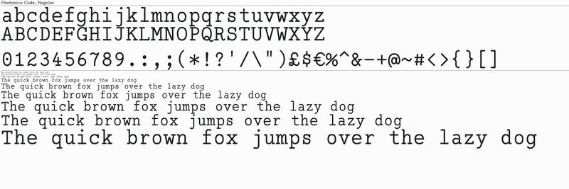
1. Photonico Code
This is a slab serif font designed for coding, which supports Latin, Greek letters, and mathematical notations.
Link: https://github.com/Photonico/Photonico_Code
Preview:
overview_1.0.png
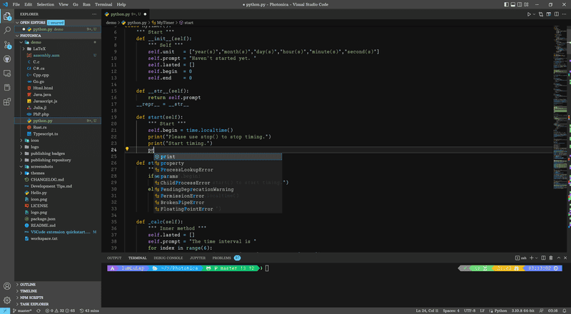
2. Photonica
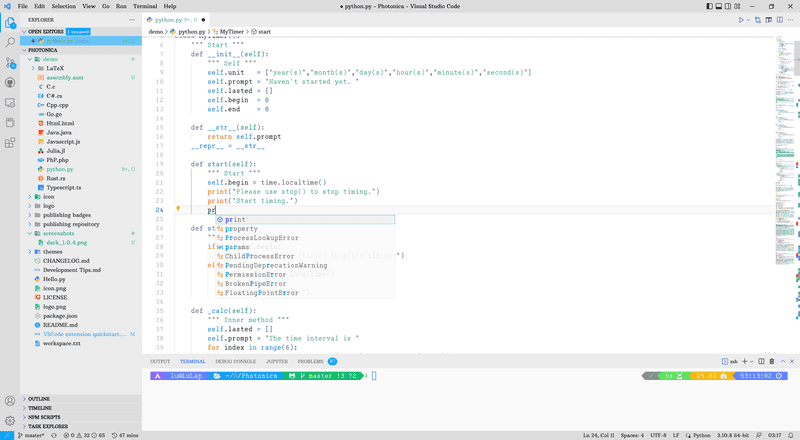
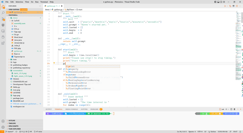
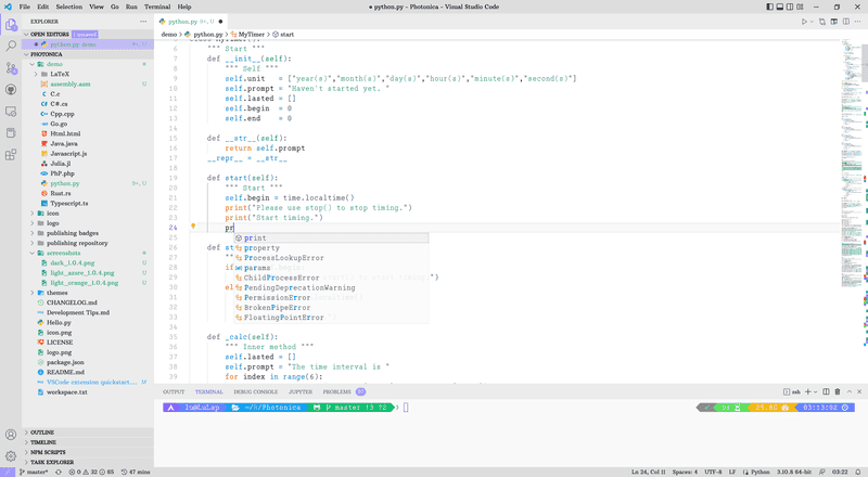
This is a set of VSCode themes
Link: https://marketplace.visualstudio.com/items?itemName=ConAntares.Photonica
Preview:
dark_1.0.4.png

light_azure_1.0.4.png

light_orange_1.0.4.png

light_violet_1.0.4.png
I am looking forward any suggestions.
 
Physics news on Phys.org
fresh_42 said:
Shouldn't "C" by horizontally symmetric?
There is a serif on top of the character C.
 
fresh_42 said:
Shouldn't "C" by horizontally symmetric? I find the missing lower serif disturbing.
I 'C' your point. Similar letters such as G and S do have lower serifs.

However, that is the case with many other monospaced serif typefaces - such as Courier - too.
1687358764778.png
Still, it's a nice, calming monospace font.
 
DaveC426913 said:
I 'C' your point. Similar letters such as G and S do have lower serifs.

However, that is the case with many other monospaced serif typefaces - such as Courier - too.
View attachment 328177Still, it's a nice, calming monospace font.
Thank you very much. My fondness lies strongly with slab-serif monospace fonts, but I've noticed a scarcity of this type.

I surmise that one reason could be that this particular design tends to lead to a certain degree of homogeneity.

I have tried to make some customized designs in my font.

I look forward to any feedback.
 
Photonico said:
Thank you very much. My fondness lies strongly with slab-serif monospace fonts, but I've noticed a scarcity of this type.

I surmise that one reason could be that this particular design tends to lead to a certain degree of homogeneity.

I have tried to make some customized designs in my font.

I look forward to any feedback.

To be certain I found this definition on myfonts:

A slab serif font is a serif font where the serif is squared off, giving the font a blocky, sturdy appearance as opposed to the more refined look of a traditional serif. Slab serifs tend to have less contrast overall than other serifs, which contributes to their heavy, often dramatic appearance. ... Popular slab serif fonts include Rockwell, Clarendon, Serifa, Courier, and Memphis.

Presuming concurrence with this definition, your font achieves this description. Being a fan of sans serif fonts for quicker reading, I also prefer a balanced symmetrical character for the letter 'c'; that is, no serif top and bottom. Once committed to slab serif one can argue the efficacy of serif placement -- top, bottom, both for symmetry, or none, also symmetric.

The further definition mentions slab fonts preferred for block text, particularly titles and banners. For coding purposes I prefer unobtrusive unadorned sans serif fonts that preclude ambiguity. Early coding texts and numerals generally required a set space on a Hollerith card leading to a preference for proportional fonts where each character occupies identical space.

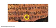
While a bold and dramatic font for titles and text blocks, I am unsure of any advantage for coding purposes though without trial. This font reminds one of early typesetter slab serif fonts with a nod toward the origin of our alphabet and numerals. For instance, the dot in the center of the typed zero harks back to the misty origins* of this vital placeholder. This image from an early Indian manuscript indicates a 'dot zero'.
1687869101853.png
1687869101853.png
*I have enjoyed reading several books over the years dedicated to zero, as a mathematical concept but also for its importance in computation.
 
Reply
  • Like
Likes   Reactions: Photonico