roam
- 1,265
- 12
- TL;DR
- Why does the curve ##1/\sqrt{n}## best fit my simulation data shown below? How does my simulation relate to the Central Limit Theorem?
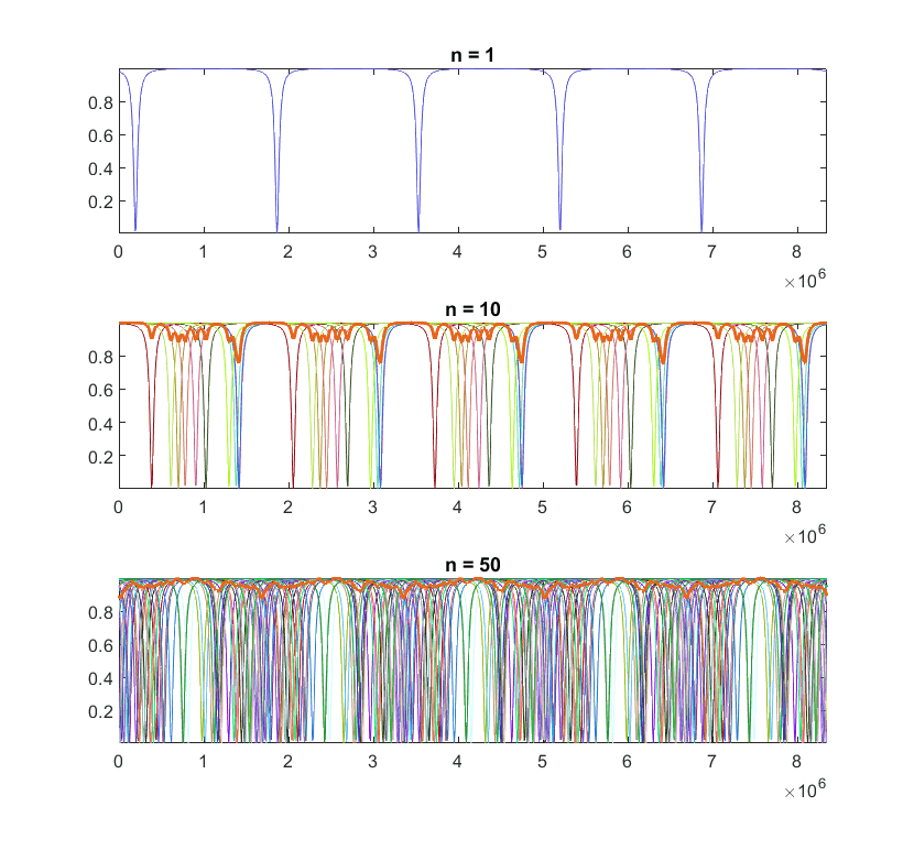
I am working with a simulation which generates an arbitrary number ##n## of identical curves with different phases and calculates their (normalized) sum. As expected, the fluctuation depth of the curves decreases as we increase ##n##. Here is an example of my simulation (when ##n>1##, the thicker line is the final sum):

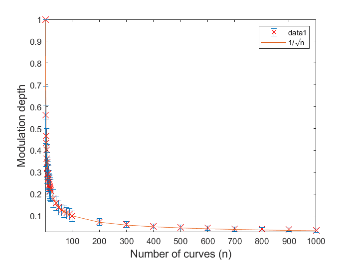
When I plot the fluctuation depth versus ##n##, I find that they vary according to:
$$\frac{1}{\sqrt{n}} \tag{1}$$
The following are my measurements fitted with ##1/\sqrt{n}##. Each data point is the average of 100 runs and the error bars show the standard deviation.

So, how do we make the connection between my simulation results and the Central Limit Theorem?
It appears that the fluctuation depth is proportional to its standard deviation ##\sigma##. And from the Central Limit Theorem, we know that the standard deviation varies according to ##1/\sqrt{n}##, where ##n## is the sample size.
Any explanations would be greatly appreciated.
When I plot the fluctuation depth versus ##n##, I find that they vary according to:
$$\frac{1}{\sqrt{n}} \tag{1}$$
The following are my measurements fitted with ##1/\sqrt{n}##. Each data point is the average of 100 runs and the error bars show the standard deviation.
So, how do we make the connection between my simulation results and the Central Limit Theorem?
It appears that the fluctuation depth is proportional to its standard deviation ##\sigma##. And from the Central Limit Theorem, we know that the standard deviation varies according to ##1/\sqrt{n}##, where ##n## is the sample size.
Any explanations would be greatly appreciated.