- 2,772
- 12,202
- TL;DR
- Several Maps are published about how climate change might play out in the 48 contiguous US states.
Several maps, from ProPublica, showing how climate change may play out as changes in the US.
Lessor amounts of similar data can be found in this PNAS publication.
Some of the maps are interactive (different levels of continued emissions).
The maps cover:

There is also a big table summarizing the various data county by county in the US.
Many of the maps seem to be based on counties and therefore some of the mappings of effects are not fine enough grained to satisfy me. For example, the county I live in (Lane county, Oregon), has coastal areas that could be affected by sea level rise, but not where I live (40 miles away and on the inland side of the coastal range). Nevertheless, I find it interesting.
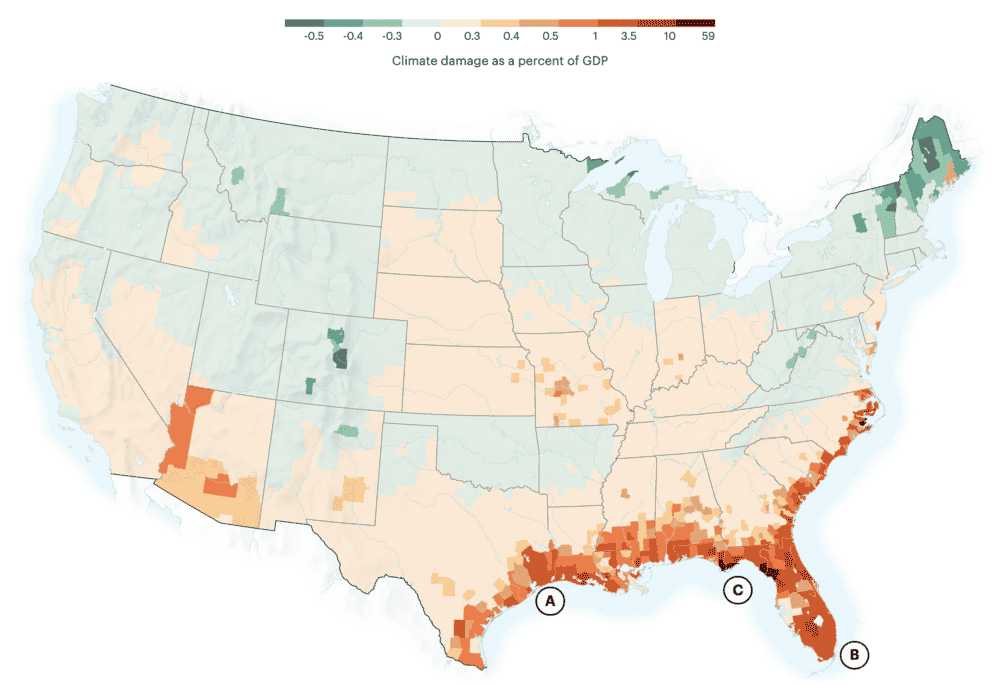
According to new data from the Rhodium Group analyzed by ProPublica and The New York Times Magazine, warming temperatures and changing rainfall will drive agriculture and temperate climates northward, while sea level rise will consume coastlines and dangerous levels of humidity will swamp the Mississippi River valley.
Note: Wet bulb, sea level rise, crop yield and economic damage data represent ranges of median probabilities for each county modeled by the Rhodium Group for each climate scenario between 2040 and 2060. Sources: Chi Xu, School of Life Sciences, Nanjing University (global human climate niche), Rhodium Group/Climate Impact Lab (wet bulb, heat, crop yields and economic damages), John Abatzoglou, University of California, Merced (very large fires). Noun Project icons by Adrien Coquet, Laymik and ProSymbols
Lessor amounts of similar data can be found in this PNAS publication.
Some of the maps are interactive (different levels of continued emissions).
The maps cover:
- temperature/humidity based most optimal human niche areas (2070)
- extreme heat areas (weeks above 95˚ F) (2040-2060)
- Extreme heat and humidity (2040-2060)
- Large Wild Fires (2040-2071)
- Sea Level Rise (2040-2060)
- Farm Crop Yields (2040-2060)
- Economic Damage from Climate Change (2040-2060)
There is also a big table summarizing the various data county by county in the US.
Many of the maps seem to be based on counties and therefore some of the mappings of effects are not fine enough grained to satisfy me. For example, the county I live in (Lane county, Oregon), has coastal areas that could be affected by sea level rise, but not where I live (40 miles away and on the inland side of the coastal range). Nevertheless, I find it interesting.