Different versions of Excel do things differently, so see if you can adapt this to yours.
You probably want the Chart Wizard to create a line graph, but before you do that you need to know what data you are going to graph.
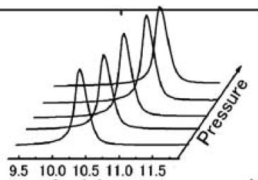
Suppose your data points for your first curve are in A1:A10, your second curve are in B1:B10, your third curve are in C1:C10, etc. But you want to include an x and y offset for the second curve, double that offset for the third curve, etc. The offset you want to have will shift each curve up and to the right to give the 3D impression you are looking for. So for the second curve you substitute x-1 for every x (to shift it right) and you add 1 to the function (to shift it up). Then use -2 and +2 for the third curve, etc. This sounds like a lot of work. Maybe you can add constants to each of your cells to make this work. Or maybe there is a trick you might use. ROW() in a formula will give you the number of the row the cell is in, COLUMN() in a formula will give you the number of the column the cell is in. So if you insert ROW() or COLUMN() in your formulas in just the right places then you might be able to get each one offset by just what you need so that when you plot a Series of columns in Chart Wizard, one for each curve, it will give you your desired 3D effect.
Now you are probably going to have to experiment with this until you begin to see how to get it to do what you want. Start simple and make small changes until you hopefully see how to get this to do what you want