- 2,331
- 5,052
I thought that I would share some interesting visualizations that I have created from some personal driving data. I've recently been introduced to the wonderful world of the D3.js Javascript library. D3 stands for Data-Driven Documents is an extremely powerful and versatile data visualization tool. I've been using it to analyze administrative data at work but I wanted to do something for fun.
Where can I get some interesting data I thought, when I remembered that I have been recording fillup data for my 2006 Prius since I bought it new in Aug. 2006. I am a few hundred miles short of 100K miles so I decided to create a web page containing some D3 charts with the data. I have put together a series of cross-filtered charts that all update based on user selections. I wanted to verify what I knew to be anecdotally true (that milage is better in the summer) and to see what other interesting facts could be found. I hope that some of you find the data interesting.
About the data:
Ever since I purchased my car, I have been recording the date, mileage, gallons, estimated MPG and occasional notes every time I fill up with gas. I fill it when it's on the last notch of the gauge (90+ % of the time), have never partially filled the tank and, except for a few rare occasions, have always stopped at whole dollar increments. The dashboard has an estimated MPG that I reset each time as well. If you want to see the code in action, the starting point for my visualizations came from the Crossfilter site.
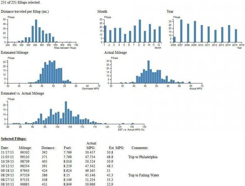
Here is the starting data without any filters:

As you can see from the data, I generally get around 375 - 500 miles between fillups on a 12 gallon tank and I tend to do slightly more driving in the summer. The estimated MPG that the car reports tends to be in a tighter range than the actual mileage and it has also tended to over estimate it by a few percentage points. Since I haven't normalized the data by month, the data does tend to skew (especially for August).
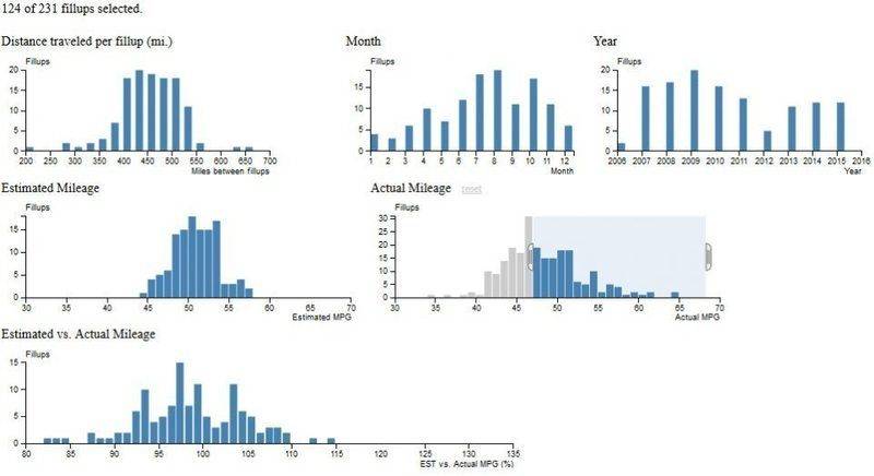
OK, I've got some nice charts that show some minor statistical data but now what? Well, these are cross-filtered charts which means that I can select specific sections of one chart and all of the other charts are automatically updated. Let's take a look at my anecdotal assumption about mileage being better in the summer. To do that, I'm going to select all of the actual mileage data to the right of the peak.

As I expected, the fillups with better actual mileage tend to occur in the warmer months. It also seems that the number of good mileage fillups have been going down in the last few years. Another thing that I notice is that the estimated vs. actual mileage has shifted down. It seems that the car tends to under-estimate the mileage on good MPG results. Hmmm, I wonder if that's true?
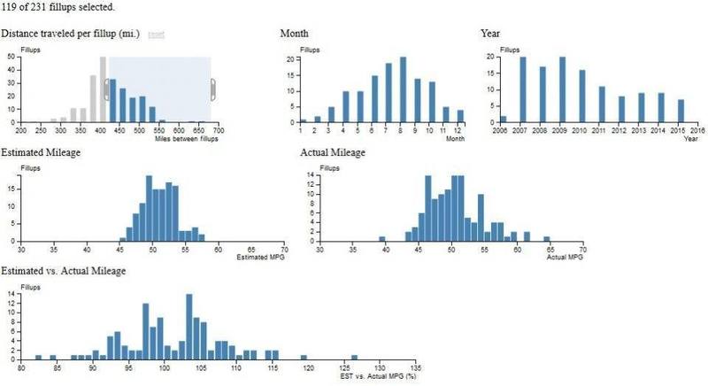
But first, I want to look at the distance traveled chart. By selecting the right side of the bell (425 miles or more), I get a much better bell centered on the summer months.

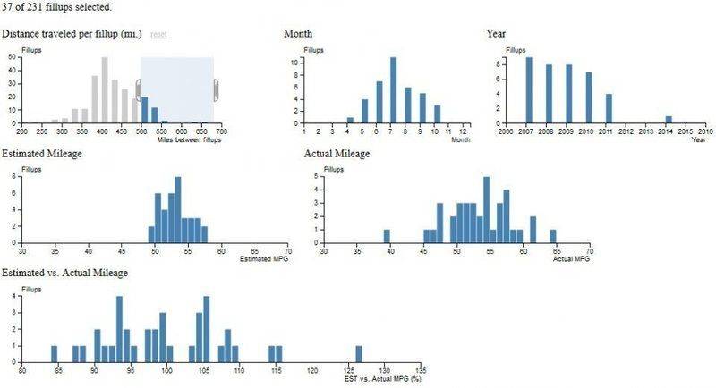
However, I remember that my data isn't normalized and decide to just look at the records where I traveled 500 miles or more. Now I have a more defined bell curve centered on July - half of all of the July fillups resulted in 500+ miles. But then I notice the year chart - I've only had a single 500+ mile tank in the last four years!

I'm not sure what could be the cause of this but it seems clear that the car has been struggling with its MPG over the last few years.
I do know that there are clear variations between tanks because of the up and down swings from the actual MPG plot here. I plan on adding a 2 - 3 tank moving average to try to smooth it out. Still, you can see seasonal variations in the calculated MPG readings.

That's where I'm at right now. I hope that you enjoyed my project.
Where can I get some interesting data I thought, when I remembered that I have been recording fillup data for my 2006 Prius since I bought it new in Aug. 2006. I am a few hundred miles short of 100K miles so I decided to create a web page containing some D3 charts with the data. I have put together a series of cross-filtered charts that all update based on user selections. I wanted to verify what I knew to be anecdotally true (that milage is better in the summer) and to see what other interesting facts could be found. I hope that some of you find the data interesting.
About the data:
Ever since I purchased my car, I have been recording the date, mileage, gallons, estimated MPG and occasional notes every time I fill up with gas. I fill it when it's on the last notch of the gauge (90+ % of the time), have never partially filled the tank and, except for a few rare occasions, have always stopped at whole dollar increments. The dashboard has an estimated MPG that I reset each time as well. If you want to see the code in action, the starting point for my visualizations came from the Crossfilter site.
Here is the starting data without any filters:
As you can see from the data, I generally get around 375 - 500 miles between fillups on a 12 gallon tank and I tend to do slightly more driving in the summer. The estimated MPG that the car reports tends to be in a tighter range than the actual mileage and it has also tended to over estimate it by a few percentage points. Since I haven't normalized the data by month, the data does tend to skew (especially for August).
OK, I've got some nice charts that show some minor statistical data but now what? Well, these are cross-filtered charts which means that I can select specific sections of one chart and all of the other charts are automatically updated. Let's take a look at my anecdotal assumption about mileage being better in the summer. To do that, I'm going to select all of the actual mileage data to the right of the peak.
As I expected, the fillups with better actual mileage tend to occur in the warmer months. It also seems that the number of good mileage fillups have been going down in the last few years. Another thing that I notice is that the estimated vs. actual mileage has shifted down. It seems that the car tends to under-estimate the mileage on good MPG results. Hmmm, I wonder if that's true?
But first, I want to look at the distance traveled chart. By selecting the right side of the bell (425 miles or more), I get a much better bell centered on the summer months.
However, I remember that my data isn't normalized and decide to just look at the records where I traveled 500 miles or more. Now I have a more defined bell curve centered on July - half of all of the July fillups resulted in 500+ miles. But then I notice the year chart - I've only had a single 500+ mile tank in the last four years!
I'm not sure what could be the cause of this but it seems clear that the car has been struggling with its MPG over the last few years.
I do know that there are clear variations between tanks because of the up and down swings from the actual MPG plot here. I plan on adding a 2 - 3 tank moving average to try to smooth it out. Still, you can see seasonal variations in the calculated MPG readings.
That's where I'm at right now. I hope that you enjoyed my project.