Solve Statistics Exercise: 1500 in Biology vs Physics Pie Chart

In summary, the question is asking for the difference in number of students between biology and physics in a faculty of science with 3000 students. However, without a measuring device or precise scale, the best estimate that can be given is "a lot".
  • #1
sp3
8
0
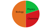
Hello, I'm not familiar with basic statistics exercises using pie chart and I'd like to know how i can solve this one: in a faculty science of 3000 students, some are in biology, some in physics and some in chemistry as shown on the pie chart. I can for sure tell that 1500 students are in biology. The question asked is how many more students are there in biology compared to physics? I don't know how to tackle this.

Thanks for your help in advance!
 

Attachments

  • 876piechart.png
    876piechart.png
    2.9 KB · Views: 59
Mathematics news on Phys.org
  • #2
Best you can do with the pie chart given is an estimate.

See what you can do to improve that estimate if a measuring device is used ...
 
  • #3
There's no device used so I thought some statistical calculations were involved... Thanks for the quick response!
 
  • #4
sp3 said:
The question asked is how many more students are there in biology compared to physics?
Since they didn't give you an actual scale to say with any precision, my answer would be "a lot." (Angel)

-Dan
 

What is the purpose of solving statistics exercise on a pie chart comparing Biology and Physics?

The purpose of solving statistics exercise on a pie chart is to visually represent and compare the distribution of data between two categories, in this case Biology and Physics. This allows for a better understanding of the relationship between the two subjects and can provide insights into potential patterns or trends.

How can I interpret the data on the pie chart?

The data on the pie chart can be interpreted by looking at the size of each slice in relation to the whole pie. The larger the slice, the greater the proportion of data it represents. Additionally, the labels on each slice can provide specific numerical values or percentages to further understand the distribution.

What does the number 1500 represent in the pie chart?

The number 1500 represents the total number of data points or observations in the study. This could be the total number of students, experiments, or any other unit that was used to collect the data for the pie chart.

Why is a pie chart a useful tool for representing data in Biology and Physics?

A pie chart is a useful tool for representing data in Biology and Physics because it allows for a quick and easy comparison between two categories. The visual representation of the data can also help identify any significant differences or similarities between the two subjects.

What are some limitations of using a pie chart for statistical analysis?

Some limitations of using a pie chart for statistical analysis include difficulty in accurately comparing multiple categories, as well as the potential for misinterpretation if the slices are not proportional to the data they represent. Additionally, pie charts may not be suitable for displaying large amounts of data or data with small differences in proportions.

Similar threads

  • STEM Academic Advising
Replies
1
Views
1K
  • STEM Academic Advising
Replies
2
Views
1K
  • STEM Academic Advising
Replies
1
Views
590
  • STEM Academic Advising
Replies
2
Views
807
Replies
1
Views
42
  • Science and Math Textbooks
Replies
28
Views
2K
  • Biology and Medical
Replies
1
Views
1K
Replies
2
Views
632
  • STEM Academic Advising
Replies
9
Views
1K
Replies
1
Views
253
Back
Top