Username600
- 1
- 0
- TL;DR
- I'm trying to graph and accurately visualize some data on Microsoft Excel via charting but I'm having a hard time.
--------------------------------
Hi, just some backstory: My mom and my brother Rob, both loaned me some money in August 2020. They each loaned me $1000.00. I decided to use excel spreadsheet to keep track of my progress paying them both back.
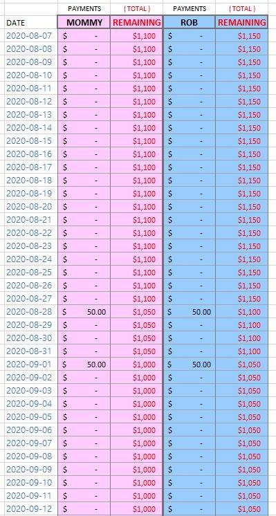
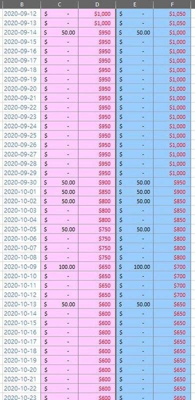
Okay so here is the data table I created; as you can see the progression of the date column is DATE + 1. When I make a payment towards either party i record the amount under the appropriate Payments column. The adjacent Remaining field gets subtracted by the amount just entered. Here see for yourself.
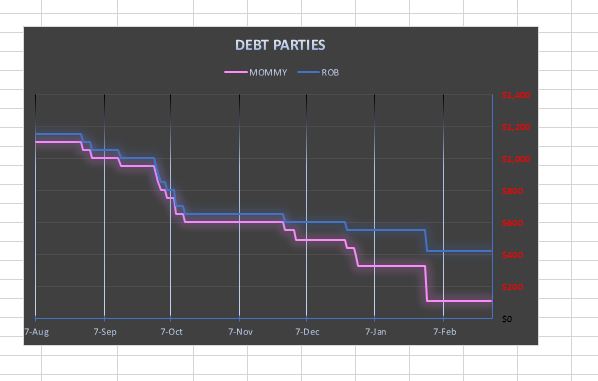
 And from this data, here is a line graph showing my paying down debt.
--------------------------------------------------------------------------------------------------
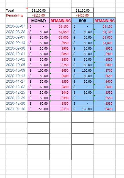
But notice in the above data table, there's a lot of redundant rows (dates); dates during which nothing happened. I decided to trim these dates/rows and created (what I thought to be..) just a more compact but an equivalent table with the same amount of data.Here is the new table I created:
And here is the corresponding graph:
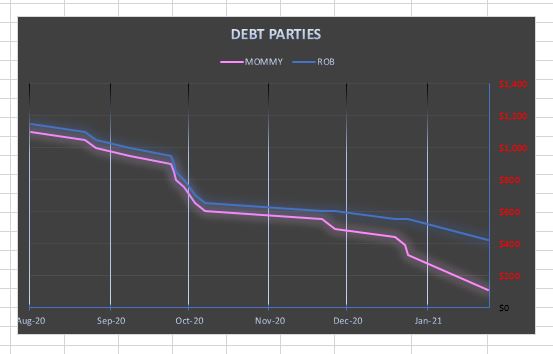 The second data table is just more compact, that's it.
Yet if you look at the two graphs side by side they look quite different. I've made sure the two graphs' settings are all identical, so I'm at a loss.

If someone can offer an explanation as to why graph 2 is plotting the SAME data, differently, please do tell!Any helpful input is appreciated, Thanks!
Hi, just some backstory: My mom and my brother Rob, both loaned me some money in August 2020. They each loaned me $1000.00. I decided to use excel spreadsheet to keep track of my progress paying them both back.
Okay so here is the data table I created; as you can see the progression of the date column is DATE + 1. When I make a payment towards either party i record the amount under the appropriate Payments column. The adjacent Remaining field gets subtracted by the amount just entered. Here see for yourself.
--------------------------------------------------------------------------------------------------
But notice in the above data table, there's a lot of redundant rows (dates); dates during which nothing happened. I decided to trim these dates/rows and created (what I thought to be..) just a more compact but an equivalent table with the same amount of data.Here is the new table I created:
And here is the corresponding graph:
Yet if you look at the two graphs side by side they look quite different. I've made sure the two graphs' settings are all identical, so I'm at a loss.
If someone can offer an explanation as to why graph 2 is plotting the SAME data, differently, please do tell!Any helpful input is appreciated, Thanks!
Last edited: