How to 'reverse' derive correct value when given MEAN + SD

In summary: Yes. There is a way to do that. You can use the "Find Minimum" or "Find Maximum" functions in Excel to find the value that would give you the desired mean and the smallest or largest value of the known data.
  • #1
dgsfbandeira
12
4
TL;DR Summary
Is there a way to reverse find the one that is missing? I mean, is there a function that would give me the value that, amongst the 54 values found, would fit and give me the MEAN and SD I have?
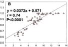
I have a scatterplot that I'm trying to extract. I found 54 values out of 55.
There is one "missing" value, probably because it is overlapped and I can't actually see.
I have the MEAN and Stand Dev of the 55 values.

Is there a way to reverse find the one that is missing? I mean, is there a function that would give me the value that, amongst the 54 values found, would fit and give me the MEAN and SD I have?

PLEASE!

(preferably a function in excel),
 
Physics news on Phys.org
  • #2
Welcome to PF. :smile:

Is this for a schoolwork assignment, or is the data from an experiment at your work?
 
  • #3
I'm actually very new to math in general.
I'm an interventional cardiologist starting to do some research in my area, and I'm having a lot of trouble with statistics.
Right now, I'm doing a meta-analysis and extracting data from a lot of scatterplots. Sadly, some of them just have missing data, probably because the dots are overlapped and I can't see.

I'm struggling the find the overlapped dots by error, which is very time consuming. And that seems like someone with a little bit of experience in maths would do easily.. So I started to seek for help online.. haha

edit: not "new", but I don't use it since high school! hahaha.
 
  • Like
Likes berkeman
  • #4
Hopefully we can help you out. Can you upload a PDF copy of a typical plot that you are analyzing (use the "Attach files" link below the Edit window)? Or else give links to the data/papers that you are analyzing for your meta analysis? Thanks.
 
  • #5
You can calculate a single missing data value or the sum of multiple missing data values from the MEAN and the known values. Since MEAN = sum/number_of_data, you have MEAN*number_of_data - sum_of_known = sum_of_unknown.
If you are sure that the problem is that a certain number (number_of_unknown_data) of points are on top of others, you can look for number_of_unknown_data combinations of the known data that give the correct sum_of_unknown. If there are several combinations that work, you can then test which combinations would give the correct SD. Hopefully, there will only be one combination that works.

I'll leave it to you or others to translate this into EXCEL. I don't have EXCEL.
 
  • Like
Likes Dale
  • #6
Putting @FactChecker ’s formula into LeTeX we have $$ x_1 = N \ \bar x -\sum_{i=2}^N x_i$$ where for you ##N=54##, ##x_1## is the missing data point, ##x_2## through ##x_N## are the other data points, and ##\bar x## is the known average.
 
  • Like
Likes WWGD, sysprog, Mark44 and 2 others
  • #7
Dale said:
Putting @FactChecker ’s formula into LeTeX we have $$ x_1 = N \ \bar x -\sum_{i=2}^N x_i$$ where for you ##N=54##, ##x_1## is the missing data point, ##x_2## through ##x_N## are the other data points, and ##\bar x## is the known average.
Yes. Good point. I overcomplicated it by worrying about multiple missing values. If there is only one missing value, the calculation is direct.
 
  • Like
Likes sysprog
  • #8
berkeman said:
Hopefully we can help you out. Can you upload a PDF copy of a typical plot that you are analyzing (use the "Attach files" link below the Edit window)? Or else give links to the data/papers that you are analyzing for your meta analysis? Thanks.
So here is one of the scatterplots. There are 54 values found out of 55 reported in the paper
For X, the mean = 7,65 and SD = 3.0
For Y, the mean = 0,85 and SD = 0,12

The missing value is supposedly an overlapping value that I can't see to digitize.
 

Attachments

  • example.JPG
    example.JPG
    30.2 KB · Views: 85
  • #9
FactChecker said:
Yes. Good point. I overcomplicated it by worrying about multiple missing values. If there is only one missing value, the calculation is direct.
Actually, in some graphs there are three or more missing values. Still, even if there is a lot of combinations possible to achieve the same mean and SD, this would still help me
 
  • #10
FactChecker said:
You can calculate a single missing data value or the sum of multiple missing data values from the MEAN and the known values. Since MEAN = sum/number_of_data, you have MEAN*number_of_data - sum_of_known = sum_of_unknown.
If you are sure that the problem is that a certain number (number_of_unknown_data) of points are on top of others, you can look for number_of_unknown_data combinations of the known data that give the correct sum_of_unknown. If there are several combinations that work, you can then test which combinations would give the correct SD. Hopefully, there will only be one combination that works.

I'll leave it to you or others to translate this into EXCEL. I don't have EXCEL.
Nice. Now I see how dumb my question is and how simple the rationale to do this is.
Much obliged for the answer

Still, is there a way to put in a formula when more values are missing?
A way to see the possible combinations between the values that are already known that would give me the desired mean and sd?
 
  • #11
FactChecker said:
You can calculate a single missing data value or the sum of multiple missing data values from the MEAN and the known values. Since MEAN = sum/number_of_data, you have MEAN*number_of_data - sum_of_known = sum_of_unknown.
If you are sure that the problem is that a certain number (number_of_unknown_data) of points are on top of others, you can look for number_of_unknown_data combinations of the known data that give the correct sum_of_unknown. If there are several combinations that work, you can then test which combinations would give the correct SD. Hopefully, there will only be one combination that works.

I'll leave it to you or others to translate this into EXCEL. I don't have EXCEL.
That didnt work.

See:
Sum_of_known_X (54 values digitized) = 421,69281
Number_of_data_X = 55 and Mean = 7,65
7,65 x 55 = 420,75.

How is that even possible? Mean reported wrongly in the paper?
 

Attachments

  • Default Dataset.csv
    667 bytes · Views: 96
  • exemploe 2.JPG
    exemploe 2.JPG
    28.7 KB · Views: 93
  • #12
dgsfbandeira said:
Right now, I'm doing a meta-analysis and extracting data from a lot of scatterplots. Sadly, some of them just have missing data, probably because the dots are overlapped and I can't see.
So wait. You are doing a meta analysis paper without the actual source data? You are interpolating published graphs visually instead of requesting the original data from the authors? Is that a normal practice?
 
  • Like
Likes dgsfbandeira and sysprog
  • #13
It looks to me like it's not quite doable ##-## I think that in general, you can't reliably infer the generating values from the generated results by examining a graph ##-## inexactitudes, overlays (such as you mentioned in the OP), and other factors, will make precise recovery impracticable ##\dots##
 
Last edited:
  • #14
berkeman said:
So wait. You are doing a meta analysis paper without the actual source data? You are interpolating published graphs visually instead of requesting the original data from the authors? Is that a normal practice?
Some people are against, calling it data stealing
But in fact, its a validated methodology and there are several articles published using bitmap-to-digital tools to extract scatterplot and bland-altman data.
 
  • Like
Likes Dale
  • #15
dgsfbandeira said:
Some people are against, calling it data stealing
But in fact, its a validated methodology and there are several articles published using bitmap-to-digital tools to extract scatterplot and bland-altman data.
Wow -- are you asking PF to assist you in refining expropriatory techniques? PF is very careful about respecting intellectual property rights.
 
  • #16
sysprog said:
Wow -- are you asking PF to assist you in refining expropriatory techniques? PF is very careful about respecting intellectual property rights.
You are entitled to your opinion.
You can report if you want, but you don't need to start an unrelated argument in my thread.

FYI, one example Meta-analysis using this methodology in a very respected journal.

Its not expropriating if the data is published.

Cheers and thank you for your help.
 
  • Like
Likes Dale
  • #17
sysprog said:
Wow -- are you asking PF to assist you in refining expropriatory techniques? PF is very careful about respecting intellectual property rights.
What the OP is trying to do is not anything untoward. Meta analysis uses such tools frequently. There is no violation of intellectual property rights in looking at published graphs and extracting the data from them.

There is a growing awareness of the importance of such analyses, so it is becoming progressively more common to actually post the data itself to a website. But for older papers and newer papers that are not so aware of the issue, all that we have is often a scatter plot.
 
  • Informative
  • Like
Likes dgsfbandeira and sysprog
  • #18
berkeman said:
So wait. You are doing a meta analysis paper without the actual source data? You are interpolating published graphs visually instead of requesting the original data from the authors? Is that a normal practice?
Yes, that is in fact the norm.
 
  • Informative
  • Like
Likes berkeman and dgsfbandeira
  • #19
In that case, I guess you will either have to either obtain the raw data from the authors or live with some inaccurate results. You can still get some estimates with the calculations we discussed.
You might want to consider doing the calculations only with the observable data. That would change the MEAN and SD, but you would know what data those numbers came from (within the accuracy of your interpretation of the diagrams).
 
  • Like
Likes Dale, dgsfbandeira and sysprog
  • #20
I looked at the data you posted in post #11 and do not see any connection between the data in the .CSV file and the statistic you circled in the other attachment. The statistic looks like it matches the plot and statistic in the earlier post #8, but the data in the .CSV file does not seem to match anything.
 
Last edited:
  • Like
Likes Dale and dgsfbandeira
  • #21
dgsfbandeira said:
You are entitled to your opinion.
You can report if you want, but you don't need to start an unrelated argument in my thread.

FYI, one example Meta-analysis using this methodology in a very respected journal.

Its not expropriating if the data is published.

Cheers and thank you for your help.
Senior member (Mentor/Moderator) @Dale has turned off my alarm in the matter.
 
  • Like
Likes Dale and dgsfbandeira
  • #22
dgsfbandeira said:
So here is one of the scatterplots.
example-jpg.jpg
I have a couple of comments about this:
  • The plot is intended to show a relationship between two quantities, let's say for the sake of example that the x-axis is age in years and the y-axis is leg length in metres. Data have been collected from 54 samples with age ranging from approximately 2 years to 16 years and as expected there is a corresponding range of leg lengths. Why do you think the fact that the mean age is 7.65 years with a sd of 3.00 years is important?
  • The plot appears to calculate a linear fit to the data. The maximum value of y in the plot is 1.0, and there are a number of points with exactly this value. This could mean that the data represent a ratio (such as the proportion of plaque that is fibrotic) which makes a linear relationship unlikely. Alternatively this could be some feature of the measurment process, in which case it would be better to ignore any point with y = 1.
  • The correlation for the linear fit appears to be r = 0.74. This is not a very a good fit, which given the above remark (as well as visual inspection) is not surprising.
  • According to the table there are a number of different sub-populations (DM, hypertension, prior surgery). I think that the data might reveal a more consistent pattern when looking at these sub-populations (or their complements): for instance what happens if you eliminate those with prior bypass surgery?

In conclusion I would say that you probably need to revise and improve your statistics; is there a course you can take at your facility? Is there a supervisor or colleague who can help?
 
  • Like
Likes dgsfbandeira
  • #23
pbuk said:
I have a couple of comments about this:
  • The plot is intended to show a relationship between two quantities, let's say for the sake of example that the x-axis is age in years and the y-axis is leg length in metres. Data have been collected from 54 samples with age ranging from approximately 2 years to 16 years and as expected there is a corresponding range of leg lengths. Why do you think the fact that the mean age is 7.65 years with a sd of 3.00 years is important?
  • The plot appears to calculate a linear fit to the data. The maximum value of y in the plot is 1.0, and there are a number of points with exactly this value. This could mean that the data represent a ratio (such as the proportion of plaque that is fibrotic) which makes a linear relationship unlikely. Alternatively this could be some feature of the measurment process, in which case it would be better to ignore any point with y = 1.
  • The correlation for the linear fit appears to be r = 0.74. This is not a very a good fit, which given the above remark (as well as visual inspection) is not surprising.
  • According to the table there are a number of different sub-populations (DM, hypertension, prior surgery). I think that the data might reveal a more consistent pattern when looking at these sub-populations (or their complements): for instance what happens if you eliminate those with prior bypass surgery?

In conclusion I would say that you probably need to revise and improve your statistics; is there a course you can take at your facility? Is there a supervisor or colleague who can help?
Thanks for the feedback.

1) In order to validate the digitizing, I need to find all the values in the scatterplot. If I find all the dots and my mean+sd is equal to the ones published in the paper, that means the method is correct.
That’s the importance of mean+sd

2) These 2 variables don’t actually correlation in a linear fit. People think they do, though. Despite having a bat correlation, people also frequently use one to predict the other. That’s why i’m doing this analysis

3) I’ll conduct a lot of sub-populations analysis, since there are papers with specific populations.

Right now, i know there are some limited combinations of values that would fill the 1 or 2 missing dots in some graphs and I just need a better way of “guessing” them.

Thanks for the concern! Much obliged for the feedbaxk
FactChecker said:
In that case, I guess you will either have to either obtain the raw data from the authors or live with some inaccurate results. You can still get some estimates with the calculations we discussed.
You might want to consider doing the calculations only with the observable data. That would change the MEAN and SD, but you would know what data those numbers came from (within the accuracy of your interpretation of the diagrams).
For the papers we cannot actually extract the data precisely, we will contact the authors, yes.

I can too do the calculations with the known and observable data! But to validate each graph-digitizing, i need to find at least a close value of mean+sd to the one reported in the paper
 
  • Like
Likes pbuk
  • #24
FactChecker said:
I looked at the data you posted in post #11 and do not see any connection between the data in the .CSV file and the statistic you circled in the other attachment. The statistic looks like it matches the plot and statistic in the earlier post #8, but the data in the .CSV file does not seem to match anything.
The data in the .CSV is the digitized data from the plot. First column is the X value and second is the Y value.

In the file, there are only 54 lines of values because I only found 54 points on the graph, although there are 55 (n=55 in the table figure I sent).

Yeah, i’m afraid the mean+sd on that table (for the X variable) is wrong. In the paper, the mean+sd for the Y variable is 0.85+-0.12, and for the other 2 graphs in the same paper (that have the same y variable and different x variables) i was able to find the 55 points and match the value of mean reported.
 
  • #25
@dgsfbandeira, have you looked at the Viterbi algorithm? ##-## the algorithm is applicable not only to finding meaningful signal information amidst noise in cell phone traffic, but also to extracting specially meaningful digitizable information from graphics files.
 
  • Like
Likes dgsfbandeira
  • #26
dgsfbandeira said:
1) In order to validate the digitizing, I need to find all the values in the scatterplot. If I find all the dots and my mean+sd is equal to the ones published in the paper, that means the method is correct.
That’s the importance of mean+sd
I see. The problem is that with any reasonably large sample one individual value has such a small impact on the mean that you can only determine a "missing" value approximately, even if the digitization is perfectly accurate. For instance with the given chart any value for the missing x between 7.4 and 7.9 might lead to a mean of 7.65 which doesn't really add much information.

dgsfbandeira said:
2) These 2 variables don’t actually correlation in a linear fit. People think they do, though. Despite having a bat correlation, people also frequently use one to predict the other. That’s why i’m doing this analysis
Excellent!

dgsfbandeira said:
Right now, i know there are some limited combinations of values that would fill the 1 or 2 missing dots in some graphs and I just need a better way of “guessing” them.
As above, you can only guess one missing dot with a low amount of confidence, and for two or more dots you may as well be throwing darts. WebPlotDigitizer is a pretty good piece of software and the fact that it doesn't already do this may be a clue to how useful a feature it would be. On the other hand you could make a suggestion - it doesn't seem to have been raised before.

dgsfbandeira said:
Thanks for the concern! Much obliged for the feedbaxk
No problem, unfortunately I have a vested interest.

dgsfbandeira said:
For the papers we cannot actually extract the data precisely, we will contact the authors, yes.
Even where you can it may be worth doing (e.g. there may be sub-population data that isn't in the paper).
 
  • Like
Likes dgsfbandeira
  • #27
sysprog said:
@dgsfbandeira, have you looked at the Viterbi algorithm? ##-## the algorithm is applicable not only to finding meaningful signal information amidst noise in cell phone traffic, but also to extracting specially meaningful digitizable information from graphics files.
I looked just now that you suggested it. Seems like it would be a very nice fit for what I want.
Unfortunately, I know nothing about programming or how to apply this for my situation.
 
  • #28
pbuk said:
I see. The problem is that with any reasonably large sample one individual value has such a small impact on the mean that you can only determine a "missing" value approximately, even if the digitization is perfectly accurate. For instance with the given chart any value for the missing x between 7.4 and 7.9 might lead to a mean of 7.65 which doesn't really add much information.Excellent!As above, you can only guess one missing dot with a low amount of confidence, and for two or more dots you may as well be throwing darts. WebPlotDigitizer is a pretty good piece of software and the fact that it doesn't already do this may be a clue to how useful a feature it would be. On the other hand you could make a suggestion - it doesn't seem to have been raised before.No problem, unfortunately I have a vested interest.Even where you can it may be worth doing (e.g. there may be sub-population data that isn't in the paper).
1) I Understand that between 1-100, there is an infinite number of possible combinations that would result in the same mean. Of course that the found value would be useless.
In my analysis, though, there are some finite (and low) number of values in the scatterplot. The ones missing are probably overlapped because the values plotted are duplicated. If there are just 1-2 missing dots, how many possible combinations of two duplicate values are there to reach the same mean? Even though they are not the actual values found by the original research investigators, they would be close enough and I would be able to validate the digitizing.

2) I use the WebPlotDigitizer tool, actually. I used another ones before, but that one let me move plots, delete them and save my unfinished progress to open later. I will make this suggestion right now! Thanks for pointing this to me.

3) We have papers from 20 years ago, authors that are not even alive anymore. Even if we could reach all of them, its not practical to try and reach 80 authors. And even if we could, not all of them would give us their database.

By digitizing, we get the individual patient data of each plot for 2 given variables, but we cannot link this data to the other variables of each patient.. So unfortunately we have the comorbidities for the general population, but we cannot link the variables.
 
  • #29
pbuk said:
  • The correlation for the linear fit appears to be r = 0.74. This is not a very a good fit, which given the above remark (as well as visual inspection) is not surprising.
In physics .74 correlation might not be much, but in life sciences it is strong. Indeed physics is exceptional in that it is often possible to come up with very pure experiments, getting excited about discrepancies in the sixth decimal place and so forth. Other sciences can scarcely imagine any such thing.
 
  • #30
dgsfbandeira said:
The data in the .CSV is the digitized data from the plot. First column is the X value and second is the Y value.
I think there is something wrong. The .CSV data has no values over 5.2131. In the plot, most of the data points have X values over 6.
dgsfbandeira said:
In the file, there are only 54 lines of values because I only found 54 points on the graph, although there are 55 (n=55 in the table figure I sent).
There are only 41 (X,Y) values in the CSV data file. It seems unrelated to the plot.
 
Last edited:

1. What is the process of 'reverse' deriving a correct value when given the mean and standard deviation?

The process of 'reverse' deriving a correct value when given the mean and standard deviation involves using the formula for the normal distribution to find the corresponding z-score for the given mean and standard deviation. Once the z-score is found, it can be used to find the corresponding raw score by rearranging the formula for the normal distribution.

2. How do I find the z-score when given the mean and standard deviation?

The z-score can be found by subtracting the given mean from the desired value and then dividing by the standard deviation. This will give the number of standard deviations the desired value is from the mean.

3. Can I use the normal distribution table to find the z-score?

Yes, the normal distribution table can be used to find the z-score. The table provides the area under the normal curve for different z-scores. By locating the area that corresponds to the desired z-score, the corresponding raw score can be found.

4. What if the given mean and standard deviation are for a sample instead of a population?

If the given mean and standard deviation are for a sample, the formula for the standard error of the mean should be used instead of the standard deviation. This will give a more accurate estimate of the z-score and corresponding raw score.

5. Is it possible to 'reverse' derive a correct value if the given mean and standard deviation are for a non-normal distribution?

Yes, it is possible to 'reverse' derive a correct value even if the given mean and standard deviation are for a non-normal distribution. However, the results may not be as accurate as if the distribution were normal. In this case, it may be helpful to use a different statistical method, such as the t-distribution, to estimate the desired value.

Similar threads

  • Set Theory, Logic, Probability, Statistics
Replies
4
Views
927
  • Set Theory, Logic, Probability, Statistics
Replies
2
Views
794
  • Set Theory, Logic, Probability, Statistics
Replies
6
Views
1K
  • Set Theory, Logic, Probability, Statistics
Replies
10
Views
8K
  • Set Theory, Logic, Probability, Statistics
Replies
21
Views
2K
  • Set Theory, Logic, Probability, Statistics
Replies
2
Views
1K
  • Set Theory, Logic, Probability, Statistics
Replies
4
Views
1K
  • Calculus and Beyond Homework Help
Replies
4
Views
771
  • Set Theory, Logic, Probability, Statistics
Replies
5
Views
2K
  • Set Theory, Logic, Probability, Statistics
Replies
1
Views
714
Back
Top