Understanding the Purpose of Charts in Differential Geometry

In summary: So a coordinate chart assigns points on a manifold to parameters in a domain in Euclidean space. The inverse of a coordinate chart is called a "parameterization".
  • #1
Fgard
15
1
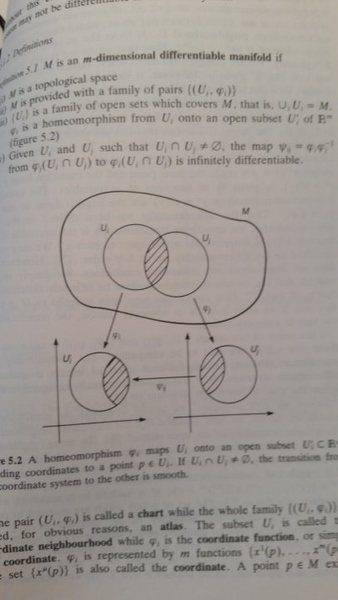
I am studying differential geometry and I stumbled on something that I don't understand. When we have a m- dim differential manifold, with U_i and U_j open subsets of M with their corresponding coordinate
20160125_093821.jpg

function phi. As can be seen in the figure.

If I understand it correctly phi_j of a point gives us a coordinate of that point. So what does the inverse of a coordinate function do? And how come the product of phi_i * phi_j = psi takes us between subsets?
 
  • Like
Likes Math Amateur
Physics news on Phys.org
  • #2
The idea behind is that charts are a locally Euclidean map (coordinates) of the (curved) manifold. Just as street maps in an atlas are. Earth isn't flat, but locally we can pretend it is. This concept requires that overlapping charts are identical on their intersection.
The image in the textbook says ##φ_i|_{U_i ∩ U_j} = Ψ_i \cdot φ_j|_{U_i ∩ U_j}##.
 
  • Like
Likes Math Amateur
  • #3
It is ##\phi_i\phi_j^{-1}## which maps a subset of ##U'_j## to a subset of ##U'_i##, as is written on the page you scanned near the right margin on the upper half.
 
  • Like
Likes Math Amateur
  • #4
So that [tex]$\Psi$[\tex] maps between different subsets comes from a definition?
 
  • #5
Fgard said:
So that [tex]$\Psi$[\tex] maps between different subsets comes from a definition?
Yes.
Set ##U_{ij}=U_i \cap U_j##, and assume that ##U_{ij}\neq \varnothing##
##\Psi_{ij}## by definition maps ##\phi_j(U_{ij})## to ##\phi_i(U_{ij})##.
##\Psi_{ij}## being infinitely differentiable is the condition imposed in (iv) for M to be an m-dimensional differentiable manifold.

As said above you can view ##\Psi_{ij}## as a coordinate transformation. Point (iv) in the definition requires these transformations to be infinitely differentiable.

The book explains it better than I could, actually:
nakahara.jpg
 
Last edited:
  • #6
Okej. Thank you very much for all the help.
 
  • #7
Fgard said:
If I understand it correctly phi_j of a point gives us a coordinate of that point. So what does the inverse of a coordinate function do? And how come the product of phi_i * phi_j = psi takes us between subsets?

The inverse of a coordinate chart is called a "parameterization". It assigns points on the manifold to parameters in a domain in Euclidean space.

Example:

## φ(u,v) = (sin(u)cos(v),sin(u)sin(v),cos(u))## parameterizes a region of the sphere. (u and v need to be restricted so that the map is 1 to 1).

Another Example:

##φ(u,v) = (cos(u),sin(u),cos(v),sin(v))## parameterizes a torus in four dimensional Euclidean space.

A parameterization generalizes the idea of a parameterized curve,##c(t)##, to more than one parameter.

- A coordinate chart goes in the other direction. It assigns a domain in Euclidean space to points on a manifold.

Example: Project the northern hemisphere (minus the equator) of the unit sphere onto the open unit disk in the xy-plane by dropping the z-coordinate.

- A parameterization followed by a coordinate chart maps a domain in Euclidean space into another domain in Euclidean space. If ##ψ## and ##φ## are two coordinate charts then ##φψ^{-1}## is a parameterization followed by a coordinate chart.

For smooth manifolds,##φψ^{-1}## is required to be a smooth map.
 
Last edited:
  • #8
Here's a bit of intuition about charts. An n-manifold M is a space that is locally like Euclidean space of dimension n. If M is a smooth n-manifold — the nicest kind — then it makes sense to talk about smooth functions

f: M →

on it, smooth curves

α: [a,b] → M​

on it, smooth vector fields

V: M → T(M)​

on it, etc. (Here T(M) is the tangent space of M, a concept that your course will soon introduce, which consists of all tangent vectors at all points of M.)

In order to achieve this, we can always construct M by taking pieces (open sets) of Euclidean space n and "gluing them together smoothly". The idea of charts with their smooth transition functions is the right way to make this idea of smooth glueing precise, and allows for definition of smooth functions, curves, vector fields, etc. associated with M.
 
  • Like
Likes jim mcnamara

What is the purpose of using charts in scientific research?

The purpose of using charts in scientific research is to visually represent data and information in a clear and concise manner. This helps researchers to analyze and interpret data more easily, identify patterns and trends, and communicate their findings to others.

What are the different types of charts commonly used in scientific research?

The different types of charts commonly used in scientific research include line graphs, bar graphs, pie charts, scatter plots, and histograms. Each type of chart is suitable for visualizing different types of data and can be chosen based on the research question and type of data being presented.

How do you choose the appropriate chart for your data?

Choosing the appropriate chart for your data depends on several factors, such as the type of data being presented, the research question, and the audience. Line graphs are useful for showing trends over time, bar graphs are good for comparing different categories, and scatter plots are ideal for visualizing relationships between two variables. It's important to choose a chart that best represents your data and effectively communicates your findings.

What are some best practices for creating charts in scientific research?

Some best practices for creating charts in scientific research include clearly labeling all axes and data points, using appropriate and consistent scales, avoiding 3D effects and unnecessary elements, and using colors and fonts that are easy to read and understand. It's also important to include a clear and concise title and a legend for any data markers used.

How can charts aid in data analysis and interpretation?

Charts can aid in data analysis and interpretation by visually representing large amounts of data in a format that is easy to understand and interpret. They can help identify patterns, trends, and outliers, and make it easier to compare and contrast different data points. This can lead to a deeper understanding of the data and potential insights for further research.

Similar threads

Replies
20
Views
3K
  • Topology and Analysis
Replies
8
Views
2K
  • Topology and Analysis
Replies
25
Views
3K
  • Topology and Analysis
Replies
7
Views
3K
  • Differential Geometry
Replies
2
Views
594
Replies
2
Views
2K
  • Differential Geometry
Replies
20
Views
2K
  • Topology and Analysis
Replies
13
Views
2K
  • Differential Geometry
Replies
10
Views
724
  • Topology and Analysis
Replies
12
Views
2K
Back
Top