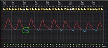
Is there something happening below 0°C in this daily temperature graph?

In summary: C axis.In summary, the temperature curve changes first the slope and then the concavity when the temperature reaches -2/-3 degrees Celsius. The thermocouple located is not clear, but is probably a government weather station, a private instrument, or a personal system. The location is going through a calm period with little precipitation - clear skies - and very little wind.
  • #1
Andrea Vironda
69
3
Hi,
I notice from the graph that every night when the temperature reaches -2/-3 °C the curve change first the slope and then the concavity.
Is something special happening?
 

Attachments

  • Screenshot 2022-01-15 072413.jpg
    Screenshot 2022-01-15 072413.jpg
    55.5 KB · Views: 74
Physics news on Phys.org
  • #2
You mean: like freezing ?

##\ ##
 
  • Like
Likes 256bits and Vanadium 50
  • #3
ahahaha, yes for example. But why does freezing should cause that weird shape?
 
  • #4
I have no idea of the circumstances that resulted in your graph.
Heat radiates off into space at a certain rate. During freezing the temperature of liquid water remains constant. An air temperature of -2 or -3 degrees C provides a reasonable driving force for a while until all is frozen and then the temperature can drop further.

##\ ##
 
  • Like
Likes 256bits, Andrea Vironda and Lnewqban
  • #5
Andrea Vironda said:
But why does freezing should cause that weird shape?
Besides freezing/melting (of water) and heat of fusion, there are mechanisms of heat transport: conduction, convection and radiation, as well as temperature of atmosphere, structures and ground.

Andrea Vironda said:
I notice from the graph that every night when the temperature reaches -2/-3 °C the curve change first the slope and then the concavity.
Where is the thermocouple located? Is this a government weather station, a private instrument, or a personal system?

We have a coil thermometer with a needle gauge on the kitchen window. The temperature in my backyard is currently -18°C (it was about -17°C about 2 hours before sunrise), while the official temperature reported on my smart phone is -16°C. The weather app on my phone shows a predicted high of -5°C today.
 
Last edited:
  • Like
Likes Lnewqban
  • #6
Andrea Vironda said:
Is something special happening?
Guess: frost is happening. And with that comes some heat, so the transition between the + and - range is a bit slower.
 
  • Like
Likes 256bits and russ_watters
  • #7
Do you you have dew point data that corresponds with this temperature data?
 
  • Like
Likes gmax137, Wrichik Basu, Astronuc and 2 others
  • #8
Andrea Vironda said:
I notice from the graph
That screenshot that you posted is very confusing. Could you please post the complete context of that screenshot? If it is from a website, please post a link. If it is from your personal weather station, please post a link to the user manual. Thank you.

For example, the plot changes color when it goes below the 0C axis, but that color corresponds to the atmospheric pressure or whatever the heck is displayed on the right vertical axis.
 
  • #9
berkeman said:
the atmospheric pressure or whatever the heck is displayed on the right vertical axis.
Indeed. What is the right axis representing?

What parameter is 6mm at 0C and 0mm at -20C?
 
  • Like
Likes berkeman
  • #10
More unusual things to note:
  • Wherever this is (Cuorgnè, Italy?), the wind speed is astonishingly steady (except Thursday AM).
  • This data is either predictive or it is at least 11 years out-of-date (possibly as much as 28).
 
  • Like
Likes Astronuc
  • #11
DaveC426913 said:
Wherever this is, the wind speed is astonishingly steady (except Thursday AM).
Yeah, I almost replied that his wind sensor was frozen in place, but then saw a couple datapoints that were different direction or zero. But the near-continuous 4mph data is pretty indicative of a broken home weather station, IMO...
 
  • Like
Likes Astronuc
  • #12
berkeman said:
But the near-continuous 4mph data is pretty indicative of a broken home weather station, IMO...
Or mounted inside a shed** or something.

** [ EDIT ] Sorry: capannone.
 
  • Haha
Likes berkeman
  • #13
Precipitation is measured in mm.
For the graph, precipitation scale is at the right.

Looking at the daylight hours,
three times as many moons as suns, if that represents direct sunlight
the location was either somewhere 50 deg north latitude,
or,
the situated in a valley.

Cuorgnè, Italy
Yes. that would make sense.
Wind travels up and down the valley, changing direction during the day versus the night.
The location is going through a calm period with little precipitation - clear skies - and very little wind.

Notice only the one period with designated cloud cover.

During precipitation, temperature usually runs steady.
Although it cannot be deduced if that is the case here, as the graph shows no afternoon light snowfall or light rain.
 
  • Like
Likes Lnewqban
  • #14
This is the link I used for the screenshot
 
  • #15
Andrea Vironda said:
This is the link I used for the screenshot
OK. We were all wrong. About everything. :frown:
 
  • Like
Likes berkeman and BvU
  • #16
OK, the right axis is precipitation, but it has nothing to do with the blue curve.
It just happens that there is no precip in Cuorgnè during the period. Here's a graph for Toronto for comparison.

1642366420916.png


The upshot is that we can now contextualize and dismiss irrelevant artifacts in the OP's screenshot, leaving us to concentrate on the double trough of the air temp as it goes below 0C.I think my Toronto example is too different to be useful. It doesn't get near 0C this week, and certainly does not vary like that over a day. Here is a better example of a city whose temperatures are largely controlled by day/night cycle: Galveston TX:
1642367029919.png
 
Last edited:
  • Like
Likes russ_watters and BvU
  • #17
To be honest, this is just a bad colour scheme for drawing graphs.

Two different quantities are often plotted on the same graph, with two different y-axes and sharing the same x-axis. In such a case, two colours are used for plotting the two quantities, and the colour of the y-axis indicates which curve it represents.

This graph, however, just changes colour when it goes below the x-axis. And it takes the colour of the other quantity that is shown on the y-axis on the right. This is technically incorrect. This probably got everyone wondering why the red temperature curve is discontinuous at the x-axis, and why the blue curve only appears in the fourth quadrant. Now that we have some pictures with the bar graphs, things have become clear. But the colour scheme still remains wrong.
 
  • Like
Likes berkeman
  • #18
So, returning to the OP's actual question, now that we've decrypted the map, I'd say Rive is onto something here:
Rive said:
Guess: frost is happening. And with that comes some heat, so the transition between the + and - range is a bit slower.
 
  • Like
Likes BvU and Wrichik Basu
  • #19
DaveC426913 said:
So, returning to the OP's actual question, now that we've decrypted the map, I'd say Rive is onto something here:
Though @russ_watters caught it more accurately: this transition belongs to the dew point (below zero), and not simply to the +/- range.
 
  • Like
Likes Wrichik Basu
  • #20
Rive said:
Though @russ_watters caught it more accurately: this transition belongs to the dew point (below zero), and not simply to the +/- range.
Thanks, and broader I'd expect to see the same thing on days when both temp and dew point are above freezing. I've not taken note of it on a graph before, but one way to predict the overnight low temperature is by looking at the daytime dew point: they should be within a few degrees of each other unless there has been a weather system change in the meantime. This is part of the reason why deserts have large temperature differences between day and night while wetter climates do not (also impacts radiative cooling).
 
  • Like
Likes gmax137, 256bits and Rive
  • #21
Rive said:
Though @russ_watters caught it more accurately: this transition belongs to the dew point (below zero), and not simply to the +/- range.
Yeah, I just don't know much about dew points.

Is it because condensation is exothermic?
 
  • Like
Likes russ_watters
  • #22
russ_watters said:
Thanks, and broader I'd expect to see the same thing on days when both temp and dew point are above freezing. I've not taken note of it on a graph before, but one way to predict the overnight low temperature is by looking at the daytime dew point: they should be within a few degrees of each other unless there has been a weather system change in the meantime. This is part of the reason why deserts have large temperature differences between day and night while wetter climates do not (also impacts radiative cooling).
I would agree with that.
After the second peek, there is a slight shift in the dropping temperature, signified by the cloud cover and reduced radiation.
An above 0C occurrence of change in temperature drop rate is seen after the 5th. and lessor so on the 2nd, 3rd, and fifth signifying an above 0C dew point..
 
  • #23
DaveC426913 said:
Yeah, I just don't know much about dew points.

Is it because condensation is exothermic?
Yes. Because thermal energy is released in freezing or condensation, further reductions in temperature are more difficult. I haven't tried to calculate how much more difficult.
 
  • #24
russ_watters said:
further reductions in temperature are more difficult. I haven't tried to calculate how much more difficult.
Looks like about 4-5 metric pixels to me.
1642567241326.png

:woot:
 
  • #25
Here's some values for energy required to lower the temperature of air, in 3 scenarios: all vapor, condensing water, and frost:

Dewpoint-Enthalpy.jpg


It may be surprising that the heat loss per degree of temperature drop is lower for frost than for dew, but this is because there is less moisture in the air at lower temperatures/dew points.

I could see a rabbit-hole of more and more complex models of this...
 
  • Like
Likes Rive and Wrichik Basu

1. What is the significance of the temperature dropping below 0°C?

The temperature dropping below 0°C indicates that the temperature has reached the freezing point. This means that any water present will start to freeze, and this can have various effects on the environment and living organisms.

2. Does the temperature always drop below 0°C during the winter?

The temperature dropping below 0°C is not a guarantee during the winter as it depends on various factors such as location, altitude, and weather patterns. However, in most places, temperatures below 0°C are common during winter months.

3. Can the temperature drop below 0°C during the summer?

It is possible for the temperature to drop below 0°C during the summer, especially in places with high altitudes or near bodies of water. However, it is not common and usually only occurs in extreme weather conditions.

4. What other factors can affect the temperature dropping below 0°C?

Aside from weather patterns, other factors that can affect the temperature dropping below 0°C include human activities such as deforestation and urbanization, as well as natural phenomena like El Niño and La Niña.

5. Are there any consequences of the temperature dropping below 0°C?

The consequences of the temperature dropping below 0°C can vary depending on the location and duration. In general, it can lead to freezing of water sources, damage to crops and plants, and disruption of transportation and infrastructure. It can also pose risks to human and animal health if proper precautions are not taken.

Similar threads

Replies
3
Views
914
  • Biology and Chemistry Homework Help
Replies
8
Views
398
Replies
1
Views
604
Replies
32
Views
2K
Replies
14
Views
2K
  • Introductory Physics Homework Help
Replies
12
Views
613
Replies
2
Views
1K
  • Calculus and Beyond Homework Help
Replies
3
Views
117
  • General Engineering
Replies
4
Views
948
Replies
49
Views
1K
Back
Top