- #1
Phisico
- 12
- 2
- Homework Statement
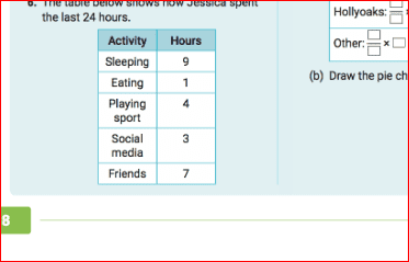
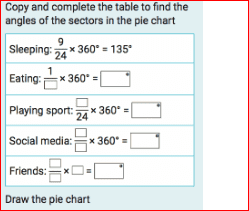
- Draw a pie chart
- Relevant Equations
- find out the angle?
May anyone help me I really don get it. How do you draw a pie chart?


Last edited by a moderator:
The first step in creating a pie chart is to determine the data values that you want to represent. This can be done by collecting data from a survey or by using existing data sets. Once you have your data, you will need to calculate the percentage or proportion of each data value in relation to the total.
When choosing colors for your pie chart, it is important to consider the purpose and audience of your chart. For example, if your chart is for a professional presentation, you may want to use muted or neutral colors. If your chart is for a more casual audience, you can use brighter and more vibrant colors. It is also important to choose colors that are easily distinguishable from each other to avoid confusion.
The size and proportions of each slice in a pie chart are determined by the data values you have calculated. The percentage or proportion of each data value will correspond to the size of its slice in the pie chart. It is important to accurately represent the data values in your chart to ensure the accuracy of your visual representation.
Labels are an important part of a pie chart as they provide context and understanding to the data being represented. Each slice in the pie chart should be labeled with its corresponding data value or percentage. You can also include a legend to further explain the data and colors used in the chart.
To ensure the accuracy and readability of your pie chart, it is important to carefully choose the data values, colors, and labels. You should also make sure that the slices are accurately sized and proportioned. Additionally, it is important to use a clear and legible font for the labels and make sure they are not overlapping. Regularly checking and double-checking your chart for accuracy is also recommended.