Excel Graph Help: Plotting Experimental Data with Theoretical Model in One Graph

In summary, the conversation is about how to plot experimental data points and a theoretical model on the same graph. The problem is that the model needs to be a continuous line while the data points are just dots. The solution suggested is to use the Scatter Plot function in Excel and adjust the settings for each data series to achieve the desired result. The conversation ends with the person thanking for the help and expressing their excitement to try it out with actual data.
  • #1
dRic2
Gold Member
883
225
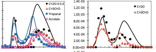
I have a set of n point (x, y) of experimental data and a function y=f(x) which is the theoretical model. I want to plot them in the same graph and see the difference. My problem is that f(x) has to be a continuous line while my n point has be just dots. I need to get something like this:
gr.png


I don't know how to plot dots and line simultaneously. Can anybody help me?
 

Attachments

  • gr.png
    gr.png
    13.6 KB · Views: 420
Physics news on Phys.org
  • #2
In the Excel "Insert" tab, try Scatter Plot, and choose what kind of lines you want to connect your dots with... :smile:
 
  • #3
Yes you can format each data series individually, so use
"Marker Options = Automatic" and "Line Color = no line" for the recorded data, and
"Marker Options = No marker" for the function.
 
  • Like
Likes dRic2
  • #4
How do I use Marker Options ? I'm not very good with excel
 
  • #5
OK I did it. Thank you very much!
 
  • Like
Likes berkeman
  • #6
wow that was quick ! I hope it looks as you wanted.
 
  • #7
Ahahahah I tried with some random numbers. Now I'm going to do the real stuff ;)
 

Question 1: How do I create a graph in Excel?

To create a graph in Excel, first select the data you want to include in the graph. Then, click on the "Insert" tab and choose the type of graph you want to create from the "Charts" section. Finally, customize your graph by adding labels, titles, and formatting options.

Question 2: How do I edit an existing graph in Excel?

To edit an existing graph in Excel, simply click on the graph to select it. Then, use the "Chart Tools" tab to make any changes to the data, design, or layout of the graph.

Question 3: How do I change the type of graph in Excel?

To change the type of graph in Excel, select the graph and click on the "Design" tab. Then, click on the "Change Chart Type" button and select the new type of graph you want to use.

Question 4: Can I add multiple data sets to a single graph in Excel?

Yes, you can add multiple data sets to a single graph in Excel. Simply select all of the data you want to include and follow the steps to create a graph. You can also add additional data sets to an existing graph by clicking on the graph and using the "Select Data" option.

Question 5: How do I add a trendline to a graph in Excel?

To add a trendline to a graph in Excel, select the graph and click on the data point you want the trendline to start from. Then, click on the "Layout" tab and choose "Trendline" from the "Analysis" section. You can customize the trendline by right-clicking on it and selecting "Format Trendline".

Similar threads

  • MATLAB, Maple, Mathematica, LaTeX
Replies
3
Views
147
  • MATLAB, Maple, Mathematica, LaTeX
Replies
1
Views
1K
  • MATLAB, Maple, Mathematica, LaTeX
Replies
1
Views
697
  • MATLAB, Maple, Mathematica, LaTeX
Replies
6
Views
1K
  • MATLAB, Maple, Mathematica, LaTeX
Replies
12
Views
3K
  • MATLAB, Maple, Mathematica, LaTeX
Replies
14
Views
2K
  • MATLAB, Maple, Mathematica, LaTeX
Replies
1
Views
1K
  • MATLAB, Maple, Mathematica, LaTeX
Replies
1
Views
3K
  • MATLAB, Maple, Mathematica, LaTeX
Replies
3
Views
2K
  • MATLAB, Maple, Mathematica, LaTeX
Replies
1
Views
1K
Back
Top