Suggestion Floating Menu Bar: Issues & Options

  • Thread starter Thread starter RabbitWho
  • Start date Start date
AI Thread Summary
The floating menu bar is criticized for being cumbersome on small screens, with suggestions for alternatives like a side placement or an option to disable it. Users express frustration with its size, especially when zoomed in, which hinders readability. While some find the floating bar convenient for quick access, others argue it takes up unnecessary space. There are potential solutions like using userscripts to modify its appearance, but these require technical knowledge. The forum plans to reevaluate the menu's design in 2018 to address user concerns.
RabbitWho
Messages
152
Reaction score
18
What is the purpose of that floating menu bar on top, it is quite cumbersome for me on my small screen with its big writing.

You know in the 90s there were frames on every website and we got rid of them because they were universally hated. Now that we all have wide-screen computers and vertical space is at a premium, they've been brought back? Could the bar not be on the side?

Is there an option to turn it off and keep it fixed on the top of the page instead of on top of the screen? Could there be?

Let me give you an idea what a problem it is for some of us:
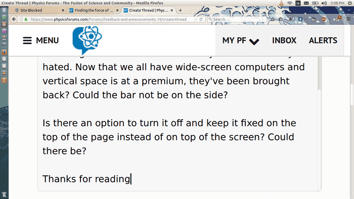
Screenshotfrom2017-04-1517083951cd6.png

Thanks for reading
 
Physics news on Phys.org
It looks like you zoomed in a lot in your browser. You could zoom out to have more content on the page.
 
I need to be able to see what I a reading, which I can't if I zoom out.
 
Okay, I was going by the size of the icons elsewhere - they are smaller than individual letters in the image.

The bar has a useful size with typical zoom levels. You could add a userscript to make the bar smaller in your browser.
 
I don't have to read the icons so they are the smallest size possible. I don't know how to do that. It was just a suggestion, forget about it. I really don't think the menu has any purpose other than to take up space, if I wanted any of those functions I could scroll up to them. But obviously I am the only one, so never mind. Thanks anyway!
 
You are not wrong. It will be an issue for a small number of users with your zoom level. At the moment there isn't an easy solution. The float is convenient for many as you don't need to scroll. For power users, it saves a lot of time and movement. We are planning on reevaluating our style in 2018 and will consider options for your case.
 
  • Like
Likes RabbitWho
I use the tool bar very often to access the https://www.physicsforums.com/watched/threads and sometimes other functions, and scrolling up to access it every time would be annoying. Fixing it to the top would improve the forum for a few, but make it much worse for most others.
RabbitWho said:
I don't know how to do that.
There are tutorials how to modify the appearance of websites with tools like Greasemonkey.
 
  • Like
Likes RabbitWho
I noticed that you're using Firefox. Try this: Move the mouse pointer so that it hovers over the menu bar. Hold down the left mouse button and while you're holding it down press the delete key on your keyboard. Of course this won't work if you're not using a mouse. I'll see if I can find a way to do it without the mouse.

Edit:
I just realized that this is a NoScript feature and not a feature of FireFox. So you'll need to add the NoScript addon to use this feature.
 
Last edited:
  • Like
Likes RabbitWho
You can also use right-click -> inspect element and then delete it, but you would have to do this for every forum page you load.
 
  • #10
mfb said:
I use the tool bar very often
+1.0 I use it quite a lot, and like having access to it all the time. :smile:
 
  • #11
mfb said:
Okay, I was going by the size of the icons elsewhere - they are smaller than individual letters in the image.
He might have his zoom function configured like this... ?

Zoom text only.JPG
 
  • Like
Likes Greg Bernhardt
Back
Top