Ackbach
Gold Member
MHB
- 4,148
- 94
Warning: requires the tikz and pgfplots packages.
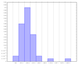
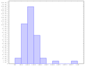
I've got my histogram almost where I want it:
The one thing I want to change is where the $x$-axis labels are showing up. Instead of labeling the intervals (which I think is extremely confusing and unhelpful unless you give the range, which won't fit here), I want to label the boundaries between the intervals. How can I get pgfplots to do that? Thanks!
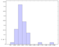
I've got my histogram almost where I want it:
Code:
\begin{center}
\begin{tikzpicture}
\begin{axis}[
  tiny,
  width=6in,
  ymin=0,
  ybar interval,
  ]
  \addplot+[hist={bins=10,density}]
    table[row sep=\\,y index=0] {
    	data \\
      565 \\ 786 \\ 870 \\ 923 \\ 948 \\ 951 \\ 964 \\ 968 \\
      997 \\1007 \\1013 \\1037 \\1040 \\1051 \\1056 \\1080 \\
     1088 \\1090 \\1102 \\1103 \\1104 \\1120 \\1151 \\1159 \\
     1165 \\1185 \\1189 \\1207 \\1216 \\1233 \\1251 \\1256 \\
     1261 \\1292 \\1312 \\1317 \\1347 \\1358 \\1385 \\1416 \\
     1477 \\1500 \\1514 \\1567 \\1592 \\1588 \\1615 \\1713 \\
     2325 \\3168 \\};
\end{axis}
\end{tikzpicture}
\end{center}
The one thing I want to change is where the $x$-axis labels are showing up. Instead of labeling the intervals (which I think is extremely confusing and unhelpful unless you give the range, which won't fit here), I want to label the boundaries between the intervals. How can I get pgfplots to do that? Thanks!