Plot a curve through some arbitrary points

In summary, the conversation discussed how to plot a curve in Excel or MATLAB and the different types of curves that can be used. The expert suggested using the least mean squared (LMS) criterion for the best fit and explained how to choose the type of curve based on this criterion. They also mentioned the importance of considering the physical model behind the data and using tools like trendlines or ARIMA for time series analysis. Finally, they suggested transforming the data to find a better fit with Excel.
  • #1
Auteng
20
1
Hi how can i plot a curve (red curve at this example) like this:
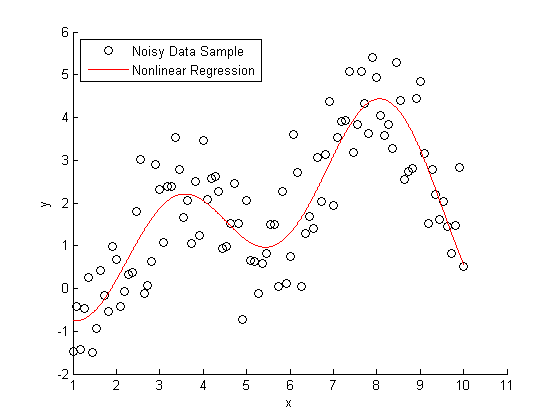
nonlinear.png
 
Mathematics news on Phys.org
  • #2
You could make a table of moving average y values (say 5 before and 5 after) versus x and put a spline curve through those points.
 
  • Like
Likes Auteng
  • #3
Hi Auteng:

I am not sure i understand what you are asking. There are two possibilities that come to mind.
1. How to use a tool, like a spreadsheet, to plot sample points and a curve through the points.
2. How to do the math to calculate the curve to be plotted.
For this post I am assuming #2. Generally this means you want a curve of a certain type with the best fit.

There are two things you need to specify.
1. The criterion you want to use for "best fit". The most commonly used one is: least mean squared (LMS). From you use of the term "non-linear regression", I think this is the one you want.
2. The type of curve. This may depend on the "best fit" criterion. Examples assuming LMS: quadratic, cubic, sinusoidal, exponential, and many more.

Each kind of curve is usually based on a type of physical model for the source of the data points. Sometimes there are many reasonable models, so you fit the points with many curves, and then decide which is the one you want to use. For example, it you are using polynomials, the higher the maximum exponent the smaller the error. There are criteria you can use to tell you when to stop. The criteria are based on how much relative reduction you get from adding one more term to the polynomial.

Hope this helps.

Regards,
Buzz
 
  • Like
Likes Auteng
  • #4
How can i do it with MATLAB or EXCEL?
 
  • #5
Hi Auteng:

I don't know MATLAB, but I am quite familiar with EXCEL. I don't have time now to give a long explanation, but you need to decide on what you want to do. Do you want to use polynomials? Do you have in mind a specific number of terms?

I will look for your responding post in a few hours.

Regards,
Buzz
 
  • Like
Likes Auteng
  • #6
I want a sin diagram that decay with time
 
  • #8
Hi Autang:

I have a few minutes before I have to leave for a few hours.

Are you saying the x-axis represents time? The picture shows a general increase of y-axis values as x increases. Why do you think the pattern should be a decaying sine function? You might have a linear function plus a sine with a decay, but if there is any decay it seems to be towards x = 0. From physical processes I can think of, I would expect a sine function to decay as time increases.

Regards,
Buzz
 
  • Like
Likes Auteng
  • #9
I don't think the figure in the first post is the OP's actual data, it is just a figure showing what he wants to do: find the red curve for "his" data.

To the OP: in excel what you want to do is called a "Trendline." Use excel help to explain how to make a trendline for your data. I don't think you are going to fine a decaying sine curve as a built in choice in Excel though. You're going to need to get trickier in Excel.
 
  • Like
Likes Auteng
  • #10
for example i want to correlate a curve through the points that i have attached...
https://uploadfiles.io/753a6
 
  • #11
Hi Autung:

Sorry, I was unable to download your data. If you can take a screen shot of the graph of the actual data points, you can upload a PNG file attached to your next post with the image.

If you are confident that the curve you want is a decaying sine function, there are many ways to proceed. The way I am going to suggest is not the best way, but I think it is the easiest to understand what is going on.

First, recognize that the function you want to fit has four parameters, A, B, C, and D in the equation below.
y = A × sin ( B × (x + C)) × e-(D × x)
You can assume A, B, C, and D are all positive, and assuming that the sin function is with respect to radians, C is limited by
0 ≤ C ≤ 2π.​

If you post back that you understand this, I will post you some more about this later.

Regards,
Buzz
 
  • #12
If your data is a time series and you want a statistical approach, you should consider time series analysis. A powerful approach is the Box-Jenkins technique of Auto-Regressive Integrated Moving Average (ARIMA). The free software package R has tools for ARIMA (see http://www.statmethods.net/advstats/timeseries.html ).
 
  • Like
Likes Buzz Bloom
  • #13
Hi @FactChecker:

Is ARIMA suitable for very noisy decaying sinusoidal functions?

Regards,
Buzz
 
  • #14
Buzz Bloom said:
Hi @FactChecker:

Is ARIMA suitable for very noisy decaying sinusoidal functions?

Regards,
Buzz
I think it should be able to handle it. It is designed for noise. If the sinusoidal component at one frame is a multiple of that component at a fixed number of frames earlier, then it should be ok. It can be applied to seasonal data. (see https://people.duke.edu/~rnau/411sdif.htm )
 
  • Like
Likes Buzz Bloom
  • #15
Hi @FactChecker:

Thank you for your post. It has been a very long time since I worked with ARIMA calculations. I have forgotten how ARIMA produces a curve with a least mean squared fit error.

Regards,
Buzz
 
  • #16
Excel is quite limited in the available shapes of trend lines, but sometimes you can transform your data. If you want a polynomial of an exponential, for example, don't plot the data itself, plot the logarithm, and then find a polynomial trendline there. That has an influence on the weights the individual data points get, but if you want to take uncertainties into account properly then Excel is not the right tool anyway.
 

What is the purpose of plotting a curve through arbitrary points?

The purpose of plotting a curve through arbitrary points is to visually represent the relationship between the points. This allows for a better understanding of the data and can help identify any patterns or trends.

What is the process for plotting a curve through arbitrary points?

The process for plotting a curve through arbitrary points involves first identifying the points on a graph and then connecting them with a smooth line or curve. This can be done manually or with the help of a computer program.

What types of data can be plotted using this method?

Any type of data that can be represented on a graph can be plotted using this method. This includes numerical data, categorical data, and even complex data such as mathematical functions.

What factors should be considered when plotting a curve through arbitrary points?

When plotting a curve through arbitrary points, it is important to consider the scale of the graph, the range of the data, and the shape of the curve. These factors can affect the accuracy and interpretation of the plotted curve.

Are there any limitations to plotting a curve through arbitrary points?

Yes, there are limitations to plotting a curve through arbitrary points. The accuracy of the curve depends on the number of points plotted and the smoothness of the curve can be affected by outliers or missing data. Additionally, the interpretation of the curve may be limited by the type of data being plotted and any assumptions made during the plotting process.

Similar threads

Replies
2
Views
354
  • General Math
Replies
9
Views
1K
Replies
10
Views
2K
  • General Math
Replies
12
Views
961
Replies
1
Views
791
Replies
49
Views
3K
Replies
2
Views
1K
Replies
8
Views
1K
  • General Math
Replies
17
Views
1K
  • Programming and Computer Science
Replies
0
Views
207
Back
Top