rnielsen25
- 25
- 1
- TL;DR
- I'm having trouble understanding the two diagrams describing the composition of stars at the late stages of stellar evolution. I hope some of you can help me understand and read the diagrams.
Hi, I have an upcoming exam in astrophysics. We have been told to make sure we study all figures and tables, s.t. we are able to explain them. However, I ran into these figures below, in my lecturer's PowerPoint and I do not know where they originate and aren't presented in my book. I'm having some trouble understanding the two figures below, and I was hoping you could help me understand what information they contain.
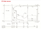
The first figure is this one:

As the title indicates, this figure represents a 25-solar-mass star. I believe it describes the shell structure of the star at the end of its evolution (because of the iron core). However, I'm a little unsure how to read this graph exactly. Especially, I'm having trouble understanding what the y-axis describes? So the x-axis indicates the inner mass m(r) from zero to about 8 solar masses. I believe this makes me able to tell that the inner core from 0-2 solar masses contains iron, the next part gets a little messy. Does it describe that the next layer is a mixture of Ca, Ar, S, and Si and then the y-axis represents the fraction of these elements at the given layer?The next figure is this table:

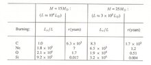
So this figure represents the two stars, one of 15 solar masses and the other 25 solar masses.
I believe tau(years) is the time it takes the fusion processes to exhaust C, Ne, O and Si, respectively. Then $L_{\nu}/L$ must represent the amount of luminosity (energy) released from neutrinos compared to the normal luminosity.
So it tells us that a substantial amount of the energy released from the star is from neutrinos in the later stages of the stellar evolution?
Why is this important?
The first figure is this one:
As the title indicates, this figure represents a 25-solar-mass star. I believe it describes the shell structure of the star at the end of its evolution (because of the iron core). However, I'm a little unsure how to read this graph exactly. Especially, I'm having trouble understanding what the y-axis describes? So the x-axis indicates the inner mass m(r) from zero to about 8 solar masses. I believe this makes me able to tell that the inner core from 0-2 solar masses contains iron, the next part gets a little messy. Does it describe that the next layer is a mixture of Ca, Ar, S, and Si and then the y-axis represents the fraction of these elements at the given layer?The next figure is this table:
So this figure represents the two stars, one of 15 solar masses and the other 25 solar masses.
I believe tau(years) is the time it takes the fusion processes to exhaust C, Ne, O and Si, respectively. Then $L_{\nu}/L$ must represent the amount of luminosity (energy) released from neutrinos compared to the normal luminosity.
So it tells us that a substantial amount of the energy released from the star is from neutrinos in the later stages of the stellar evolution?
Why is this important?