Help me understand these cosmological horizons and graphics

In summary: The Y-axis is the 'size' of the universe. It shows that the universe has been expanding since it was very small.
  • #1
Adoniram
94
6
Hi all, I am trying to understand a few basic concepts about cosmology and the CMB, but I am not getting the information presented in these graphics. I've seen them a million times, and I generally just take it for granted without close examination, but now it's bothering me. (these come from a U Chicago intro to the CMD, linked here)

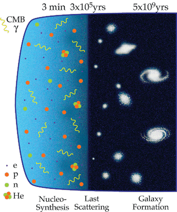
Pic 1: I get that TIME is the X-axis, and this shows a time evolution of structure formation in the universe. No need to go into symmetry breaking, QFT, etc. What I do NOT understand is what is on the Y-axis. I would naively think the size of space itself (i.e. the universe expanding), but that can't be right, can it? Did the universe really pop out like that in less than a million years, and then not expand much (by comparison) for the next 14 billion years??
evol.gif
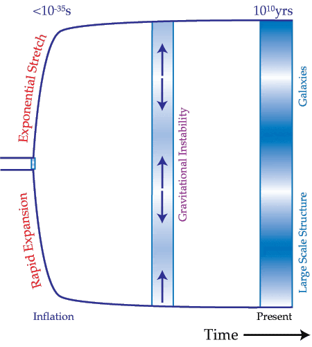
Pic 2: Here's another image that leads me to the conclusion that ~95% of the space of the universe was there within a relatively tiny amount of time... Really?
inflation1.gif

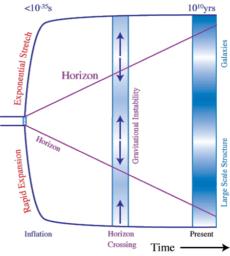
Pic 3: This is where I really get lost... The "horizon." Ok... so if a photon magically appeared at the beginning of time (before the rapid expansion), it could only travel so far given a specified amount of time. This is relevant if space itself is expanding faster than the speed of light. Check.
THAT is what I think of when I think of a "horizon" in this picture. Is that the correct interpretation?
So... if the universe is full of energy/particles/whatever before inflation, that would mean it's still full of stuff afterwards, in a roughly isotropic distribution. Right?
So... what the heck is this horizon shown in the pic?
inflation2.gif
Thank you all for your help in understanding these basic cosmology concepts...
 

Attachments

  • evol.gif
    evol.gif
    69 KB · Views: 540
  • inflation1.gif
    inflation1.gif
    17.3 KB · Views: 715
  • inflation2.gif
    inflation2.gif
    22.1 KB · Views: 702
Last edited by a moderator:
Space news on Phys.org
  • #2
Adoniram said:
What I do NOT understand is what is on the Y-axis. I would naively think the size of space itself (i.e. the universe expanding), but that can't be right, can it? Did the universe really pop out like that in less than a million years, and then not expand much (by comparison) for the next 14 billion years??
It's just a picture of the general evolution of the universe. Is it look too scientific? For me, it's not. If you want to think the picture such as Y-axis would correspond to space, maybe yes it does, but it doesn't have any sort of scale. It's wrong to conclude such things (look the bold part of your quote) just by looking the picture.
Adoniram said:
Here's another image that leads me to the conclusion that ~95% of the space of the universe was there within a relatively tiny amount of time... Really?
If we assume the universe is finite and then why not? The universe can be much smaller. I am not sure why it surprises you?

Adoniram said:
So... if the universe is full of energy/particles/whatever before inflation, that would mean it's still full of stuff afterwards, in a roughly isotropic distribution. Right?
So... what the heck is this horizon shown in the pic?
It's about the horizon problem. If you look the different regions of the sky you'll see that the temperature is constant. So Think you are center in the observable universe, then how the different parts of the universe can have an approximately same temperature? For more information you can search, there are also couple great videos that explain the phenomena.
 
  • #3
Adoniram said:
What I do NOT understand is what is on the Y-axis. I would naively think the size of space itself (i.e. the universe expanding), but that can't be right, can it? Did the universe really pop out like that in less than a million years, and then not expand much (by comparison) for the next 14 billion years??
You can't take these pictures literally. They show the evolution of the universe just in principle. Note that they show a tiny part of the universe which we call observable universe.
The era of inflation lasted about ##10^{-33}## seconds while expanding by an incredible large factor. It's obvious that this can't be shown in with picture.
 
  • #4
Adoniram said:
Pic 1: (...) What I do NOT understand is what is on the Y-axis. I would naively think the size of space itself (i.e. the universe expanding), but that can't be right, can it? Did the universe really pop out like that in less than a million years, and then not expand much (by comparison) for the next 14 billion years??
This is indeed the spatial dimension. While one shouldn't take too literally any graph without marked axes, the illustrations show the general idea correctly - that is, the universe did expand at a huge rate in the very earies moments, when compared to the later rate.

If you look at the X axis, there's a mark there at the last scattering boundary labelled 3x10E5 years. That's 300 000 years after the big bang, and the erliest moment we can directly observe. From that point in time until today all the spatial expansion that have happened resulted in the universe growing approx. 1090 times.
It's clear that the graphs are not scaled linearly to this kind of expansion.

However, if you look at the numbers on the X axis, it looks like is uses some sort of logarythmic scaling. The first few seconds are stretched out on the graph, and the rest of time is compressed to fit in the picture.
The graph will make more sense if you imagine the Y axis to also be scaled logarythmically.
The low sloping after the time of last scattering can then be read as growth by a factor of x~1000, and the sloping to the left of that point represents shrinking (because we're going back in time) by a factor approaching infinity in the limit of t=0 (because all distances approach 0).
A factor of inifinity is certainly larger than 1090.

Adoniram said:
Pic 2: Here's another image that leads me to the conclusion that ~95% of the space of the universe was there within a relatively tiny amount of time... Really?
Yes. Once again, the last 13-odd billion years without the very last 300 000 resulted in a 'mere' x1090 growth. Going back from that point, the still-millions of light-years large currently observable universe shrinks at an increasingly faster rate the earlier you go, allowing the millions of light-years to shrink to 0 (in the limit) in this relatively short time.

Adoniram said:
Pic 3: This is where I really get lost... The "horizon." Ok... so if a photon magically appeared at the beginning of time (before the rapid expansion), it could only travel so far given a specified amount of time. This is relevant if space itself is expanding faster than the speed of light. Check.
THAT is what I think of when I think of a "horizon" in this picture. Is that the correct interpretation?
So... if the universe is full of energy/particles/whatever before inflation, that would mean it's still full of stuff afterwards, in a roughly isotropic distribution. Right?
So... what the heck is this horizon shown in the pic?
Your interpretations seems to be o.k., and matches what was explained on the website the graphs are taken from, suggesting an understanding. So your last question comes as a surprise. Can you be more specific in describing the issue you're having with it?
 
  • #5
Bandersnatch said:
...

Your interpretations seems to be o.k., and matches what was explained on the website the graphs are taken from, suggesting an understanding. So your last question comes as a surprise. Can you be more specific in describing the issue you're having with it?

Thank you for all that earlier clarification. Regarding this last point, I just don't get why that horizon is drawn there (centered at the space/time origin). It could (theoretically) be drawn from any point on the plot where a photon was emitted, right?
The real trouble, for me, was here:
inflation3.gif


The "Last Scattering" time I get (i.e. recombination, or the moment in time when the CMB was essentially made in its observed form). I even get the orange lines being photons that a CMB observer sees, originating from distant points. The purple horizon lines just bother me because it feels like they are supposed to be relevant or important somehow, to this particular picture (other than what we've discussed). And the "Horizon crossing" I don't get at all...
 

Attachments

  • inflation3.gif
    inflation3.gif
    27.7 KB · Views: 465
  • #6
Adoniram said:
So... if the universe is full of energy/particles/whatever before inflation,

There wasn't particles before the inflation in BB theory.
 
  • #7
Bandersnatch said:
This is indeed the spatial dimension.
I don't think it is. I think it's the Hubble length. Which would make part of the graph mislabeled. The Hubble length itself is the inverse of the rate of expansion. So larger values mean slower expansion.

The reason I think it's the Hubble length is that there's a narrow "throat" at the far left of the graph. This makes sense if it represents inflation, during which the rate of expansion (and hence the Hubble length) was approximately constant. That means the "exponential expansion" applies to the narrow throat part of the graph.

When inflation ended, the Hubble length rapidly increased as the expansion rapidly slowed. The Hubble length is now approaching a constant value again.

But yes, the vertical axis needs to be logarithmic to make sense, as the Hubble length during inflation was something like ##10^{-30}## meters, so that its thickness would be invisible if this were a linear scale.
 
  • #8
kimbyd said:
The reason I think it's the Hubble length is that there's a narrow "throat" at the far left of the graph.
Huh. That would explain the narrow bit indeed. And the bell shape seems to make more sense too, what with it approaching cylindrical shape towards the present. Unless the accelerated expansion is simply hidden by the log scaling.
But then the particle horizon and CMB lightcone make no sense drawn as they are. And the labelling becomes dodgy, as you say.
The more I look at these pictures, the more I'm convinced they're just poorly made.

Adoniram said:
The purple horizon lines just bother me because it feels like they are supposed to be relevant or important somehow, to this particular picture
The somewhat suspect quality of the picture notwithstanding, the particle horizon tells you which observers (at which events) see the emitter of a signal as their farthest detectable point of the universe. It's like a slightly offset past light cone (in orange), only more concerned with the emitter than with the observer.

If you pick a time on the X axis, and draw a vertical line, it'll intersect both the orange and the purple cones.
The two points marked by the intersection with the horizon indicate observers which at this moment are able to detect the emission event.
The two points at the intersection with the orange light cone tell you of emission events which will be detectable by an observer in the present.

If an observer can't have seen you as their farthest detectable point, then you couldn't have influenced that observer (and vice versa) in any way, including gravitationally. As time passes, bits of distant matter start to enter each others' particle horizons, and can start influencing each other, leading to large-scale structure formation.

So the orange light cone takes now as the vantage point, and tells you: those are the events that influence us now.
The purple horizon takes the emission event as the vantage point, and tells you: those are the events we will be influencing.
 

What is a cosmological horizon?

A cosmological horizon is a boundary in space beyond which objects cannot be observed. It marks the limit of the observable universe and is determined by the speed of light and the expansion of the universe.

What are the different types of cosmological horizons?

There are three main types of cosmological horizons: the particle horizon, the event horizon, and the cosmic horizon. The particle horizon is the most distant boundary from which light can reach us since the beginning of the universe. The event horizon is the boundary beyond which no information or light can reach us. The cosmic horizon is the maximum distance that light can travel in the entire history of the universe.

How are cosmological horizons related to the Big Bang theory?

Cosmological horizons are a direct result of the Big Bang theory. The expansion of the universe that occurred during the Big Bang created these boundaries, limiting our ability to observe the universe beyond a certain point.

What do the graphics associated with cosmological horizons represent?

The graphics associated with cosmological horizons often depict the expansion of the universe over time and the boundaries that are formed as a result. They can also show the relationship between different types of cosmological horizons and how they change over time.

Why are cosmological horizons important to study?

Cosmological horizons provide valuable insights into the history and structure of the universe. By studying these boundaries, scientists can learn more about the origins of the universe, its expansion, and the fundamental laws of physics that govern it.

Similar threads

Replies
3
Views
976
Replies
1
Views
1K
  • Cosmology
Replies
17
Views
1K
Replies
19
Views
2K
Replies
9
Views
2K
Replies
2
Views
1K
Replies
1
Views
967
  • Cosmology
Replies
4
Views
1K
Replies
20
Views
1K
Replies
19
Views
2K
Back
Top