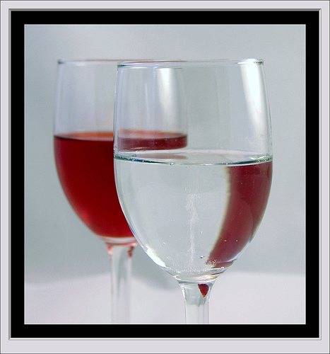
The discussion centers on selecting a photo for a contest themed "Red." Participants evaluate two initial photos, noting that both have less red than desired, which diminishes their impact. Suggestions include rotating the glass in the first photo for a different perspective and adjusting the positioning of elements in the second photo to enhance the red theme. The conversation shifts to additional photos, with one participant favoring a pastoral image (#4) for its subtlety and composition, despite its lack of red. The group discusses the importance of not overwhelming the viewer with color while still capturing the essence of the theme. A website for sharing and discovering high-quality photography is recommended, emphasizing the community aspect and potential for inspiration. Overall, the consensus leans toward using photo #4 for its standout qualities.

