How can I effectively display different types of worker coverage on a map?

In summary, the map is intended to be at-a-glance and easy to read. The colour scheme is not easily distinguishable and the legend is difficult to use.
  • #1
DaveC426913
Gold Member
22,497
6,168
OK, I'm stuck on a problem implementing this map.
(It'll be built in HTML with JavaScript and CSS and is interactive but that's just context - this is really about map-colouring.)

The function of the map is to help users see at-a-glance what regions/counties of the province are serviced by three types of workers (PSWs, Doulas and RNs). (I will have rollovers and drill downs to provide another level of detail, but that's not exactly "at-a-glance").

The below map examples are at 100% scale. You can see by the size of the areas that I have very little room for details. That's why I'm preferring block colouring.

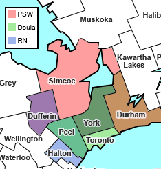
Here is a (bad) atttempt:
1640138382036.png


County Simcoe is serviced by a PSW, county Toronto is serviced by a Doula and county Halton is serviced by an RN.

Counties served by more than one type are a combination of the colours:
County Peel is serviced by a Doula and an RN (green, blue)
County Dufferin is serviced by a PSW and an RN (red, blue)
County Durham is serviced by a PSW and Doula (red, green)**
County York is serviced by all three (red, green, blue)**.
** note that these are actual mixes of the colours at 40% opacity, so R and G don't make yellow and RGB doesn't make white.

Anyway, you can see how this doesn't work - it's not at all apparent what, say, purple represents.

I tried this too, where the three colours are visible and don't overlap:
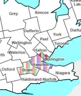
1640138723088.png

but it's pretty hideous ain't it?

I'd like to be able to incorporate density of coverage at the same time:
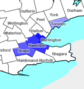
1640138950951.png

So, Burlington has multiple RNs - much more than Toronto.

Suggestions?
 
Science news on Phys.org
  • #2
Technically, this works without the legend getting out-of-hand...
I'm just not sure the colours are differentiable enough.

1640142460905.png
 
  • #3
I think even with perfect colour vision this is too great a cognitive load: the brain is just not used to separating 3 orthogonal axes from a colour map.

How about separate the colours into sectors so that in each area from 12 to 4 o'clock you display red at the appropriate opacity for the density of Doulas, from 4 to 8 o'clock green at the appropriate opacity for the density of RNs etc. You may need to experiment with an algorithm to calculate centres for the 'pies'. Also there are probably better colours than red, blue and green.
 
  • Like
Likes sysprog and DaveE
  • #4
Akternatively a single (grey?) shade for density covering the whole of each area with a radar chart or star chart for numbers or ratios of each type of carer.
 
  • Like
Likes sysprog
  • #6
pbuk said:
How about separate the colours into sectors so that in each area from 12 to 4 o'clock you display red at the appropriate opacity for the density of Doulas, from 4 to 8 o'clock green at the appropriate opacity for the density of RNs etc. You may need to experiment with an algorithm to calculate centres for the 'pies'.
Yeah, I tried pie pieces. It was nightmarish-looking.

pbuk said:
Also there are probably better colours than red, blue and green.
I played with CMY as well. Not as intuitive as RGB.

I am pretty confident that RGB - and the secondaries C, M and Y - are by far the easiest to identify. They are all colours we're intimately familiar with.

Any other three primaries will produce a rainbow with strongly overlapping segments, for example: green, yellow-green (is it green? is it yellow?) and yellow.
 
  • #7
I'm going to move forward with this until I come up with something better:

1640222793474.png
I've just added some functionality to make it much easier: the legend is comprised of hot spots to turn colours on and off:

1640222875542.png


Unfortunately, it doesn't facilitate a density parameter (yet).(I guess I may have to actually reinstall an editor after years. Notepad is a bit clunky for this.)
 
  • #8
DaveC426913 said:
Yeah, I tried pie pieces. It was nightmarish-looking.
Shame. How about 3 vertical or horizontal bars with relative quantity represented by relative area?

DaveC426913 said:
Any other three primaries will produce a rainbow with strongly overlapping segments, for example: green, yellow-green (is it green? is it yellow?) and yellow.
I was thinking of different colours for separate display to overcome the different perception of equal intensities of each of R, G and B. I agree mixing anything other than primaries is going to be even worse.
 
  • #9
pbuk said:
Shame. How about 3 vertical or horizontal bars with relative quantity represented by relative area?
See post #1, pic #2. Hideous.
 
  • #10
DaveC426913 said:
I've just added some functionality to make it much easier: the legend is comprised of hot spots to turn colours on and off:
Well 2-way blends are easier to grok than 3-way I suppose, but it still doesn't work for me.
DaveC426913 said:
See post #1, pic #2.
Too many stripes - I was thinking of exactly 0, 1, 2 or 3 for each region.
 
  • #11
pbuk said:
Too many stripes - I was thinking of exactly 0, 1, 2 or 3 for each region.
Surely you don't mean small counties have small bars, while huge counties have huge bars? ?:)
 
  • #12
DaveC426913 said:
See post #1, pic #2. Hideous.
I kind of liked that one. It doesn't look great, but it's easy to grok the meaning, easy to understand the legend. When I see purple, I just don't think of red + blue. You may have to choose between pretty and easy to understand.

How about different colored dots instead of stripes. This would be particularly good if you had more detailed geographic data than by county boundaries. You could separate the county boundaries from the service area boundaries. Kind of like a radar plot of rain superimposed on the map.

Anyway, you won't satisfy everyone, including yourself.
 
  • Like
Likes Keith_McClary and pbuk
  • #13
DaveC426913 said:
Surely you don't mean small counties have small bars, while huge counties have huge bars? ?:)
Yes that's exactly what I mean: if coverage per unit area or head of population is represented by opacity/intensity what is the problem?

DaveE said:
When I see purple, I just don't think of red + blue.
Me neither - and even worse for red + green = brown at low intensities, yellow at high intensities.

DaveE said:
How about different colored dots instead of stripes.
Yes, (non-overlapping) dots could be good.
 
  • Like
Likes Keith_McClary
  • #14
DaveE said:
. When I see purple, I just don't think of red + blue
THats OK the legend makes it clear
 
  • #15
Here is a brain-shift:

Instead of colors use, use a single letter, P, D, R, for the service provider.

Make the letter, uppercase, block, with the size larger than the names.

If more than one provider, proportionally vary the letter size to reflect relative applicability. (probably 3 different sizes, possibly 4)

The letter color could be chosen to contrast with the region-color they are embedded in. (Although the region coloring is no longer needed.)

Where possible, readability could be slightly improved if the letters are consistently either above or below the region names.

Cheers,
Tom
 
  • Like
Likes DaveE
  • #16
You don't have to actually mix colors. You just need 7 distinct colors for the 7 different mixes of services, and you can pick those 7 colors to be as visually distinct as possible.
 
  • #17
Office_Shredder said:
You don't have to actually mix colors. You just need 7 distinct colors for the 7 different mixes of services, and you can pick those 7 colors to be as visually distinct as possible.
Can you imagine the legend though?

[ ] PSWs
[ ] Doulas
[ ] RNs
[ ] PSWs and Doulas
[ ] Doulas and RNs
[ ] RNs and PSWs
[ ] PSWs, Doulas and RNs
 
  • #18
You could still draw the Venn diagram and just color it appropriately if that's what you're worried about
 
  • #19
I prefer the striped one. It's actually pretty easy to interpret at a glance.

The coloring blended version is absolutely terrible in terms of function.

I think you should make sure that the encodings of all of the colors in the map are clearly represented in the color map.

If you choose to mix colors, then rather than just blending one color over the other using transparency, it would probably be better to just take a linear combination of the colors (e.g. 0.5 * c1 + 0.5 * c2 ), and ideally in a more perceptually uniform color space than RGB. You might want to also consider colorblind friendliness.
 
Last edited:
  • #20
DaveC426913 said:
(I guess I may have to actually reinstall an editor after years. Notepad is a bit clunky for this.)
I suggest that you try NotePad++.
 
  • #21
FWIW - your scheme is not generally applicable. Period. You may not see it as a problem. Your call.
Colour (color) blindness (colour vision deficiency, or CVD) affects approximately 1 in 12 men (8%) and 1 in 200 women in the world. In Britain this means that there are approximately 3 million colour blind people (about 4.5% of the entire population), most of whom are male.
https://www.colourblindawareness.org

British site, but it obtains worldwide.
 
  • Informative
Likes Klystron and Tom.G
  • #22
Suggestion: use the bounding box of the county name as a single bar stacked barchart to give the ratio of your three practitioner types (so each name has a background that looks like a standard issue three colour national flag). Use a greyscale (or other single colour) shading of the county polygon to denote the total number (or density or whatever) of practitioners.
 
Last edited:
  • Like
Likes Tom.G

1. What is the purpose of the Map Colour Design Challenge?

The purpose of the Map Colour Design Challenge is to encourage scientists and designers to create visually appealing and informative maps that effectively communicate data and information to a wide audience.

2. Who can participate in the Map Colour Design Challenge?

Anyone can participate in the Map Colour Design Challenge, regardless of their background or profession. The challenge is open to all individuals who are interested in creating maps and promoting data visualization.

3. Is there a specific format or style for the maps in the challenge?

No, there are no specific requirements for the format or style of the maps. Participants are encouraged to be creative and use any tools or techniques they are comfortable with to design their maps.

4. How are the winners of the Map Colour Design Challenge selected?

The winners of the Map Colour Design Challenge are selected by a panel of judges who evaluate the maps based on their design, clarity, and effectiveness in communicating data. The judges may also consider the creativity and originality of the maps.

5. Can I use data from any source for my map?

Yes, participants are free to use data from any source for their maps. However, they must ensure that they have the necessary permissions and rights to use the data and provide proper attribution if required.

Similar threads

  • Programming and Computer Science
Replies
13
Views
1K
Back
Top