Mini road trip: Don’t take this place for granite

  • Thread starter Thread starter jtbell
  • Start date Start date
AI Thread Summary
The discussion centers around a mini road trip to Atlanta, highlighting stops in Elberton, Georgia, and visits to historical sites like the Atlanta Zero Milepost and the Cyclorama at the Atlanta History Center. The conversation touches on the use of different photo-editing apps, with participants discussing how saturation levels affect the appearance of images posted online. There is also mention of Peachtree Corners as an official city with a test track for autonomous vehicles, and the historical significance of pneumatic tubes for communication in Paris. The Cyclorama's restoration and its ironic ties to Confederate heritage are noted as points of interest, showcasing the blend of history and modern technology in the area. Overall, the thread emphasizes the rich historical context and personal experiences during the trip.
jtbell
Staff Emeritus
Science Advisor
Homework Helper
Messages
16,023
Reaction score
7,625
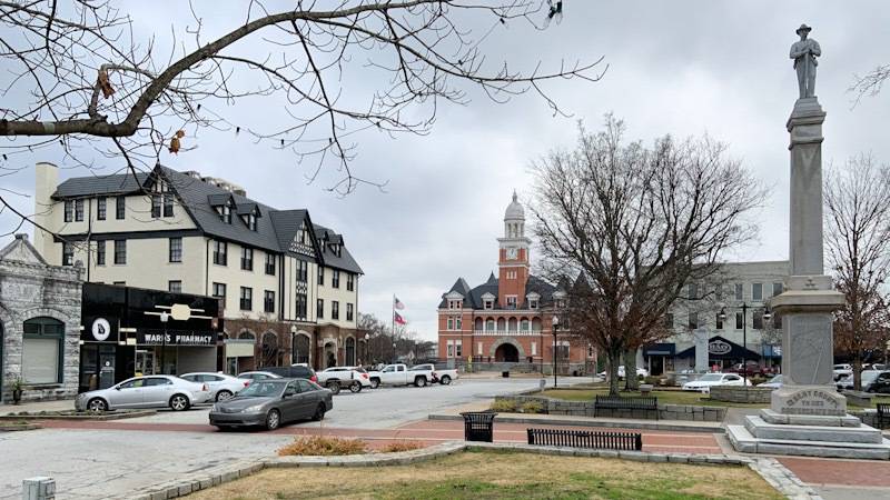
I’m spending a few nights in Atlanta for a stamp show and some sightseeing. On my way there today (er, yesterday now), I passed through Elberton, Georgia.

CE695D55-D09A-4A06-BEAA-09CBB649CAFD.jpeg


F464BFA4-858B-4BC3-B047-9F8166FD92D8.jpeg


Let’s see how these turn out... I’m using a different photo-editing app from my previous trips. The old one apparently didn’t get updated for iOS 13.
 
  • Like
Likes Klystron and PeroK
Physics news on Phys.org
Aberdeen, Scotland, is known as the "Granite City" because most of its buildings were built out of the grey granite that was quarried locally. This was Scottish fact of the week, I see, in Aug 2014:

https://www.scotsman.com/lifestyle-2-15039/scottish-fact-of-the-week-the-granite-city-1-3510261
 
Today I learned (oops, wrong thread :wink:) that Peachtree Corners isn’t just a name for a crossroads with a shopping center in the suburban sprawl outside Atlanta. It’s an official city, incorporated in 2012, with a lot of office parks and technology companies. Just last fall it opened a test track for autonomous vehicles along the street in front of my hotel.

6A622A5A-1068-4FA2-AF43-420922F4A83A.jpeg


At the stamp show, one exhibit covered an early example of technology for high-speed communication: pneumatic tubes that carried mail across Paris:

C2061D7A-593C-4DB3-8565-0DB7D2218F8A.jpeg


During last summer’s road trip, I showed a letter that traveled from San Francisco to New York to Paris, shortly after the transcontinental railroad opened. Now let’s go the other way, sort of, Helsinki to New York to San Francisco.

FB667A0A-2EF3-4F99-A78B-C77CDE8ECEEF.jpeg
 
  • Love
  • Like
Likes dlgoff and davenn
jtbell said:
test track for autonomous vehicles
That seems odd, what is it? In Palo Alto they just drive on the streets with everyone else (not on freeways though).
 
Apparently it’s for AVs that aren’t quite ready for fully mixed operation with ordinary traffic. I’ll look tomorrow and see if there are warning signs for crossing traffic at intersections.
 
I drove along the entire 1.5 mile road that has the AV lane. The only signs for normal traffic that I noticed, were for vehicles turning right, across the AV lane. Something like “Yield to shuttles.” I guess traffic on cross streets and driveways has to stop anyway, so they need no special warning.
 
Atlanta began when the Western & Atlantic Railroad built a line from Chattanooga TN to a spot in the middle of nowhere in Georgia. A town named Terminus sprang up at the end of the line. It was eventually renamed Atlanta. Around 1850 the W&A installed a marble milepost with 00 on one side and 138 (the distance from Chattanooga) on the other. The “Atlanta Zero Milepost” is now in the Atlanta History Center, which I visited today.

4E206B78-182C-44BA-B864-262C91489C64.jpeg


Until recently, it was still in its original location in downtown Atlanta, underneath a street which had been elevated above it, inside a small building which was closed to the public when I tried to visit it two or three years ago. That building had to be demolished because of impending work on the elevated viaduct, so the milepost was relocated to the museum, and a replica of the milepost was placed nearby. Some controversy surrounded this, as a Google search for “Atlanta Zero Milepost“ will reveal. I also revisited that location today:

366BB3FA-786D-4C7A-BD21-B170462845D1.jpeg


IIRC the building that housed the original milepost was in the area on the left, immediately in front of the fence. (I took some pictures of it, but they’re at home so I can’t access them now.) Behind the fence is a railroad line, and behind that is one of Atlanta’s subway (metro) lines which runs alongside. If you look carefully, you can see the yellow and orange stripe on a passing subway train. A rather surreal location.

Compare the picture at the right side of the interpretative marker with my first picture.:smile:

And I didn’t see any sign of work on the viaduct.
 
  • Like
Likes davenn
What did Saturation ever do to you as a child that you despise it so! :-p

1580785653034.png


1580785824203.png
 
Wow, your copies look a lot more saturated than mine. When I post my pics unaltered, they always look undersaturated in my browser, both Firefox on my desktop Mac, and Safari on my iPad right now. So I’ve taken to boosting the saturation before posting, so they look better to me. They don’t look to me like what you posted. Scrolling between the two posts, the difference is obvious to me.

Maybe I should leave them alone after all.
 
  • #10
jtbell said:
So I’ve taken to boosting the saturation before posting, so they look better to me.
Agree. My rationale, as a photographer, is that cameras lie. They must, as, just like our eyes, they too are a subjective interpretation.

I adjust my photos so that look to me like I remember the scene from memory.
 
  • #11
I’ve usually boosted the saturation a bit on all my pictures in Photoshop. Afterwards, they looked the same in PS and on my web site, and for a long time, here on PF. I think it might have been when PF changed the forum software, all of a sudden my pics started to look undersaturated after posting. So I started making them look oversaturated in Photoshop to compensate. Now they look OK to me after posting, but apparently not to you. Is anyone else seeing this, too? Compare the two versions of the pics that Dave reposted.
 
  • #12
jtbell said:
I drove along the entire 1.5 mile road that has the AV lane. The only signs for normal traffic that I noticed, were for vehicles turning right, across the AV lane. Something like “Yield to shuttles.” I guess traffic on cross streets and driveways has to stop anyway, so they need no special warning.
So maybe it's just a transit lane so "shuttles" don't get stuck in traffic?
 
  • #13
jtbell said:
Now let’s go the other way, sort of, Helsinki to New York to San Francisco.
FB667A0A-2EF3-4F99-A78B-C77CDE8ECEEF.jpeg

The words at the top of the postcard are Swedish(?), Finnish, and Russian for "postcard," or "open letter" as the translation of the Russian phrase. It's interesting to me that there are cancellations from all three countries, with the one on the right appearing to be from Saint Petersburg.
 
  • #14
jtbell said:
I think it might have been when PF changed the forum software, all of a sudden my pics started to look undersaturated after posting.
That would be quite surprising. I've never heard of images being photo-manipulated by a site's image processor by default (and why didn't they do it to mine?). Scaling and compression, sure, but saturation??

jtbell said:
So I started making them look oversaturated in Photoshop to compensate. Now they look OK to me after posting, but apparently not to you. Is anyone else seeing this, too? Compare the two versions of the pics that Dave reposted.
I'm not sure what we're comparing. I took your pics and saturated them before reposting. They're certainly going to look more saturated.

The question of adequate saturation is a subjective one. Do your posted images look right to you? How do I know what you consider good?
 
  • #15
Now that I'm at home again, and have caught up on some other errands, I brought up this thread on my desktop Mac, and found something interesting.

I took my photos in this thread using my iPhone XR. Thanks to the magic of iCloud, I edited and posted them on my newish iPad which I took along on this trip for the first time. (Much nicer for reading, etc. in my hotel room.).

Looking at those pics now, in Firefox on my desktop Mac, they do indeed look a bit oversaturated. They look about the same on the iPhone and the iPad, with more or less normal saturation to my eye, except that the former's screen has a slight yellowish cast compared to the latter's. Or conversely, the latter's screen has a slight bluish cast. But the saturation level is about the same on both.

For the next post, I'll switch over to the iPad, and create another copy of one of the pictures, cropped about the same, but without increasing the saturation. Then we can compare it to the copy I posted earlier.
 
  • #16
Original saturation:

E2133D34-3731-486D-A1EF-CAB44DA48345.jpeg


Increased saturation, as posted previously (the same file, which is still in my photo library):

4E84BA6F-0B3B-4D4C-930D-CD6B5F95202C.jpeg
 
  • #17
On my desktop Mac, the first one looks a bit better, with the second one being somewhat oversaturated. On my iPad and iPhone, the second one looks a bit better, with the first one slightly undersaturated, but not a huge difference.

Earlier, when I was having problems with pics being undersaturated after posting, I was editing them on my desktop Mac, using Photoshop CS6. On this trip, I used Photoshop Express in the iPad. Maybe it's an issue with the color space setting in Photoshop CS6, or the calibration of my desktop Mac's monitor.

In the future, when posting from the iPad or iPhone, I'll leave the saturation alone. This has been an educational experience. Thanks to @DaveC426913 for bringing this up! (I now see that he was exaggerating the saturation in his posted copies, to make his point...)
 
  • #18
Mark44 said:
It's interesting to me that there are cancellations from all three countries, with the one on the right appearing to be from Saint Petersburg.
The one at the upper left (in Swedish) is from the post office at the Helsinki station. As the caption notes, the date is 7 March 1876, although it’s hard to read. The other two are from two different post offices in St. Petersburg. Note the date on them. :smile:
 
  • #19
The Atlanta History Center now also houses the Cyclorama, a huge 360° cylindrical painting plus diorama of the Civil War battle of Atlanta in 1864, which you view from inside. It re-opened here almost exactly one year ago after being in its own building in an Atlanta park for many decades, and undergoing considerable restoration work.

D8D6517A-F6ED-483B-8F0B-12157E9F057A.jpeg


5763C345-4F42-495B-8CEA-2615279A507F.jpeg


2AF7AEC4-4FE3-421C-AFEF-DC938316617A.jpeg


In its old location, it was something of a shrine of Confederate heritage, which is a bit ironic, considering that (a) the battle ended in a Union victory, contributing to President Lincoln's re-election a few months later, and (b) it was originally created (in 1886) for Northern audiences as a celebration of the victory, by a company in Milwaukee that employed a group of German artists.

C21A7CB2-FE5A-47F3-8292-B0D9A9D5A479.jpeg


It was originally displayed in Minneapolis and Indianapolis, before a promoter from Georgia bought it in 1892.

Even though I'm not a Civil War buff myself, I found the Cyclorama interesting because it's accompanied by exhibits about its history and how it was produced. It's also impressive technically, a rather realistic depiction of the landscape in the area of the battlefield. Some of the artists traveled to Atlanta and built a temporary observation tower at a suitable elevation so they could make careful sketches as a basis for their work in Milwaukee. Back in the day it was a rural area, but now it's a built-up part of the city.
 
Back
Top