Need some help reading this graph and getting data from it (wind turbine simulation)

  • #1
LT72884
323
48
hello all. Most the time im pretty good at analyizing data, but today i am struggling. So i need some extra help.

I used a open source program called openFAST to generate this data. openFAST is a wind turbine simulation software.

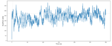
The graph below is of the a time series calculation from a turbulant wind with an average of 12.9mps. This is of the RootFxb1 loading on the blade which is: Blade 1 flapwise shear force at the blade root. The test was ran for 300 seconds. The graph seems to be cyclic in nature, and what im trying to do is calculate cycles to failure from this data.

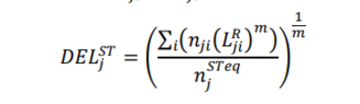
now, i do have a python script that takes this RootFxb1 data and calculates the Damage Equivalent Load. The only issue is that it uses a default value of 1 Hrz for the feq (equivalent frequency of damage equivalent load). I am trying to find the actual frequency from this graph or at least an average to use so i can get a better number. Listed below is the graph and the equations used.

nji = load rangers for a time series cycle
Lri = damage count in a time series
nj^steq = equivalant counts
feq = default 1 Hrz

thanks
 

Attachments

  • rootfxb1.PNG
    rootfxb1.PNG
    17.2 KB · Views: 46
  • del.PNG
    del.PNG
    2.9 KB · Views: 42
  • teq.PNG
    teq.PNG
    2.9 KB · Views: 45
Physics news on Phys.org
  • #2
You need the time series data that was used to plot as rootfxb1.png
Then compute the FFT of that data to get the frequency spectrum. Plot the spectrum, then look for the fundamental or peak response.
 
  • Like
Likes LT72884
  • #3
Baluncore said:
You need the time series data that was used to plot as rootfxb1.png
Then compute the FFT of that data to get the frequency spectrum. Plot the spectrum, then look for the fundamental or peak response.
oki, i can open the time series data in matlab. How do i do a fft in matlab? sorry, i should say, is it possible to do fft in matlab?

second, in pydatview, a python viewer that can open the openfast timeseries data, there is an option called fft that produces this but i do not know how to read it. the units are strange to me.
 

Attachments

  • fft.PNG
    fft.PNG
    5.1 KB · Views: 40
  • fft2.PNG
    fft2.PNG
    6.7 KB · Views: 45
  • #4
fft.png appears to be a power spectrum of the original data set.

The peak on the left is the DC offset of your data set, so freq = 0.

The next peak, partway down the slope, is the fundamental, near freq = 2.0 Hz. That is the frequency value you want.

The next peak is near 6.0 Hz, which I guess is probably the third harmonic of the fundamental.
 
  • Like
Likes LT72884
  • #5
Baluncore said:
fft.png appears to be a power spectrum of the original data set.

The peak on the left is the DC offset of your data set, so freq = 0.

The next peak, partway down the slope, is the fundamental, near freq = 2.0 Hz. That is the frequency value you want.

The next peak is near 6.0 Hz, which I guess is probably the third harmonic of the fundamental.
ok, so 2Hrz is the one i want then. So now in the python script i can use 2 instead of 1, and get DEL back. from there, how do is it possible to get cycles to failure? this concept of cycles to failure is new to me. Im still an engineering student so im not used to it yet haha.

thank you very much for all this help
 
  • #6
I do not know your software tools so you must read the instructions.

If you eliminate the DC offset of your data, the vertical scale will change, and you may better see the fundamental, (subtract the average of the input data from every element before doing the transform). Zoom in on the fundamental to read the frequency more accurately.

If the flexing happens at 2 Hz, the damage will accumulate at twice the rate it would with flexing at 1 Hz. The fatigue life will therefore be halved for the same amplitude.
https://en.wikipedia.org/wiki/Fatigue_limit
 
  • Like
Likes LT72884
  • #7
Baluncore said:
I do not know your software tools so you must read the instructions.

If you eliminate the DC offset of your data, the vertical scale will change, and you may better see the fundamental, (subtract the average of the input data from every element before doing the transform). Zoom in on the fundamental to read the frequency more accurately.

If the flexing happens at 2 Hz, the damage will accumulate at twice the rate it would with flexing at 1 Hz. The fatigue life will therefore be halved for the same amplitude.
https://en.wikipedia.org/wiki/Fatigue_limit
i can get a DEL number back with 2 hrz and its 93.54Kn but i do not know exactly what that means. DEL is damage equivalent load but for a wind turbine blade. so im not sure what damage equivalent load means at 2hrz. I have equations for cycles to fialure and ill see if i can calculate it. thanks
 
Last edited:
  • #8
ok, so i found out something. I think the way the fft graph was produced by the software is incorrect?

reasoning:

1/dt is frequency and my time series data is in steps of 0.0063 per cycle. So it should be 158.77 hrz. but that seems really really high because then the total damage is 10,000KN which is impossible. im guessing the 160hrz is how many data points are produced each second to create the original graph.
 
Last edited:
  • #9
One reason you have trouble with units is a lack of discipline. Take the time to get it right.
The unit name is lower case for units named after people, but the first letter of the symbol is then upper case. 1 volt = 1 V; 1 newton = 1 N.
All other units have a lower case symbol, second = s; metre = m.

The SI multiplier or metric prefix is capitalised if it is above 1000.
https://en.wikipedia.org/wiki/Metric_prefix#List_of_SI_prefixes
There is a space between the number and the unit name or symbol.
A frequency of one hertz, is 1 Hz.
One kilonewton is 1 kN.

LT72884 said:
I think the way the fft graph was produced by the software is incorrect?

After the FFT, the frequency spectrum will have half as many elements as the time record analysed. The real input is analysed to become complex data, a cosine and a sine amplitude coefficient for each frequency phasor. Power is the sum of the square of those amplitude coefficients. But the graph may be plotted as amplitude, so it is the root of the mean square = RMS.

t = 0.0063 s/sample
1/t = 158.73 samples/s.

A 300 second recording, at t = 158.73 will have 47,619 samples.

A time record of T=300 seconds duration will result in a frequency resolution of; 1/T = 3.333 mHz per element.

47619 samples / 2 = 23809.5 frequency elements.
23809.5 * 3.333 mHz = 79.357 Hz maximum.
Fmax = 80 Hz is what the FFT gave you.

Now go back through the numbers and do the exact computations to verify the frequency of the fundamental peak.

The vertical axis is not scaled by frequency, but in this case, is corrected for the number of samples analysed by the FFT.
 
  • Like
Likes LT72884
  • #10
When I said "I didn't understand the units" I meant the units of kn^2\s. I have never seen that kind of unit used with frequency before. I know how units work and the names just fine, but I have never seen kN^2\s before.. force squared over time... It's an interesting unit.
 
  • #11
LT72884 said:
I know how units work and the names just fine, but I have never seen kN^2\s before.. force squared over time... It's an interesting unit.
That vertical axis is "PSD(RootFxb1)[(kN)^2/s]"
The real Cos, and imaginary Sin, coefficients from the FFT are amplitude coefficients of force, with units of kN.
They were squared to give (kN)^2, then accumulated, to give the power spectrum of the force, the same units (kN)^2.
Power is proportional to the square of the amplitude.

The "/s" part of the vertical axis units, is the unit of power spectral density; 1/second = 1 Hz; Which shows that power is proportional to the bandwidth in Hz. The area under a PSD graph is the total power, (but plotted here with a log scale).
 
  • Like
Likes LT72884
  • #12
thank you so very much for taking the time to explain that. Im getting there haha. Im used to laplace stuff with linear systems, but we never got into FFT.
 

1. What does the graph represent?

The graph represents the simulation data of a wind turbine, showing the relationship between wind speed and power output.

2. How do I read the graph?

The x-axis represents wind speed in meters per second, while the y-axis represents power output in kilowatts. The line on the graph shows the trend of increasing power output as wind speed increases.

3. What is the significance of the data from the wind turbine simulation?

The data from the wind turbine simulation can be used to understand the relationship between wind speed and power output, which is important in determining the efficiency and effectiveness of a wind turbine.

4. How can I use the data from the graph for my research or project?

The data from the graph can be used to analyze the performance of a wind turbine and make informed decisions about its implementation in a specific location. It can also be used to compare different wind turbine designs and optimize their efficiency.

5. Are there any limitations to the data from the wind turbine simulation?

Yes, the data from the simulation may not accurately represent real-world conditions and may vary depending on the specific wind turbine design and location. It is important to consider these limitations when interpreting the data.

Similar threads

  • Engineering and Comp Sci Homework Help
Replies
16
Views
1K
  • Mechanical Engineering
Replies
1
Views
2K
Replies
4
Views
2K
Back
Top