Does this dynamic model complement the Balloon Analogy?

In summary, the conversation discusses a dynamic illustration on Wikipedia that shows cosmological limits, including the event horizon and particle horizon. The conversation also mentions the balloon analogy and whether the illustration complements it enough to warrant attention. The conversation also suggests labeling events and providing translations for animations. The purpose of the conversation is to discuss the usefulness of the illustration and its potential for further exploration.
  • #1
alw34
220
55
This is a kind of cooperative problem solving post. But don't be too terribly 'focused' because likely I have missed important issues. I had not seen a dynamic illustration like this before: maybe I am over impressed, weak-kneed, like seeing Kate Hudson the first time??

In Wikipedia at

https://en.wikipedia.org/wiki/Comoving_distance#Uses_of_the_proper_distance
220px-Expansion_of_the_universe%2C_proper_distances_%28Animation%29.gif


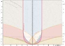
is a dynamic illustration of some cosmological limits. Clicking on the Wikipedia illustration activates the dynamic rendering, and an observer ascends vertically along the black line in time as the yellow light cone for the observer does also and approaches the dark red event horizon. No explanation of what's happening given in Wikipedia. So sad.

Given all the attention that has been justly paid to the balloon analogy [say by phinds and in Brian Powell's new "Inflationary Misconceptions and the Basics of Cosmological Horizons"
Reference https://www.physicsforums.com/insights/inflationary-misconceptions-basics-cosmological-horizons/]
is it worthwhile to focus attention on the attributes and weakness of this illustration?
Does it complement the balloon analogy in enough worthwhile respects to warrant attention? Interesting/Insightful enough for a FAQ?

Some thoughts:
I like how the particle horizon is inside the event horizon early in the universe, and then passes outside as expansion slows. Doesn't that illustrate "faster than light" expansion? When did that end? Maybe be nice to label that event with values using the Jorrie Calculator.

Maybe label a few other events? Which ones? Like the Hubble radius value today. Maybe when the Hubble radius hits 99% of the event horizon?? [light blue Hubble curve gets lost in the vertical red even horizon]
Also, obvious that the thin black horizontal line is today at about 13.8B yrs of age, and the vertically ascending event horizon is approaching the 17.3B LY that Powell mentions. How to best take advantage of the time dimension in the illustration despite being limited to only one space dimension in explanations? Can we pick out anything valuable about a[t] and H[t]?? I can't. Lastly, how does the comoving dynamic view complement this one?
 
Last edited by a moderator:
  • Like
Likes marcus and Bandersnatch
Space news on Phys.org
  • #2
I forgot to ask: If the left hand vertical units are billions of years, what are the right hand vertical units...why bother with them??
 
  • #3
I was just thinking how nice it would be to have an animated lightcone graph(s) when you posted it. In fact, for a while there I used to daydream about finally mustering enough resolve to pick up some javascript and concoct one myself - luckily, somebody else has done it already (not that I believed I'd ever get around to it).

Following the name on the graph, you can find other animations and graphs by the same author:
http://yukterez.net/
The graphs featured in the wiki article are (obviously) in the cosmology section. The 'early universe' animation is likewise highly recommended, as it shows the various distances and horizons evolve in two spatial dimensions - the description in in German, but labels on the graph are in English.

Putting together a tutorial on reading cosmological lightcone graphs could be worthwile, maybe as an insight article with some intro on what a lightcone actually is. I'm not sure I'd be up for it myself - I'm really only good at mansplaining the basics.

There's always the Davis & Lineweaver paper on misconceptions regarding cosmological horizons, which features three lightcone graphs with ample discussion:
http://arxiv.org/abs/astro-ph/0310808
(fig.1)

alw34 said:
what are the right hand vertical units...why bother with them??
That's the scale factor. Shows how big the universe was at a given time, as a fraction of its current size. A rather useful measure, and widely employed in cosmology. It's especially useful to have when looking at graphs with comoving distance units, as it allows for relatively easy transformation into proper distance.

alw34 said:
I like how the particle horizon is inside the event horizon early in the universe, and then passes outside as expansion slows. Doesn't that illustrate "faster than light" expansion?
That's certainly not the 'faster than light' expansion - that's what the Hubble radius tracks. Everything beyond ##H_R## recedes at ##V_R>c##
The particle horizon shows how far, in terms of proper distance, the farthest objects whose light is observed have managed to recede since emission.
I actually need to think some more about what the intersection means, as I don't want to say something silly here.

@marcus @Jorrie - you may want to have a look at those animations.
 
  • Like
Likes marcus
  • #4
Bandersnatch said:
@marcus @Jorrie - you may want to have a look at those animations.
Yes, this is a cool animation and does compliment the balloon analogy rather nicely, although the values depicted are for a more advanced readership than the target audience of the balloon analogy. It is essentially the top panel of the "Davis Three-panel graphs" linked to in my sig below, just with Time_now being animated from the distant past to the far future.

LightCone7's charts depict more or less the same values statically, just rotated by 90 degrees.

Some of the questions that alw34 has asked are answered in the latest tutorial on LightCone7.
 
  • #5
Bandersnatch said:
I was just thinking how nice it would be to have an animated lightcone graph(s) when you posted it.

You reminded me:
If anyone does decide to post, copy or create any animations, another thought would be to provide perhaps two or even three levels of descriptive detail. Like a beginner, intermediate and advanced level. Examples would be the Scientific American article from Lineweaver and Davis being an accessible intermediate [?] read, while their ARXIV paper was too detailed for most beginners. I don't think I ever got through all that one.

I am checking http://yukterez.net/ as suggested but I am too dumb to know what some of the static plots represent without a line or two of explanation. Graphs need to be labelled.

This one is nice, http://yukterez.net/forum/viewtopic.php?f=3&t=61/, but how does one get the translation to again appear...mine Deutch iss not so goot! Oh, if you refresh the link, the translation offer reappears.

It would be nice to be able to halt the animation at points of interest. This plot does not show the lightcone reaching the event horizon, a nice feature of his plot in Wikipedia.

Also, I forgot to ask in my initial post: For consideration, for what purposes would you experts recommend using the proper distance plot animation I posted here versus the 'coordinate distance' plot which also appears in Wikipedia? Are there some worthwhile contrasts/comparisons to be made??

As a reminder, because I always forget to look myself, for newcomers,
check out 'SIMILAR DISCUSSIONS' which appears automatically with your posts, below.
 

1. What is a dynamic model?

A dynamic model is a representation of a system or process that takes into account how it changes and evolves over time. It can be used to predict future behavior and outcomes of the system.

2. How does a dynamic model differ from a static model?

A static model only represents a system at one point in time, while a dynamic model takes into account the changes and interactions within the system over time.

3. What is the Balloon Analogy?

The Balloon Analogy is a simple way to understand the concept of dynamic modeling. It compares the behavior of a balloon as it is filled with air to the behavior of a system as it changes over time.

4. How does a dynamic model complement the Balloon Analogy?

A dynamic model uses the same principles as the Balloon Analogy to represent the changes and interactions within a system over time. It helps to visualize and understand the behavior of a system in a more comprehensive way.

5. What are some common applications of dynamic modeling?

Dynamic modeling is commonly used in fields such as economics, engineering, and environmental science to predict and analyze the behavior of complex systems over time. It can also be applied to social systems, such as population dynamics and disease spread.

Similar threads

Replies
1
Views
1K
Replies
7
Views
2K
Replies
548
Views
210K
Replies
4
Views
6K
  • Special and General Relativity
Replies
5
Views
3K
Replies
2
Views
2K
  • Cosmology
Replies
24
Views
5K
Replies
7
Views
9K
  • Special and General Relativity
3
Replies
94
Views
8K
  • MATLAB, Maple, Mathematica, LaTeX
Replies
5
Views
2K
Back
Top