What is the Software that has this Plotting Style?

In summary, the conversation discusses the search for software that has a specific plot style for graphing, with a particular focus on the semi-log plot. Various suggestions and options are mentioned, including using powerful plotting software that allows for customization, investigating specific software packages such as Matlab or Mathematica, and using LaTeX packages like PGF/TikZ and PGFPlots. It is also mentioned that the desired plot style may be similar to that of old line-plotter output. Ultimately, it is suggested to try D3 for creating charts and to use tabulated data to generate a graph.
  • #1
ecastro
254
8
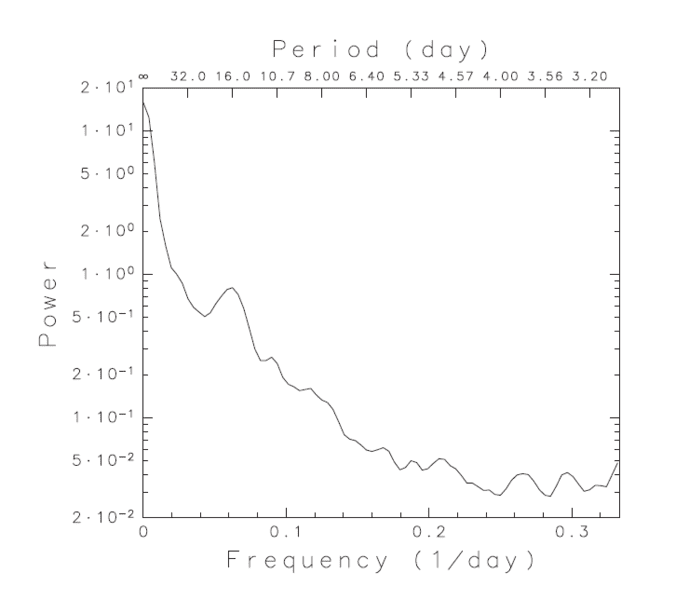
What is the software that has this kind of plot:
upload_2017-6-19_17-35-40.png


I want to use it for plotting graphs because it looks clean. Thank you in advance.

Edit: To avoid confusion, I want to know what software produces this graphing style, not the kind of plot.
 
Last edited:
Computer science news on Phys.org
  • #3
jedishrfu said:

Well, I know that it is a semi-log plot. What I meant is what kind of software creates a graph in this style. For example, when Python plots points, a graph may look like this:

aXFQh.png


The line width, sizes, and fonts used in the graph are different from the graph that I presented. I wanted to know which software when it plots points, creates the graph that I presented.
 
  • #4
Any powerful plotting software allows the user to specify color, line size, line style, data point symbol, etc., etc., etc. of the lines and axis. They usually change the color automatically when several lines of data are over-plotted on the same graph. As the user, you would need to specify any specific characteristic that you want to change.
 
  • #5
Perhaps you could do an image search on google with your image to find a web apge describing the software used.

I gave you the name of the plot to further refine your search.

As @FactChecker has said so succinctly, there are many many software plotting packages for a variety of languages that can do these kinds of plots and just seeing one plot would make it hard to identify which one. It could very well be a custom package too. Based on the typography it looks like a line plotter created it.

One could check into Matlab, Mathematica or Origin software to see what scientific plots they support.
 
  • #7
Don't know about the software used to create the graph in the OP, but if you're preparing a diagram or graph to include in a LaTeX document then consider using PGF/TikZ and/or PGFPlots. These are LaTeX packages that let you create diagrams and plots that are well-integrated with the document (e.g., axis or graph labels will by default appear in the same font and size as the rest of the document and can include LaTeX-formatted math).

Personally I just use whatever is handy (e.g., the 'plot' function if I happen to be working in Matlab or Octave) for creating quick plots in the course of investigating something and I use PGF/TikZ or PGFPlots when it's time to prepare a diagram or graph to present as part of a document.
 
  • Like
Likes fluidistic
  • #8
FactChecker said:
Any powerful plotting software allows the user to specify color, line size, line style, data point symbol, etc., etc., etc. of the lines and axis.

Yes, this is true, but I want to know the software, if any, which has this plot style as its default.

256bits said:
Investigate
http://www.astro.caltech.edu/~tjp/pgplot/ ( a little old maybe - 8 bit )
http://www.astro.caltech.edu/~tjp/pgplot/example.html
View attachment 205761

an upgrade,
http://plplot.sourceforge.net/
http://plplot.sourceforge.net/examples.php?demo=29

So there you go.
Check which plotting package your Python uses = is it plplot

All of them seems different... :frown:

wle said:
Don't know about the software used to create the graph in the OP, but if you're preparing a diagram or graph to include in a LaTeX document then consider using PGF/TikZ and/or PGFPlots. These are LaTeX packages that let you create diagrams and plots that are well-integrated with the document (e.g., axis or graph labels will by default appear in the same font and size as the rest of the document and can include LaTeX-formatted math).

I think it would be difficult to create a plot from actual data using PGF/Tikz and/or PGFPlots. But yes, I want to prepare a graph that fits well with LaTeX.
 
  • #9
Getting back to your original post. I think the software that created this was used to create reports for line plotters like the calcomp based on the typography of the labels.

Since plotters are no longer in vogue, you probably won't find software that will create charts in this exact style.

https://en.wikipedia.org/wiki/Calcomp

the 1976 manual has several charts that look similar in style to your chart (no loglog or double axes though) Page 5.76 shows their supported characters chart.

http://bitsavers.informatik.uni-stuttgart.de/pdf/calcomp/CalComp_Software_Reference_Manual_Oct76.pdf
 
  • Like
Likes FactChecker
  • #10
ecastro said:
Yes, this is true, but I want to know the software, if any, which has this plot style as its default.
As @jedishrfu said, it looks very much like the old line-plotter output. Do you know that the defaults would look like this on a modern system? I would be surprised if a current, supported, software package still had those defaults. But it is not difficult to specify plain graphs like that (although the font may be hard to match).
 
  • Like
Likes jedishrfu
  • #12
ecastro said:
I think it would be difficult to create a plot from actual data using PGF/Tikz and/or PGFPlots.

Not sure what you mean. There are commands for plotting tabulated data read from a text file. For example, I just generated this graph based on 316 plot points randomly generated in GNU Octave and printed to a text file:

randdata.png

Here's the full LaTeX source I used to create a document containing only this graph as a figure, assuming the plot points are in a separate file "mydata.table" (this is attached as "mydata.table.txt" because this forum is picky about file name extensions):
Code:
\documentclass[11pt,a4paper]{article}

\usepackage{amsmath}
\usepackage{amssymb}
\usepackage{pgfplots}

\pgfplotsset{compat=1.9}
 
\begin{document}

\begin{figure}[htbp]
  \centering
  \begin{tikzpicture}
    \begin{axis}[
        width = 12cm,
        height = 9cm,
        x tick label style = {/pgf/number format/fixed},
        xlabel = {$x$},
        ylabel = {$1 - \sqrt{x} + \Delta_{\text{random}}$},
      ]
      \addplot[black,smooth] plotfile {mydata.table};
    \end{axis}
  \end{tikzpicture}
\end{figure}

\end{document}

"mydata.table" is a 316-line-long text file; its first five lines are
Code:
0.000   1.00000000000000
0.001   0.97344731762258
0.002   0.96273942445509
0.003   0.95624010386719
0.004   0.95254957672268
This is just a simple example. There's also the usual options for controlling the type of graph, placement of things, colours, line thickness and style, plot points, the legend, etc. Since this is LaTeX you also have all the standard LaTeX commands for controlling text font, style, and size wherever you can put text.
 

Attachments

  • mydata.table.txt
    7.7 KB · Views: 443
Last edited:
  • Like
Likes FactChecker, ecastro, fluidistic and 2 others
  • #13
Oh, I never thought LaTeX is capable of plotting points from a data set. I think I will try this one, though. Thank you!
 
  • #14
The plot reminds me of a gnuplot plot from around 1990, mostly due to the simply layout and the "plotter style" text font (I am not familiar with the actual name of that font).
 
  • #15
  • Like
Likes jedishrfu
  • #16
ecastro said:
What is the software that has this kind of plot:
Where did you get that example?
If I knew where it was from I could look at the metadata to see which package produced the file and/or that graph.
 

1. What is the purpose of a plotting style in software?

The purpose of a plotting style in software is to visually represent data in a clear and organized manner. This allows for easier interpretation and analysis of the data.

2. How do I change the plotting style in software?

The process for changing the plotting style in software will vary depending on the specific program being used. However, most software will have a designated setting or option for changing the plotting style, often found in the "format" or "style" menu.

3. What are some common types of plotting styles used in software?

Some common types of plotting styles used in software include line graphs, bar graphs, scatter plots, and pie charts. These styles can be customized with different color schemes, symbols, and layouts.

4. Can I create my own custom plotting style in software?

Many software programs offer the ability to create custom plotting styles by allowing users to adjust various elements such as font, colors, and data labels. Some programs may also allow for importing external design elements or templates.

5. Why is it important to choose the right plotting style in software?

Choosing the right plotting style in software is important because it can greatly impact the clarity and effectiveness of communicating data. Different styles may be more suitable for different types of data or purposes, so it is important to consider the audience and purpose when selecting a plotting style.

Similar threads

  • Computing and Technology
Replies
14
Views
3K
Replies
10
Views
3K
Replies
8
Views
874
  • Computing and Technology
Replies
1
Views
1K
  • High Energy, Nuclear, Particle Physics
Replies
2
Views
1K
  • Computing and Technology
Replies
7
Views
4K
Replies
2
Views
1K
  • Precalculus Mathematics Homework Help
Replies
10
Views
615
  • Other Physics Topics
Replies
2
Views
2K
  • Calculus and Beyond Homework Help
Replies
10
Views
988
Back
Top