The Physics of Color Perception

In summary: The image you posted has been compressed, so the edges of the pattern are not as sharp. The second picture is a photo of a monitor through the prism.
  • #1
SecularSanity
41
1
TL;DR Summary
Question about color perception?
When you look at the following image through a prism with the apex (thinner portion) pointed towards the left or the right, why do you see magenta on one side and green and black on the other?

50050593571_c7037b7b35_c.jpg

Keep in mind that the spectrum is reversed.

49304346661_1537571513.jpg
 
  • Like
Likes Orthoceras
Physics news on Phys.org
  • #2
Lights reflect with angles depending on its frequency. Human eye identify colors with observation three ( I think but not sure ) fixed frequency. Though I am sure of the experiment configuration you show, these two would explain your question.
 
  • #3
How did you come to that conclusion? Oh, I see. You're just explaining refraction, is that it?

Weird.
 
  • #4
It's Just all that comes to my mind relating to the topics. Maybe I am wrong.
 
  • #5
Well, refraction will cause the red and blue parts of the image to overlap in places. The spectrum of light your eye receives from the overlap region is the same in the two cases, so there's no physical reason why you'd see different colours.

If there's a difference in what you would perceive then it's to do with your eye/brain, not physics. I'm reminded of The Dress that did the rounds on the internet a few years ago. Here's xkcd's version. It's easy to check in an image editor that the woman's dress is the same colour in both images, but the brownish panels look lighter than the blue in one and darker in the other - an effect of the background colour. I guess something of the sort happens with red+blue on a red background versus a blue background.
 
  • Like
Likes sophiecentaur
  • #6
Ibix said:
so there's no physical reason why you'd see different colours.
I can't think of one either; the mixing of the light is additive in this case so no problems with dodgy pigments. Our colour vision is very quirky and it's really surprising that colour TV systems are so good, these days. They work on the very 'simple' tristimulus system which is good enough that most people 'see' the same colours in near enough the same way. Do you remember just how BAD colour TV used to be? Old colour films on TV are chronic - even when the technicians have worked hard at colour correction for TV.

Edwin Land did a huge number of experiments on colour vision and came up with the Retinex Theory. The Retina and the Cortex work together. He showed that the brain doesn't just use the outputs from individual colour sensors on the retina to assess colour but uses the context of colours of the whole scene. In the simplest analysis, our eyes 'integrate to grey' which is what your camera does with the Auto setting.

I worked for some while on Colour TV analysis and was pretty much sold on the tristimulus idea (basic RGB signals) but that doesn't explain the many paradoxical colour illusions we see. Apparently, women tend 'better' at judging colours than men - hence their greater concerns about the colours of clothes and interior decorations. Nowadays there is a massive amount of effort spent on getting convincing colour matches between different materials. So a plastic belt will match a coloured shirt and, more importantly, the colours of advertising logos will agree when presented on posters, TV and T shirts.
 
  • Like
Likes Ibix
  • #7
Ibix said:
Well, refraction will cause the red and blue parts of the image to overlap in places. The spectrum of light your eye receives from the overlap region is the same in the two cases, so there's no physical reason why you'd see different colours.

If there's a difference in what you would perceive then it's to do with your eye/brain, not physics. I'm reminded of The Dress that did the rounds on the internet a few years ago. Here's xkcd's version. It's easy to check in an image editor that the woman's dress is the same colour in both images, but the brownish panels look lighter than the blue in one and darker in the other - an effect of the background colour. I guess something of the sort happens with red+blue on a red background versus a blue background.
Yeah, I thought about the blue dress but that revealed differences in human color perception. The camera picks up the magenta, the green and the black, as well. Blue and red create magenta but why are we seeing green on the opposite side when I have the green set at zero, and, in particular, why are we seeing the black line?

This is what it looks like on your computer monitor.

50065359927_a14d936d95_n.jpg

And here’s a photo taken through a prism.

50064561613_2d1abba547_w.jpg
 
  • #8
I have a lot of questions.

Are the edges of the original pattern sharp transitions? They aren't in the version you've posted, but I know that the forum software compresses images.

What's that second picture a photo of? A monitor through the prism?

Why is the red block orange in the photo?

Why are there so few straight lines?

What do you see with the same picture on the same monitor (or whatever) with the same camera and no prism?

What does a photo with the pattern rotated ninety degrees look like (with and without prism)?
 
  • #9
sophiecentaur said:
Apparently, women tend 'better' at judging colours than men - hence their greater concerns about the colours of clothes and interior decorations.
I wonder if that is an evolutionary effect. If we follow the stereotype of the man hunting then when he is tracking an animal as it travels through different lightings (eg from light to shade in a forest) needs to be able to see the same "effective" colour even though the "actual" colour changes - that is he ignores the perceived colour changes caused by different lightings.

Similarly, no woman I know will buy anything coloured without seeing it in natural, as opposed to artificial, light (eg by taking it to the shop door) so she can see the "real" colour. Some large carpet shops have skylights in their flat roof just to give natural light for accurate checking. Most nen, me inclused, cannot see any significant difference.
 
  • #10
Ibix said:
I have a lot of questions.

Are the edges of the original pattern sharp transitions? They aren't in the version you've posted, but I know that the forum software compresses images.

What's that second picture a photo of? A monitor through the prism?

Why is the red block orange in the photo?

Why are there so few straight lines?

What do you see with the same picture on the same monitor (or whatever) with the same camera and no prism?

What does a photo with the pattern rotated ninety degrees look like (with and without prism)?
I had similar questions, myself. But it was very worth while giving us that photo - even with its technical problems -thanks OP.
But I have a few thoughts. I guess the overall cast would be due to the colour balance control being automatic and it's not making a good job of the overall colour because it's not a normal scene. A calibration shot with no prism would be useful. At least the photo proves it's not just perception we're dealing with.
My first comment is to wonder whether the Blue is actually (0R, 0G and 255B). If it isn't then there can be some R and G in it which are shifted less. I just looked with my 'dropper' tool and it shows that the Blue colour actually has about 10% additional (pollution) R and G. So the blue is far from saturated.
The Red, likewise, is not pure but has 10% additional B. Using saturated colours would have been better and avoided us chasing possible red herrings.

Some regions make sense. For instance the left hand of the blue rectangle appears, reasonably, to be shifted to the left. It doesn't seem to change colour much over the black background (there is a detectable change which could be the change of R and G contributions and the red has not been displaced as much as the blue to there is mixing to produce a magenta strip.
The right hand of the blue is shifted to the left, leaving behind it some other components of the notional 'blue' colour (either in the synthesis of the display which may be not actually 0R, 0G, 255B or in the analysis in the camera
I rather lost interest in looking in more detail at the photo but I reckon you'll find that it's the impure colours that are responsible. What we really need is the same image with better R and B and a better photo with the colour balance right for the no-prism condition.
Edit. Also the photo should be taken in a darkened room or there will be contributions to the there primaries from light reflected off the screen.
 
  • #11
Instead answering all of those questions, let me just say that the same thing can be seen with red/blue objects and pigments.

You can obtain an acrylic prism for under five bucks, but if you don’t have one, you can also use any glass with a beveled edge.
 
  • #12
sophiecentaur said:
I had similar questions, myself. But it was very worth while giving us that photo - even with its technical problems -thanks OP.
But I have a few thoughts. I guess the overall cast would be due to the colour balance control being automatic and it's not making a good job of the overall colour because it's not a normal scene. A calibration shot with no prism would be useful. At least the photo proves it's not just perception we're dealing with.
My first comment is to wonder whether the Blue is actually (0R, 0G and 255B). If it isn't then there can be some R and G in it which are shifted less. I just looked with my 'dropper' tool and it shows that the Blue colour actually has about 10% additional (pollution) R and G. So the blue is far from saturated.
The Red, likewise, is not pure but has 10% additional B. Using saturated colours would have been better and avoided us chasing possible red herrings.

Some regions make sense. For instance the left hand of the blue rectangle appears, reasonably, to be shifted to the left. It doesn't seem to change colour much over the black background (there is a detectable change which could be the change of R and G contributions and the red has not been displaced as much as the blue to there is mixing to produce a magenta strip.
The right hand of the blue is shifted to the left, leaving behind it some other components of the notional 'blue' colour (either in the synthesis of the display which may be not actually 0R, 0G, 255B or in the analysis in the camera
I rather lost interest in looking in more detail at the photo but I reckon you'll find that it's the impure colours that are responsible. What we really need is the same image with better R and B and a better photo with the colour balance right for the no-prism condition.
Edit. Also the photo should be taken in a darkened room or there will be contributions to the there primaries from light reflected off the screen.

The colors on the monitor are set at 0 blue, 0 green, red 255, and vice versa, blue 255, 0 red, 0 green. It was taken in a dark closet. Can you explain the black line?
 
  • #13
SecularSanity said:
The colors on the monitor are set at 0 blue, 0 green, red 255, and vice versa, b 255, 0 red, 0 green.
I'm just trying to chase possible reasons. By the time it gets to me, that 255,0,0 is not there. If you use your 'dropper' tool are they still 255s and zeros?
As for the black line, I see no black line with my dropper. You get a transition between blue and 'orange' which is dark and which goes through a dark green. The darkest I can find with the dropper is actually only round the 'hundreds'. I think it's the contrast that makes it look black. Black on the photo is (27,28,70). That may be to do with JPEG and what you actually see may be better than that. But in principle, you could expect a dark band where blue has moved away and red hasn't got there yet. How does that sound as an idea?
You could try a white line on a black background and look a the quasi spectrum that your monitor yields.

Bottom line must be that there is an explanation, based on practical reasons. The primaries are far from being monochromatic so it could be anyone's guess what those blue and red shapes are really sending out - they will be what gives the brightest picture that's acceptable for the viewer.

I bought a cheap spectroscope a while ago (sold for lapidary identification, I believe). It shows a fair bit of Orange in that red patch from my Apple display and significant green in the blue. I put your results down to equipment failure rather than operator error - so you still get the job!
 
  • #14
sophiecentaur said:
But in principle, you could expect a dark band where blue has moved away and red hasn't got there yet. How does that sound as an idea?

Yes, in principle, you could. If so, would you then be forced to say that it’s an emission or absorption spectra?
 
  • #15
Not an absorption spectrum - just a gap between the spectra of two different sources which are physically separated. Of course, if you were dealing with pigments then they produce an absorption spectrum but .. . . let's not go there.
PS y ou could always try a similar experiment with coloured LEDs (having checked their spectra first.
 
  • #16
sophiecentaur said:
Not an absorption spectrum - just a gap between the spectra of two different sources which are physically separated. Of course, if you were dealing with pigments then they produce an absorption spectrum but .. . . let's not go there.
PS y ou could always try a similar experiment with coloured LEDs (having checked their spectra first.

Yeah, that’s what I thought, too.

I asked this guy.

He said…
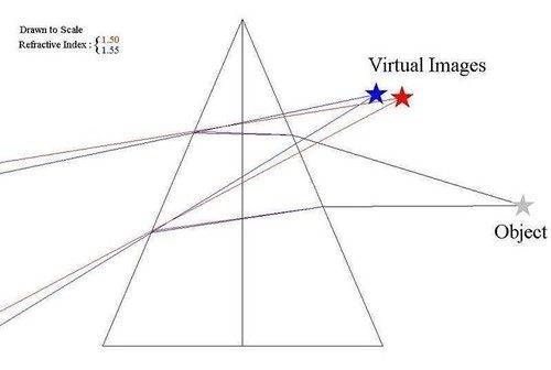
yes, if you view a light source through a prism, then the blue end of the spectrum will appear toward the pointed corner rather than the flat side of the prism. if you project the light source through the prism onto a wall, then the blue end will appear on the flat side rather than the pointed side of the prism. the reason the spectrum is reversed is because the convergence point of the image is in your eye rather than in the prism. (see diagram.)

the "black line" appears clearly in your figure c.jpg, on the pointed side of the prism, either underneath or alongside the red bar (depending on whether you hold the prism horizontally or vertically). if you hold the prism vertically, then the black line appears below the cyan line that forms over the white. the reason there is a gap there is because there is no green light in the diagram, only blue and red light. so yes, the black results because light is filtered out, but it's filtered out in your diagram, not in the prism.

best,
bruce

50052635396_2fc33da4fc.jpg


I said, but then how do you explain the green next to the black line?

He said...
The diodes are never completely "off", which explains the (very small) green evident in my image.

I thought to myself...
*but you just got finished saying that the black line is caused by the lack of green. Weird.

No hurry. It’s just a puzzle to me. If you get a chance, recreate the image, set the colors exactly to red and blue, and take a look for yourself. If you come up with anything, let me know. I'd appreciate it.

Thanks!
 
  • #17
Maybe these photo's of my LCD screen help. The second photo is a view through a prism, the third is a view through a grating. The original is a red block and a blue block, on a black background because additive colour mixing is easier to understand on a black background. The blue pixels are not monochromatic, their spectrum contains some green.

combi.jpg
 
  • Like
Likes Ibix
  • #18
Yay! I'm so excited. You actually have a prism. Right friggin on! I have to catch up on some work but I'll be back later. Now, we're talkin'!
 
  • #19
Orthoceras said:
Maybe these photo's of my LCD screen help. The second photo is a view through a prism, the third is a view through a grating. The original is a red block and a blue block, on a black background because additive colour mixing is easier to understand on a black background. The blue pixels are not monochromatic, their spectrum contains some green.

View attachment 265856

Perfect!

Everything behind the prism is displaced towards the apex. I’m sure that we would all agree that the colored fringes are reversed in order because the blue is bent more than the red.

50076933967_426f4f1891.jpg


The object is also compressed laterally towards the base and expanded towards the apex.

The following image is just black and white. On the left, the apex is pointed towards the left and vice versa for the other side. Do you agree that this is the reason we see yellow and cyan?

50076718831_4cccbfa959_w.jpg


Is it possible that the prism is acting like a colored filter?

Take a look at this image through your prism and tell me what you think.
 
Last edited:
  • #20
SecularSanity said:
Keep in mind that the spectrum is reversed.
Yes. The viewed spectrum is back to front because you see light that's been bent more from the 'other side' of the projected spectrum. We all got this idea fed to us what the rainbow was 'explained' to us. I don't get the black line bit though. There can't be anything fundamental about it, surely.

All this depends on the actual spectrum of the primaries. They will not be chosen to be monochromatic if a phosphor can be found with more light output or, when filters are used, they should be as wide as you can get away with to get the picture as bright as possible. A single point on a CIEE diagram doesn't by any means imply a monochromatic source. The experiment result will only be surprising if you forget this. TV was not designed to be looked at through a dispersive medium! Cummon guys, the poor system is doing its best.
 
  • Like
Likes Merlin3189
  • #21
sophiecentaur said:
Yes. The viewed spectrum is back to front because you see light that's been bent more from the 'other side' of the projected spectrum. We all got this idea fed to us what the rainbow was 'explained' to us. I don't get the black line bit though. There can't be anything fundamental about it, surely.

What? The rainbow is reflected.

All this depends on the actual spectrum of the primaries. They will not be chosen to be monochromatic if a phosphor can be found with more light output or, when filters are used, they should be as wide as you can get away with to get the picture as bright as possible. A single point on a CIEE diagram doesn't by any means imply a monochromatic source. The experiment result will only be surprising if you forget this. TV was not designed to be looked at through a dispersive medium! Cummon guys, the poor system is doing its best.

But it's not just the monitor, it happens with everything that's colored when you look at it through the prism. Why?
 
  • #22
SecularSanity said:
What? The rainbow is reflected.
I meant that it's the same logic. The light that's deflected most comes from higher up.
SecularSanity said:
it happens with everything that's colored
I'm not sure what you mean by "everything". You have only used practical sources. Painted blocks would probably be a lot worse and more confusing. If you had two laser sources (monochromatic) scanned and projected through shaped masks the result would be much more clear cut with no surprises. There would be a gap on one side and and overlap on the other. What else would be possible? What's worrying you has to be experimental limitations.
 
  • Like
Likes Merlin3189
  • #23
sophiecentaur said:
I meant that it's the same logic. The light that's deflected most comes from higher up.

I'm not sure what you mean by "everything". You have only used practical sources. Painted blocks would probably be a lot worse and more confusing. If you had two laser sources (monochromatic) scanned and projected through shaped masks the result would be much more clear cut with no surprises. There would be a gap on one side and and overlap on the other. What else would be possible? What's worrying you has to be experimental limitations.

So, do you still think the black line is just a gap between the spectra of two different sources which are physically separated? Do you have a prism on hand?

Do you agree that this is the reason we see yellow and cyan?

View attachment 265863
 
Last edited:
  • #24
SecularSanity said:
What? The rainbow is reflected.
The light in the primary rainbow is refracted going in then reflected then refracted on the way out of each drop. The dispersion is exactly the same physics as a prism.
 
  • #25
hutchphd said:
The light in the primary rainbow is refracted going in then reflected then refracted on the way out of each drop. The dispersion is exactly the same physics as a prism.

It was already rephrased correctly but let me ask you this. Is the spectrum reversed when looking through a prism because the blue and red rays overlap before hitting our eyes or because they overlap when we trace them back?
 
  • #26
I understand @Orthoceras' image in post #17. Here are the original and prism images split up into their R, G, B components:
1593928060119.png

We can see that the original image is quite a mix of colours, but that the rectangles are uniform. The images through the prism are not uniform. The lower rectangle has three distinct brightnesses in the red channel and two in the green, and the upper rectangle has two in the blue. That suggests to me that there's some cross-talk between the channels (as calibration it would be interesting to see an image of three rectangles of pure red, pure green, and pure blue on a black background if you have time, Orthoceras).

And here's detail from near the middle of the prism images - the full colour version at the top and then just the R, G, B channels below.
1593928978410.png

Here we can see that the red and green channels have moved about the same amount but the blue channel has moved quite a lot more. I think that's enough to explain what's going on in this image. The rectangles are slightly distorted by the prism (as seen in #19 - I get that now) but otherwise the prism image is just three copies of the two rectangles, slightly displaced with respect to each other.

Now here's the same analysis of the image from post #7. I've included the original image and its three channels this time because the original image is more complex.
1593930408316.png

The red and blue channels are pretty much what I expected, but he green channel is more complicated. Here are slices through the red/black boundary:
1593931073803.png

And a single-pixel slice (blown up vertically) through the red region:
1593932326539.png

I find this really hard to make sense of. If you ignore the green channel, it's fairly straightforward. The red and the blue slightly overlap causing magenta. But the green channel is really confusing. It has extra structure (that bright green band at the left hand edge of the blue rectangle) that doesn't seem to be associated with either of the other channels.

It would be really interesting to see the results of using @SecularSanity's same setup to photograph red, green, and blue squares on a black background both with and without a prism.
 
Last edited:
  • Like
Likes Orthoceras and sophiecentaur
  • #27
Ibix said:
I find this really hard to make sense of.
That was a useful post - well done.
I think it's only hard to make sense of because the spectra from the primaries are not straightforward. That, as I have remarked before, is to get as much light through as possible. Our vision is really bad at quantitative assessments of colour and there are some subtle details at edges that we just don't see.

If you could actually produce a spectrogram of the light from each of RGB and combine them, suitably shifted as with the prism. You would produce a quantitative value for the resulting pattern. If you had two pure sources then the whole Universe would shake if you didn't get a predictable result.
 
  • #28
I still have a few of unanswered questions, if you don’t mind. I’d really appreciate it.

First, let me make sure that I’ve understood everyone correctly. The final answer is that the blue isn’t a monochromatic source, it contains some green, correct?

The black is caused by a gap (no color at all) due to the refraction difference between red and blue, correct?

Is the spectrum reversed when looking through the prism because the rays overlaps when we trace them back or because they overlap before entering our eye?

And one final question…in the image below, why don’t we see green in the white strip when the background is red or blue? We only see green when the background is black. Why is that?

50237266382_a4859bb2ce_z.jpg
 
  • #29
You can't explain the non-ideal behaviour here without accepting that neither source nor detector are ideal. What is being seen reflects that and can't be to do with anything 'funny' about the dispersion of the prism.
Lets face it, the colours have changed an awful lot between the original and the what comes through a display and a camera. You may find it useful to measure the RGB values that you get across the image of a very narrow white stripe on a black background. That would 'indicate' the spectrum of the white source and the amount of dispersion for the different wavelengths.
There is nothing magic about the results and I don't think it's particularly to do with the eye, any more than any colour TV image (which is only an approximation to the actual spectrum of any source object).
 
  • Like
Likes Ibix
  • #30
In addition to @sophiecentaur's comments, I think we really need to see a photo of the target on your screen, with and without the prism.
 
  • #31
SecularSanity said:
So, do you still think the black line is just a gap between the spectra of two different sources which are physically separated? Do you have a prism on hand?
I think that any such phenomenon that seems to go against intuition will always have a good explanation. If you specify the conditions of your observations more completely then there will be no surprises. Try it with lasers and see if you are still seeing surprising results.
SecularSanity said:
Is the spectrum reversed when looking through a prism because the blue and red rays overlap before hitting our eyes or because they overlap when we trace them back?
If you look through just one prism then you will not see a spectrum; you will see just one narrow band of colour. The angles will be exactly what the familiar diagrams of prisms splitting light will show.
If you use a stack of very small prisms then what you will see will be upside down. This is what the elementary diagrams of rainbow formation show you. Again - no surprises.
 
  • #32
sophiecentaur said:
I think that any such phenomenon that seems to go against intuition will always have a good explanation. If you specify the conditions of your observations more completely then there will be no surprises. Try it with lasers and see if you are still seeing surprising results.

If you look through just one prism then you will not see a spectrum; you will see just one narrow band of colour. The angles will be exactly what the familiar diagrams of prisms splitting light will show.
If you use a stack of very small prisms then what you will see will be upside down. This is what the elementary diagrams of rainbow formation show you. Again - no surprises.

First of all, I don’t think that there’s anything magical or funny about the prism. I just want to understand what it is that I’m seeing, that’s all. Someone else told me that with many (though not all) modern screens the blue phosphor has a more or less distinct second peak in green. He provided me with a helpful link.

http://fluxometer.com/

Would you agree that the blue contains some green and the black is caused by a gap (no color at all) due to the refraction difference between red and blue?

As far as the reversed spectrum is concerned, here’s an old thread from in here.

https://www.physicsforums.com/threads/reversed-spectrum-through-prism.379295/

Below is a link to a colorcube website. If you run your mouse over the top of the three images, it will show you what is seen with and without the prism.

http://www.colorcube.com/articles/prism/prism.htm

We know for sure that blue and red are reversed when looking through it. So, to keep it simple, let’s just stick with those two colors.

When looking through the prism what causes those two colors to be reversed? Do the rays overlap when we trace them back or do they overlap before entering our eye?
 
  • #33
Ibix said:
In addition to @sophiecentaur's comments, I think we really need to see a photo of the target on your screen, with and without the prism.

50237266382_a4859bb2ce.jpg

50240746661_cebf6a23a8.jpg
 
  • #34
OK. The very top left image is the most interesting because it's the nearest to ideal. It shows the nearest to a proper spectrum of the displayed white against a black background (ROYGB, at least). The fact that the black portion is now grey is because of unwanted light on other paths and it 'dilutes' the spectrum that's seen.

Top right you get Blue on the left and Cyan, next in where the blue and green mix. and the rightmost stripe is a sort of Magenta where the red mixes with the blue. Allowing for the imperfections of the experiment, it does what you'd expect.The other colours with a white line seem to do the 'right thing' but it's further and further away from ideal

To clear it up, you could do the same with red, green and blue lines on black to indicate the sort of spectrum the primaries have. But the same caveat applies because the TV system is not a spectrometer and just does its best to 'see things' the way you do.

IMO you have done as much as you can with a limited setup. You would need some proper monochromatic sources and a proper spectrometer if you want to confirm what we all know about refraction and dispersion.
 
  • Like
Likes Ibix
  • #35
Just to make things nice and clear, would answer my questions in post #32.

Thanks!

Much obliged!
 

Similar threads

Replies
6
Views
1K
  • Classical Physics
Replies
21
Views
916
Replies
4
Views
885
Replies
29
Views
2K
  • Other Physics Topics
3
Replies
98
Views
7K
Replies
23
Views
969
  • Introductory Physics Homework Help
Replies
9
Views
121
  • Classical Physics
Replies
17
Views
2K
Back
Top