Why Night-Sky Stars Often Appear Brighter Than the Sun
Table of Contents
Are most visible stars brighter than the Sun?
A couple of weeks back, a thread was started about whether or not most of the stars we see at night are brighter than our Sun. The consensus was yes. I’d like to delve back into that subject in a little more detail. Just how representative is the night sky to what is out there?
Data: Hipparcos catalog and Vizier query
By querying the Hipparcos star catalog using the VisieR service(http://vizier.u-strasbg.fr/viz-bin/VizieR), I came up with 4995 stars that have a visual magnitude of <6, which is a reasonable limit to what a person with good eyesight could make out as individual points of light. The furthest star that I could get a listed distance for is HD 150136, which is a multiple star system at a distance of 1,320 +/- 120 parsecs. Thus a sphere ~1320 parsecs includes the roughly 5000 stars we can see at night (many of which are multiple star systems). Of course, it includes a lot more stars than that (all the ones too dim to see), and making an accounting of all of them would be a Herculean task.
Choosing a 67-parsec sample
So instead, we will just consider a volume out to ~67 parsecs (a parallax of 15 milliarcseconds). This still gives us a “known” star count of nearly 12,000 stars to work with. I put “known” in quotes because as we will see, even working with this smaller volume, we are going to be missing some stars.
Visual magnitude vs distance
If we plot these stars by distance and visual magnitude, we get the following graph.
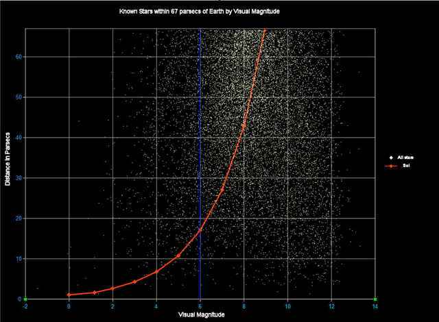
The blue vertical line divides the graph by whether or not they are naked-eye visible from Earth. Anything to the left of the line is visible, everything to the right is not. The orange line shows where our Sun would fall on the graph. Note that the Sun passes from visible to not visible at about 17-parsec point. This means that from any further than 17 parsecs the Sun would not be visible without optical aid.
As we can see, the vast majority of the stars on this graph fall on the right side of the blue line and thus are too dim to see with the naked eye from Earth. Not only that, but this graph doesn’t even paint the full picture. As you move up the chart, you should expect to see more stars crowded between the horizontal line. There are more stars 10 to 20 parsecs from Earth than there are from 0 to 10 parsecs, etc. This happens in the graph to a certain extent, but not enough. If you look at the section between magnitude 10 and 14, you notice that this starts to be the case, but then the number of stars begins to decrease as distance increases. This is due to the fact, that there are stars that should be there that are too dim to even be listed in the Hipparcos catalog.
Absolute magnitude and incompleteness
This becomes more apparent if we change the horizontal scale from visual to absolute magnitude. This way the stars are grouped by brightness if seen from an equal distance (10 parsecs).
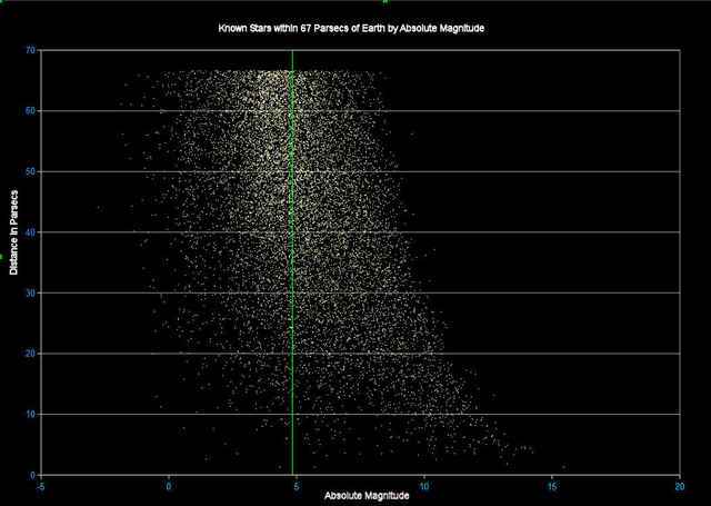
In this graph, the green vertical line is the Sun’s absolute magnitude. Stars to the left of the line are more luminous than the Sun and those to the Right are less luminous. Near the bottom, we see many less luminous stars than more luminous stars, but at the top, we see it begin to shift the other way. Since we have no reason to believe that the relative luminosity of stars would be dependent on their distance from Earth, this can only be caused by the incompleteness of the star list we are using. So even only going out to 67 parsecs gives us less than the complete picture. This should be kept in mind as we go on; Dim stars will be underrepresented.
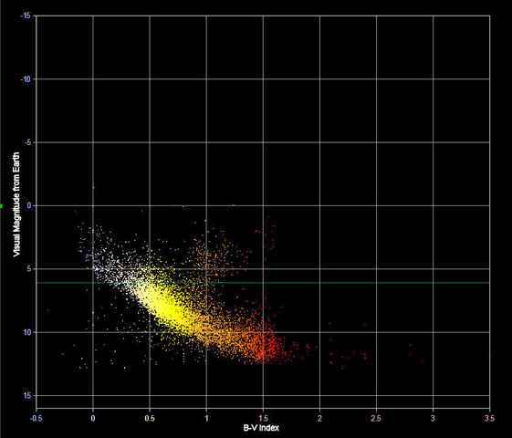
Spectrum and temperature (B-V index)
Until now, we have just dealt with visual and absolute magnitude. Stars are also sorted by their spectrum and temp. From cool red M-class stars to hot blue 0-class stars. If we plot distance vs spectrum for the same stars as above, we get the following graph.
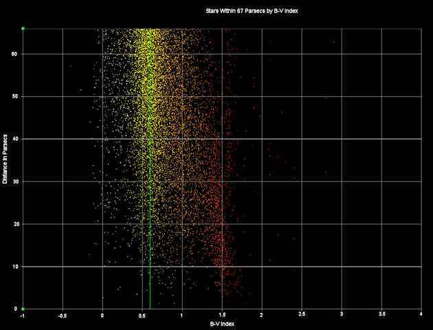
The horizontal scale is by the B-V index, which is an indicator of star temp, the lower the index, the higher the star temp. Again, the green line indicates where the Sun falls on the scale. On this graph, the fall-off in several red cool stars with distance, while still noticeable, isn’t quite as defined as it was for absolute magnitude in the last graph. The coolest star on the graph is one of the furthest away. There seem to be several outliers in this graph.
Visual magnitude vs temperature
This is made even more apparent in the next graph, where we plot visual magnitude against star temp:
The blue line is a visual magnitude of 6, thus everything above this line is starred visible in the sky. Note that while there is a general tendency for visual magnitude to decrease with star temp and indeed the vast number of visible stars are hot stars, there is a good number of cooler stars above the demarcation line. There are also hot stars below the line. Of course, visual magnitude is dependent on distance, so we can get a clearer picture if we plot absolute magnitude against B-V index
Hertzsprung-Russell diagram (HR diagram)
Such a graph is called a Hertzsprung-Russell diagram. For our stars out to 67 parsecs, it would look like this.
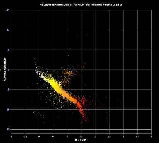
We have a well-defined band that runs from upper left to lower right and follows the rule of luminosity increasing with temp. This represents the main sequence; stars in the prime of their life. There is also a spur going off the upper right. These are the subgiants and giants which have left the main sequence. In time, our sun will enter this branch swelling in size and increasing in overall luminosity. Above this spur is the region of super and hypergiants, which is where more massive stars go when leaving the main sequence (and before many of them go supernova). Down in the lower right of the graph are the white dwarfs (where our Sun will finally end up) and between them and the main sequence are stars still in the process of cooling to the white dwarf stage. Down at the red end of the main sequence, there is a smaller spur of flare stars.
Why giants dominate the night sky
It is the giants, supergiants, and hypergiants that account for the cool stars that we see in the night sky.
Visible stars HR diagram
To make that more apparent, here is the H-R diagram containing the 4995 stars with
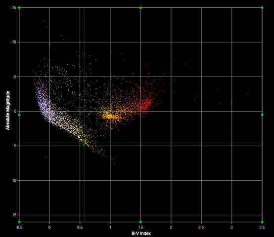
Comparison with Sun
As can be seen, it is dominated by giant stars and main sequence stars brighter and hotter than the Sun very few of them are both dimmer and cooler than the Sun. The two green lines are the absolute magnitude and B-V index for the Sun and where they cross is where the Sun would lie in this diagram. Many of these stars are also further away than the 67-parsec sphere of the earlier graphs.
Overlap of visible and nearby stars
The overlap between the stars that are both
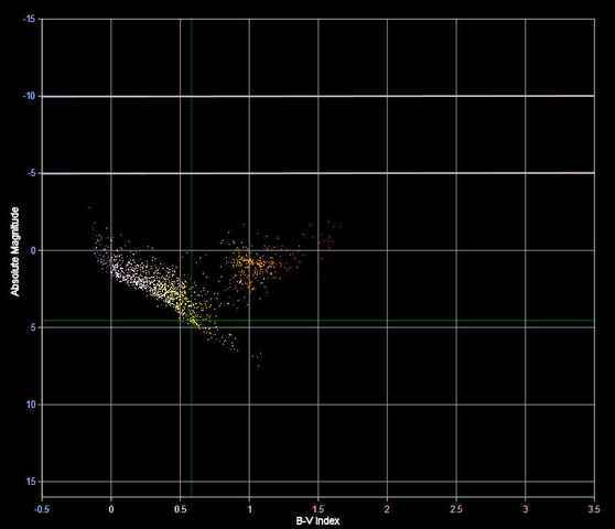
17-parsec limit: Could the Sun be seen?
Lastly, let’s consider the 17-parsec limit from which our Sun could be seen with the unaided eye.
Stars visible within 17 parsecs
If we just consider stars both bright enough to be seen from Earth and within 17 parsecs of the Earth, we are left with:
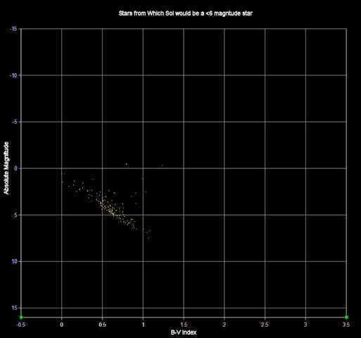
So if you have ever gone out on a clear light, looked up at a star, and wondered if someone on a planet orbiting that star was looking back at you wondering the same thing, it would have only been possible if you had been looking at one of these few stars*. (And not even all of them. Some are stars that have already left the main sequence or are hot and bright enough to have relatively short lifespans, and unlikely to host advanced life.)
Implications
And the next time you look up at the night sky keep in mind that what you are seeing isn’t only a fraction of what is out there, but a heavily skewed fraction at that.
Notes and further reading
*Assuming an equal visual acuity to our own for our distant observer
Read the next article on how to measure how many days are in a year!


“From the article: Down in the lower right of the graph are the white dwarfs
Reference [URL]https://www.physicsforums.com/insights/representative-night-sky/[/URL]
Shouldn’t that be the lower left? :)”
This is why real authors have editors.o:)
From the article: Down in the lower right of the graph are the white dwarfs
Reference [URL]https://www.physicsforums.com/insights/representative-night-sky/[/URL]
Shouldn’t that be the lower left? :)
That was an awesome article, Janus! I had no idea of the relationship between all those different factors! It’s interesting how you start with a plot of visual magnitude vs distance and gradually morph everything until you get to the Hertzsprung-Russell diagram!