Physics, Math and Science Articles
Revisiting the Velocity-Time Function
Kinematics: The Velocity-Time Function Author’s Preface: A Collaborative Approach to Lesson Development The intention behind what I hope will be a series of articles on Kinematics (this one being the first) is to begin an open, collaborative process of lesson development on Physics Forums. In order to expedite this workflow, I am making deliberate use…
Recent Entries
 https://www.physicsforums.com/insights/wp-content/uploads/2026/02/ai-problem-solving.png
135
240
Neil Parker
https://www.physicsforums.com/insights/wp-content/uploads/2019/02/Physics_Forums_Insights_logo.png
Neil Parker2026-02-28 16:16:262026-02-28 16:16:26AI Enriched Problem Solving
https://www.physicsforums.com/insights/wp-content/uploads/2026/02/ai-problem-solving.png
135
240
Neil Parker
https://www.physicsforums.com/insights/wp-content/uploads/2019/02/Physics_Forums_Insights_logo.png
Neil Parker2026-02-28 16:16:262026-02-28 16:16:26AI Enriched Problem Solving https://www.physicsforums.com/insights/wp-content/uploads/2026/02/gate-system.png
135
240
Neil Parker
https://www.physicsforums.com/insights/wp-content/uploads/2019/02/Physics_Forums_Insights_logo.png
Neil Parker2026-02-28 16:11:582026-02-28 16:12:55Remote Operated Gate Control System
https://www.physicsforums.com/insights/wp-content/uploads/2026/02/gate-system.png
135
240
Neil Parker
https://www.physicsforums.com/insights/wp-content/uploads/2019/02/Physics_Forums_Insights_logo.png
Neil Parker2026-02-28 16:11:582026-02-28 16:12:55Remote Operated Gate Control System https://www.physicsforums.com/insights/wp-content/uploads/2025/10/maxwell-research.png
135
240
fresh_42
https://www.physicsforums.com/insights/wp-content/uploads/2019/02/Physics_Forums_Insights_logo.png
fresh_422025-10-13 08:54:142026-02-17 07:37:08Inside the Scientific Box: History and Challenges Today
https://www.physicsforums.com/insights/wp-content/uploads/2025/10/maxwell-research.png
135
240
fresh_42
https://www.physicsforums.com/insights/wp-content/uploads/2019/02/Physics_Forums_Insights_logo.png
fresh_422025-10-13 08:54:142026-02-17 07:37:08Inside the Scientific Box: History and Challenges Today https://www.physicsforums.com/insights/wp-content/uploads/2025/09/Entangled-Photon-Polarization-Qubits.png
135
240
Mark Stuckey
https://www.physicsforums.com/insights/wp-content/uploads/2019/02/Physics_Forums_Insights_logo.png
Mark Stuckey2025-09-29 07:54:132025-09-29 10:06:20Why Entangled Photon-Polarization Qubits Violate Bell’s Inequality per Quantum Information Theory
https://www.physicsforums.com/insights/wp-content/uploads/2025/09/Entangled-Photon-Polarization-Qubits.png
135
240
Mark Stuckey
https://www.physicsforums.com/insights/wp-content/uploads/2019/02/Physics_Forums_Insights_logo.png
Mark Stuckey2025-09-29 07:54:132025-09-29 10:06:20Why Entangled Photon-Polarization Qubits Violate Bell’s Inequality per Quantum Information Theory https://www.physicsforums.com/insights/wp-content/uploads/2025/09/relativator.png
135
240
robphy
https://www.physicsforums.com/insights/wp-content/uploads/2019/02/Physics_Forums_Insights_logo.png
robphy2025-09-02 07:55:332025-09-02 07:55:33Relativator (Circular Slide-Rule) – Simulated with Desmos
https://www.physicsforums.com/insights/wp-content/uploads/2025/09/relativator.png
135
240
robphy
https://www.physicsforums.com/insights/wp-content/uploads/2019/02/Physics_Forums_Insights_logo.png
robphy2025-09-02 07:55:332025-09-02 07:55:33Relativator (Circular Slide-Rule) – Simulated with Desmos https://www.physicsforums.com/insights/wp-content/uploads/2025/08/dirac-function.png
135
240
jambaugh
https://www.physicsforums.com/insights/wp-content/uploads/2019/02/Physics_Forums_Insights_logo.png
jambaugh2025-08-29 06:51:272025-09-11 10:41:11What Exactly is Dirac’s Delta Function?
https://www.physicsforums.com/insights/wp-content/uploads/2025/08/dirac-function.png
135
240
jambaugh
https://www.physicsforums.com/insights/wp-content/uploads/2019/02/Physics_Forums_Insights_logo.png
jambaugh2025-08-29 06:51:272025-09-11 10:41:11What Exactly is Dirac’s Delta Function?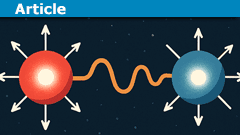 https://www.physicsforums.com/insights/wp-content/uploads/2025/08/quantum-entanglement.png
135
240
Mark Stuckey
https://www.physicsforums.com/insights/wp-content/uploads/2019/02/Physics_Forums_Insights_logo.png
Mark Stuckey2025-08-27 07:25:022025-08-27 07:25:02Quantum Entanglement is a Kinematic Fact, not a Dynamical Effect
https://www.physicsforums.com/insights/wp-content/uploads/2025/08/quantum-entanglement.png
135
240
Mark Stuckey
https://www.physicsforums.com/insights/wp-content/uploads/2019/02/Physics_Forums_Insights_logo.png
Mark Stuckey2025-08-27 07:25:022025-08-27 07:25:02Quantum Entanglement is a Kinematic Fact, not a Dynamical Effect https://www.physicsforums.com/insights/wp-content/uploads/2025/07/complex_numbers_article.png
135
240
PAllen
https://www.physicsforums.com/insights/wp-content/uploads/2019/02/Physics_Forums_Insights_logo.png
PAllen2025-07-20 06:55:082025-07-22 07:29:49Fixing Things Which Can Go Wrong With Complex Numbers
https://www.physicsforums.com/insights/wp-content/uploads/2025/07/complex_numbers_article.png
135
240
PAllen
https://www.physicsforums.com/insights/wp-content/uploads/2019/02/Physics_Forums_Insights_logo.png
PAllen2025-07-20 06:55:082025-07-22 07:29:49Fixing Things Which Can Go Wrong With Complex Numbers https://www.physicsforums.com/insights/wp-content/uploads/2025/05/fermat.png
135
240
fresh_42
https://www.physicsforums.com/insights/wp-content/uploads/2019/02/Physics_Forums_Insights_logo.png
fresh_422025-05-18 17:50:222025-07-22 07:32:17Fermat’s Last Theorem
https://www.physicsforums.com/insights/wp-content/uploads/2025/05/fermat.png
135
240
fresh_42
https://www.physicsforums.com/insights/wp-content/uploads/2019/02/Physics_Forums_Insights_logo.png
fresh_422025-05-18 17:50:222025-07-22 07:32:17Fermat’s Last Theorem https://www.physicsforums.com/insights/wp-content/uploads/2025/03/vector-spaces.png
135
240
fresh_42
https://www.physicsforums.com/insights/wp-content/uploads/2019/02/Physics_Forums_Insights_logo.png
fresh_422025-03-13 07:45:202026-02-17 07:37:26Vector Spaces: Concepts, History, and Applications Guide
https://www.physicsforums.com/insights/wp-content/uploads/2025/03/vector-spaces.png
135
240
fresh_42
https://www.physicsforums.com/insights/wp-content/uploads/2019/02/Physics_Forums_Insights_logo.png
fresh_422025-03-13 07:45:202026-02-17 07:37:26Vector Spaces: Concepts, History, and Applications Guide https://www.physicsforums.com/insights/wp-content/uploads/2025/02/math-Groups.png
135
240
fresh_42
https://www.physicsforums.com/insights/wp-content/uploads/2019/02/Physics_Forums_Insights_logo.png
fresh_422025-02-02 19:47:022025-02-12 08:56:11Groups, The Path from a Simple Concept to Mysterious Results
https://www.physicsforums.com/insights/wp-content/uploads/2025/02/math-Groups.png
135
240
fresh_42
https://www.physicsforums.com/insights/wp-content/uploads/2019/02/Physics_Forums_Insights_logo.png
fresh_422025-02-02 19:47:022025-02-12 08:56:11Groups, The Path from a Simple Concept to Mysterious Results https://www.physicsforums.com/insights/wp-content/uploads/2023/12/digital-audio-1.png
135
240
Bill Hobba
https://www.physicsforums.com/insights/wp-content/uploads/2019/02/Physics_Forums_Insights_logo.png
Bill Hobba2025-01-24 18:33:222026-02-17 08:14:18Hybrid AI Video Codecs and Modern Streaming Techniques
https://www.physicsforums.com/insights/wp-content/uploads/2023/12/digital-audio-1.png
135
240
Bill Hobba
https://www.physicsforums.com/insights/wp-content/uploads/2019/02/Physics_Forums_Insights_logo.png
Bill Hobba2025-01-24 18:33:222026-02-17 08:14:18Hybrid AI Video Codecs and Modern Streaming Techniques https://www.physicsforums.com/insights/wp-content/uploads/2024/12/no-tidal-bulge.png
135
240
D H
https://www.physicsforums.com/insights/wp-content/uploads/2019/02/Physics_Forums_Insights_logo.png
D H2024-12-31 08:23:012026-02-17 08:13:14Why the Tidal Bulge Doesn’t Exist – Tidal Theory Explained
https://www.physicsforums.com/insights/wp-content/uploads/2024/12/no-tidal-bulge.png
135
240
D H
https://www.physicsforums.com/insights/wp-content/uploads/2019/02/Physics_Forums_Insights_logo.png
D H2024-12-31 08:23:012026-02-17 08:13:14Why the Tidal Bulge Doesn’t Exist – Tidal Theory Explained https://www.physicsforums.com/insights/wp-content/uploads/2024/12/topology.png
135
240
fresh_42
https://www.physicsforums.com/insights/wp-content/uploads/2019/02/Physics_Forums_Insights_logo.png
fresh_422024-12-06 21:26:452024-12-17 02:54:22The Many Faces of Topology
https://www.physicsforums.com/insights/wp-content/uploads/2024/12/topology.png
135
240
fresh_42
https://www.physicsforums.com/insights/wp-content/uploads/2019/02/Physics_Forums_Insights_logo.png
fresh_422024-12-06 21:26:452024-12-17 02:54:22The Many Faces of Topology https://www.physicsforums.com/insights/wp-content/uploads/2024/08/brownian-motion.png
135
240
ergospherical
https://www.physicsforums.com/insights/wp-content/uploads/2019/02/Physics_Forums_Insights_logo.png
ergospherical2024-08-26 07:14:452024-11-16 10:39:17Brownian Motions and Quantifying Randomness in Physical Systems
https://www.physicsforums.com/insights/wp-content/uploads/2024/08/brownian-motion.png
135
240
ergospherical
https://www.physicsforums.com/insights/wp-content/uploads/2019/02/Physics_Forums_Insights_logo.png
ergospherical2024-08-26 07:14:452024-11-16 10:39:17Brownian Motions and Quantifying Randomness in Physical Systems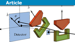 https://www.physicsforums.com/insights/wp-content/uploads/2024/07/physics-of-reality.png
135
240
Mark Stuckey
https://www.physicsforums.com/insights/wp-content/uploads/2019/02/Physics_Forums_Insights_logo.png
Mark Stuckey2024-07-22 11:24:162026-02-17 08:10:56Quantum Reconstruction & Bell Correlations Explained
https://www.physicsforums.com/insights/wp-content/uploads/2024/07/physics-of-reality.png
135
240
Mark Stuckey
https://www.physicsforums.com/insights/wp-content/uploads/2019/02/Physics_Forums_Insights_logo.png
Mark Stuckey2024-07-22 11:24:162026-02-17 08:10:56Quantum Reconstruction & Bell Correlations Explained https://www.physicsforums.com/insights/wp-content/uploads/2022/07/pvsnp.png
135
240
fresh_42
https://www.physicsforums.com/insights/wp-content/uploads/2019/02/Physics_Forums_Insights_logo.png
fresh_422024-06-21 12:42:182024-12-06 21:31:12Aspects Behind the Concept of Dimension in Various Fields
https://www.physicsforums.com/insights/wp-content/uploads/2022/07/pvsnp.png
135
240
fresh_42
https://www.physicsforums.com/insights/wp-content/uploads/2019/02/Physics_Forums_Insights_logo.png
fresh_422024-06-21 12:42:182024-12-06 21:31:12Aspects Behind the Concept of Dimension in Various Fields https://www.physicsforums.com/insights/wp-content/uploads/2024/06/complex-numbers-views.png
135
240
fresh_42
https://www.physicsforums.com/insights/wp-content/uploads/2019/02/Physics_Forums_Insights_logo.png
fresh_422024-06-07 06:10:002024-09-30 09:01:04Views On Complex Numbers
https://www.physicsforums.com/insights/wp-content/uploads/2024/06/complex-numbers-views.png
135
240
fresh_42
https://www.physicsforums.com/insights/wp-content/uploads/2019/02/Physics_Forums_Insights_logo.png
fresh_422024-06-07 06:10:002024-09-30 09:01:04Views On Complex Numbers https://www.physicsforums.com/insights/wp-content/uploads/2024/05/addition_of_velocities.png
135
240
robphy
https://www.physicsforums.com/insights/wp-content/uploads/2019/02/Physics_Forums_Insights_logo.png
robphy2024-05-20 06:37:492024-09-30 09:15:04Addition of Velocities (Velocity Composition) in Special Relativity
https://www.physicsforums.com/insights/wp-content/uploads/2024/05/addition_of_velocities.png
135
240
robphy
https://www.physicsforums.com/insights/wp-content/uploads/2019/02/Physics_Forums_Insights_logo.png
robphy2024-05-20 06:37:492024-09-30 09:15:04Addition of Velocities (Velocity Composition) in Special Relativity https://www.physicsforums.com/insights/wp-content/uploads/2024/03/shrodingers-cat.png
135
240
Mark Stuckey
https://www.physicsforums.com/insights/wp-content/uploads/2019/02/Physics_Forums_Insights_logo.png
Mark Stuckey2024-04-02 08:51:192025-01-06 15:26:42Schrödinger’s Cat and the Qbit
https://www.physicsforums.com/insights/wp-content/uploads/2024/03/shrodingers-cat.png
135
240
Mark Stuckey
https://www.physicsforums.com/insights/wp-content/uploads/2019/02/Physics_Forums_Insights_logo.png
Mark Stuckey2024-04-02 08:51:192025-01-06 15:26:42Schrödinger’s Cat and the Qbit https://www.physicsforums.com/insights/wp-content/uploads/2024/03/slinky-drop-experiment.png
135
240
Orodruin
https://www.physicsforums.com/insights/wp-content/uploads/2019/02/Physics_Forums_Insights_logo.png
Orodruin2024-03-28 16:19:542024-09-30 09:01:52The Slinky Drop Experiment Analysed
https://www.physicsforums.com/insights/wp-content/uploads/2024/03/slinky-drop-experiment.png
135
240
Orodruin
https://www.physicsforums.com/insights/wp-content/uploads/2019/02/Physics_Forums_Insights_logo.png
Orodruin2024-03-28 16:19:542024-09-30 09:01:52The Slinky Drop Experiment Analysed https://www.physicsforums.com/insights/wp-content/uploads/2024/11/infinite-universe.png
135
240
Greg Bernhardt
https://www.physicsforums.com/insights/wp-content/uploads/2019/02/Physics_Forums_Insights_logo.png
Greg Bernhardt2024-03-16 10:35:042026-04-05 14:05:22Open, Flat & Closed Universes: Curvature Explained
https://www.physicsforums.com/insights/wp-content/uploads/2024/11/infinite-universe.png
135
240
Greg Bernhardt
https://www.physicsforums.com/insights/wp-content/uploads/2019/02/Physics_Forums_Insights_logo.png
Greg Bernhardt2024-03-16 10:35:042026-04-05 14:05:22Open, Flat & Closed Universes: Curvature Explained https://www.physicsforums.com/insights/wp-content/uploads/2024/11/einstein-field-equations.png
135
240
Greg Bernhardt
https://www.physicsforums.com/insights/wp-content/uploads/2019/02/Physics_Forums_Insights_logo.png
Greg Bernhardt2024-02-26 08:29:202026-04-05 14:07:24Einstein Field Equations – Definition and Fast Facts
https://www.physicsforums.com/insights/wp-content/uploads/2024/11/einstein-field-equations.png
135
240
Greg Bernhardt
https://www.physicsforums.com/insights/wp-content/uploads/2019/02/Physics_Forums_Insights_logo.png
Greg Bernhardt2024-02-26 08:29:202026-04-05 14:07:24Einstein Field Equations – Definition and Fast Facts https://www.physicsforums.com/insights/wp-content/uploads/2024/02/Multi-Atwood-Machine-Assembly.png
135
240
kuruman
https://www.physicsforums.com/insights/wp-content/uploads/2019/02/Physics_Forums_Insights_logo.png
kuruman2024-02-16 10:18:122024-08-18 10:52:43How to Solve a Multi-Atwood Machine Assembly
https://www.physicsforums.com/insights/wp-content/uploads/2024/02/Multi-Atwood-Machine-Assembly.png
135
240
kuruman
https://www.physicsforums.com/insights/wp-content/uploads/2019/02/Physics_Forums_Insights_logo.png
kuruman2024-02-16 10:18:122024-08-18 10:52:43How to Solve a Multi-Atwood Machine Assembly https://www.physicsforums.com/insights/wp-content/uploads/2024/02/Lambert-W-Function-in-Finance.png
135
240
Neil Parker
https://www.physicsforums.com/insights/wp-content/uploads/2019/02/Physics_Forums_Insights_logo.png
Neil Parker2024-02-09 08:25:092024-02-09 08:25:09The Lambert W Function in Finance
https://www.physicsforums.com/insights/wp-content/uploads/2024/02/Lambert-W-Function-in-Finance.png
135
240
Neil Parker
https://www.physicsforums.com/insights/wp-content/uploads/2019/02/Physics_Forums_Insights_logo.png
Neil Parker2024-02-09 08:25:092024-02-09 08:25:09The Lambert W Function in Finance https://www.physicsforums.com/insights/wp-content/uploads/2015/09/infinity.png
135
240
fresh_42
https://www.physicsforums.com/insights/wp-content/uploads/2019/02/Physics_Forums_Insights_logo.png
fresh_422024-01-11 10:41:332026-04-05 14:09:53Why Division by Zero Is Impossible: 10 Mathematical Reasons
https://www.physicsforums.com/insights/wp-content/uploads/2023/12/digital-audio-1.png
135
240
Bill Hobba
https://www.physicsforums.com/insights/wp-content/uploads/2019/02/Physics_Forums_Insights_logo.png
Bill Hobba2023-12-14 14:50:052026-02-17 08:09:43Sinc Function & Upsampling in Digital Audio Explained
https://www.physicsforums.com/insights/wp-content/uploads/2015/09/infinity.png
135
240
fresh_42
https://www.physicsforums.com/insights/wp-content/uploads/2019/02/Physics_Forums_Insights_logo.png
fresh_422024-01-11 10:41:332026-04-05 14:09:53Why Division by Zero Is Impossible: 10 Mathematical Reasons
https://www.physicsforums.com/insights/wp-content/uploads/2023/12/digital-audio-1.png
135
240
Bill Hobba
https://www.physicsforums.com/insights/wp-content/uploads/2019/02/Physics_Forums_Insights_logo.png
Bill Hobba2023-12-14 14:50:052026-02-17 08:09:43Sinc Function & Upsampling in Digital Audio Explained https://www.physicsforums.com/insights/wp-content/uploads/2023/12/digital-audio-introduction.png
135
240
Bill Hobba
https://www.physicsforums.com/insights/wp-content/uploads/2019/02/Physics_Forums_Insights_logo.png
Bill Hobba2023-12-11 19:08:572026-02-17 08:09:01Modern DACs, Dither, DXD & High-Res Audio Explained
https://www.physicsforums.com/insights/wp-content/uploads/2023/12/digital-audio-introduction.png
135
240
Bill Hobba
https://www.physicsforums.com/insights/wp-content/uploads/2019/02/Physics_Forums_Insights_logo.png
Bill Hobba2023-12-11 19:08:572026-02-17 08:09:01Modern DACs, Dither, DXD & High-Res Audio Explained https://www.physicsforums.com/insights/wp-content/uploads/2023/11/geometric-series.png
135
240
fresh_42
https://www.physicsforums.com/insights/wp-content/uploads/2019/02/Physics_Forums_Insights_logo.png
fresh_422023-11-07 20:13:492024-12-06 21:31:10Series in Mathematics: From Zeno to Quantum Theory
https://www.physicsforums.com/insights/wp-content/uploads/2023/11/geometric-series.png
135
240
fresh_42
https://www.physicsforums.com/insights/wp-content/uploads/2019/02/Physics_Forums_Insights_logo.png
fresh_422023-11-07 20:13:492024-12-06 21:31:10Series in Mathematics: From Zeno to Quantum Theory https://www.physicsforums.com/insights/wp-content/uploads/2023/10/epsilontic.png
135
240
fresh_42
https://www.physicsforums.com/insights/wp-content/uploads/2019/02/Physics_Forums_Insights_logo.png
fresh_422023-10-06 08:41:072024-12-06 21:31:13Epsilontic – Limits and Continuity
https://www.physicsforums.com/insights/wp-content/uploads/2023/10/epsilontic.png
135
240
fresh_42
https://www.physicsforums.com/insights/wp-content/uploads/2019/02/Physics_Forums_Insights_logo.png
fresh_422023-10-06 08:41:072024-12-06 21:31:13Epsilontic – Limits and Continuity https://www.physicsforums.com/insights/wp-content/uploads/2023/08/Milli-Ohm.png
135
240
Neil Parker
https://www.physicsforums.com/insights/wp-content/uploads/2019/02/Physics_Forums_Insights_logo.png
Neil Parker2023-09-01 16:17:552024-08-18 10:49:47The Poor Man’s Milli-Ohm Meter
https://www.physicsforums.com/insights/wp-content/uploads/2023/08/Milli-Ohm.png
135
240
Neil Parker
https://www.physicsforums.com/insights/wp-content/uploads/2019/02/Physics_Forums_Insights_logo.png
Neil Parker2023-09-01 16:17:552024-08-18 10:49:47The Poor Man’s Milli-Ohm Meter https://www.physicsforums.com/insights/wp-content/uploads/2023/08/Differential-Equation-Systems-and-Nature.png
135
240
fresh_42
https://www.physicsforums.com/insights/wp-content/uploads/2019/02/Physics_Forums_Insights_logo.png
fresh_422023-08-27 07:20:352024-01-09 07:51:58Differential Equation Systems and Nature
https://www.physicsforums.com/insights/wp-content/uploads/2023/08/Differential-Equation-Systems-and-Nature.png
135
240
fresh_42
https://www.physicsforums.com/insights/wp-content/uploads/2019/02/Physics_Forums_Insights_logo.png
fresh_422023-08-27 07:20:352024-01-09 07:51:58Differential Equation Systems and Nature https://www.physicsforums.com/insights/wp-content/uploads/2023/08/calc-precalc.png
135
240
Bill Hobba
https://www.physicsforums.com/insights/wp-content/uploads/2019/02/Physics_Forums_Insights_logo.png
Bill Hobba2023-08-18 01:04:412026-03-20 21:54:36Beginners Guide to Precalculus, Calculus and Infinitesimals
https://www.physicsforums.com/insights/wp-content/uploads/2023/08/calc-precalc.png
135
240
Bill Hobba
https://www.physicsforums.com/insights/wp-content/uploads/2019/02/Physics_Forums_Insights_logo.png
Bill Hobba2023-08-18 01:04:412026-03-20 21:54:36Beginners Guide to Precalculus, Calculus and Infinitesimals https://www.physicsforums.com/insights/wp-content/uploads/2023/08/Variable-Mass-Systems.png
135
240
kuruman
https://www.physicsforums.com/insights/wp-content/uploads/2019/02/Physics_Forums_Insights_logo.png
kuruman2023-08-15 08:45:482025-07-14 14:24:06How to Apply Newton’s Second Law to Variable Mass Systems
https://www.physicsforums.com/insights/wp-content/uploads/2023/08/Variable-Mass-Systems.png
135
240
kuruman
https://www.physicsforums.com/insights/wp-content/uploads/2019/02/Physics_Forums_Insights_logo.png
kuruman2023-08-15 08:45:482025-07-14 14:24:06How to Apply Newton’s Second Law to Variable Mass Systems https://www.physicsforums.com/insights/wp-content/uploads/2023/08/what-are-numbers.png
135
240
Bill Hobba
https://www.physicsforums.com/insights/wp-content/uploads/2019/02/Physics_Forums_Insights_logo.png
Bill Hobba2023-08-14 22:43:452023-11-01 18:53:56What Are Numbers?
https://www.physicsforums.com/insights/wp-content/uploads/2023/08/what-are-numbers.png
135
240
Bill Hobba
https://www.physicsforums.com/insights/wp-content/uploads/2019/02/Physics_Forums_Insights_logo.png
Bill Hobba2023-08-14 22:43:452023-11-01 18:53:56What Are Numbers? https://www.physicsforums.com/insights/wp-content/uploads/2023/07/world-of-algebras.png
135
240
fresh_42
https://www.physicsforums.com/insights/wp-content/uploads/2019/02/Physics_Forums_Insights_logo.png
fresh_422023-07-08 07:35:072025-07-22 07:32:18Introduction to the World of Algebras
https://www.physicsforums.com/insights/wp-content/uploads/2023/07/world-of-algebras.png
135
240
fresh_42
https://www.physicsforums.com/insights/wp-content/uploads/2019/02/Physics_Forums_Insights_logo.png
fresh_422023-07-08 07:35:072025-07-22 07:32:18Introduction to the World of Algebras https://www.physicsforums.com/insights/wp-content/uploads/2023/07/chatgpt-reliable.png
135
240
PeterDonis
https://www.physicsforums.com/insights/wp-content/uploads/2019/02/Physics_Forums_Insights_logo.png
PeterDonis2023-07-05 06:08:152026-02-17 08:06:52Why ChatGPT Is Unreliable: Design Limits and Misconceptions
https://www.physicsforums.com/insights/wp-content/uploads/2023/07/chatgpt-reliable.png
135
240
PeterDonis
https://www.physicsforums.com/insights/wp-content/uploads/2019/02/Physics_Forums_Insights_logo.png
PeterDonis2023-07-05 06:08:152026-02-17 08:06:52Why ChatGPT Is Unreliable: Design Limits and Misconceptions https://www.physicsforums.com/insights/wp-content/uploads/2023/05/Infinitesimals.png
135
240
Bill Hobba
https://www.physicsforums.com/insights/wp-content/uploads/2019/02/Physics_Forums_Insights_logo.png
Bill Hobba2023-06-04 12:49:412024-08-18 09:52:41What Are Infinitesimals – Simple Version
https://www.physicsforums.com/insights/wp-content/uploads/2023/05/Infinitesimals.png
135
240
Bill Hobba
https://www.physicsforums.com/insights/wp-content/uploads/2019/02/Physics_Forums_Insights_logo.png
Bill Hobba2023-06-04 12:49:412024-08-18 09:52:41What Are Infinitesimals – Simple Version https://www.physicsforums.com/insights/wp-content/uploads/2023/06/quantum-information2.png
135
240
Mark Stuckey
https://www.physicsforums.com/insights/wp-content/uploads/2019/02/Physics_Forums_Insights_logo.png
Mark Stuckey2023-06-03 08:49:502026-02-17 07:59:17How Quantum Information Theory Solves “the only mystery” of Quantum Mechanics
https://www.physicsforums.com/insights/wp-content/uploads/2023/05/Infinitesimals.png
135
240
Bill Hobba
https://www.physicsforums.com/insights/wp-content/uploads/2019/02/Physics_Forums_Insights_logo.png
Bill Hobba2023-05-24 03:01:582024-08-18 09:51:21What Are Infinitesimals – Advanced Version
https://www.physicsforums.com/insights/wp-content/uploads/2023/06/quantum-information2.png
135
240
Mark Stuckey
https://www.physicsforums.com/insights/wp-content/uploads/2019/02/Physics_Forums_Insights_logo.png
Mark Stuckey2023-06-03 08:49:502026-02-17 07:59:17How Quantum Information Theory Solves “the only mystery” of Quantum Mechanics
https://www.physicsforums.com/insights/wp-content/uploads/2023/05/Infinitesimals.png
135
240
Bill Hobba
https://www.physicsforums.com/insights/wp-content/uploads/2019/02/Physics_Forums_Insights_logo.png
Bill Hobba2023-05-24 03:01:582024-08-18 09:51:21What Are Infinitesimals – Advanced Version https://www.physicsforums.com/insights/wp-content/uploads/2023/04/pro-scientist-pop-science.png
135
240
fresh_42
https://www.physicsforums.com/insights/wp-content/uploads/2019/02/Physics_Forums_Insights_logo.png
fresh_422023-04-30 12:05:432026-02-17 07:58:21Popular Science Communication: Bridging Science & Public
https://www.physicsforums.com/insights/wp-content/uploads/2023/04/pro-scientist-pop-science.png
135
240
fresh_42
https://www.physicsforums.com/insights/wp-content/uploads/2019/02/Physics_Forums_Insights_logo.png
fresh_422023-04-30 12:05:432026-02-17 07:58:21Popular Science Communication: Bridging Science & Public https://www.physicsforums.com/insights/wp-content/uploads/2023/04/art-of-integration.png
135
240
fresh_42
https://www.physicsforums.com/insights/wp-content/uploads/2019/02/Physics_Forums_Insights_logo.png
fresh_422023-04-10 07:36:522024-01-07 06:01:07The Art of Integration
https://www.physicsforums.com/insights/wp-content/uploads/2023/04/art-of-integration.png
135
240
fresh_42
https://www.physicsforums.com/insights/wp-content/uploads/2019/02/Physics_Forums_Insights_logo.png
fresh_422023-04-10 07:36:522024-01-07 06:01:07The Art of Integration https://www.physicsforums.com/insights/wp-content/uploads/2023/03/teaching-physics.png
135
240
kuruman
https://www.physicsforums.com/insights/wp-content/uploads/2019/02/Physics_Forums_Insights_logo.png
kuruman2023-03-16 08:06:332026-03-13 08:05:02A Lesson In Teaching Physics: You Can’t Give It Away
https://www.physicsforums.com/insights/wp-content/uploads/2023/03/teaching-physics.png
135
240
kuruman
https://www.physicsforums.com/insights/wp-content/uploads/2019/02/Physics_Forums_Insights_logo.png
kuruman2023-03-16 08:06:332026-03-13 08:05:02A Lesson In Teaching Physics: You Can’t Give It Away https://www.physicsforums.com/insights/wp-content/uploads/2023/03/integration_differentiation.png
135
240
fresh_42
https://www.physicsforums.com/insights/wp-content/uploads/2019/02/Physics_Forums_Insights_logo.png
fresh_422023-03-14 08:24:252024-06-02 15:46:27An Overview of Complex Differentiation and Integration
https://www.physicsforums.com/insights/wp-content/uploads/2023/03/integration_differentiation.png
135
240
fresh_42
https://www.physicsforums.com/insights/wp-content/uploads/2019/02/Physics_Forums_Insights_logo.png
fresh_422023-03-14 08:24:252024-06-02 15:46:27An Overview of Complex Differentiation and Integration https://www.physicsforums.com/insights/wp-content/uploads/2023/02/Measure-Internal-Resistance-of-Battery.png
135
240
Neil Parker
https://www.physicsforums.com/insights/wp-content/uploads/2019/02/Physics_Forums_Insights_logo.png
Neil Parker2023-02-14 08:49:272026-02-17 07:55:36How to Measure Internal Resistance of a Battery
https://www.physicsforums.com/insights/wp-content/uploads/2023/02/Measure-Internal-Resistance-of-Battery.png
135
240
Neil Parker
https://www.physicsforums.com/insights/wp-content/uploads/2019/02/Physics_Forums_Insights_logo.png
Neil Parker2023-02-14 08:49:272026-02-17 07:55:36How to Measure Internal Resistance of a Battery https://www.physicsforums.com/insights/wp-content/uploads/2023/02/lie-group-physics.png
135
240
fresh_42
https://www.physicsforums.com/insights/wp-content/uploads/2019/02/Physics_Forums_Insights_logo.png
fresh_422023-02-08 07:44:282023-04-05 20:15:42When Lie Groups Became Physics
https://www.physicsforums.com/insights/wp-content/uploads/2023/02/lie-group-physics.png
135
240
fresh_42
https://www.physicsforums.com/insights/wp-content/uploads/2019/02/Physics_Forums_Insights_logo.png
fresh_422023-02-08 07:44:282023-04-05 20:15:42When Lie Groups Became Physics https://www.physicsforums.com/insights/wp-content/uploads/2023/01/white-dwarfs.png
135
240
PeterDonis
https://www.physicsforums.com/insights/wp-content/uploads/2019/02/Physics_Forums_Insights_logo.png
PeterDonis2023-01-27 08:01:592026-02-17 07:52:50Why There Are Maximum Mass Limits for Compact Objects
https://www.physicsforums.com/insights/wp-content/uploads/2023/01/white-dwarfs.png
135
240
PeterDonis
https://www.physicsforums.com/insights/wp-content/uploads/2019/02/Physics_Forums_Insights_logo.png
PeterDonis2023-01-27 08:01:592026-02-17 07:52:50Why There Are Maximum Mass Limits for Compact Objects https://www.physicsforums.com/insights/wp-content/uploads/2023/01/gravity-collapse3.png
135
240
PeterDonis
https://www.physicsforums.com/insights/wp-content/uploads/2019/02/Physics_Forums_Insights_logo.png
PeterDonis2023-01-15 21:27:432024-11-24 11:58:00Oppenheimer-Snyder Model of Gravitational Collapse: Implications
https://www.physicsforums.com/insights/wp-content/uploads/2023/01/gravity-collapse3.png
135
240
PeterDonis
https://www.physicsforums.com/insights/wp-content/uploads/2019/02/Physics_Forums_Insights_logo.png
PeterDonis2023-01-15 21:27:432024-11-24 11:58:00Oppenheimer-Snyder Model of Gravitational Collapse: Implications https://www.physicsforums.com/insights/wp-content/uploads/2020/08/tensors-relativity.png
135
240
Isaac0427
https://www.physicsforums.com/insights/wp-content/uploads/2019/02/Physics_Forums_Insights_logo.png
Isaac04272023-01-11 07:57:092026-05-02 08:09:13Tensors Explained: Beginner’s Essentials for Relativity
https://www.physicsforums.com/insights/wp-content/uploads/2020/08/tensors-relativity.png
135
240
Isaac0427
https://www.physicsforums.com/insights/wp-content/uploads/2019/02/Physics_Forums_Insights_logo.png
Isaac04272023-01-11 07:57:092026-05-02 08:09:13Tensors Explained: Beginner’s Essentials for Relativity https://www.physicsforums.com/insights/wp-content/uploads/2022/12/gravity-collapse2.png
135
240
PeterDonis
https://www.physicsforums.com/insights/wp-content/uploads/2019/02/Physics_Forums_Insights_logo.png
PeterDonis2023-01-09 08:01:012023-04-02 10:15:26Oppenheimer-Snyder Model of Gravitational Collapse: Mathematical Details
https://www.physicsforums.com/insights/wp-content/uploads/2022/12/gravity-collapse2.png
135
240
PeterDonis
https://www.physicsforums.com/insights/wp-content/uploads/2019/02/Physics_Forums_Insights_logo.png
PeterDonis2023-01-09 08:01:012023-04-02 10:15:26Oppenheimer-Snyder Model of Gravitational Collapse: Mathematical Details https://www.physicsforums.com/insights/wp-content/uploads/2023/01/twin-paradox.png
135
240
PeterDonis
https://www.physicsforums.com/insights/wp-content/uploads/2019/02/Physics_Forums_Insights_logo.png
PeterDonis2023-01-02 08:55:152026-02-17 07:51:15Twin Paradox Guide: Spacetime Geometry Explained Clearly
https://www.physicsforums.com/insights/wp-content/uploads/2023/01/twin-paradox.png
135
240
PeterDonis
https://www.physicsforums.com/insights/wp-content/uploads/2019/02/Physics_Forums_Insights_logo.png
PeterDonis2023-01-02 08:55:152026-02-17 07:51:15Twin Paradox Guide: Spacetime Geometry Explained Clearly https://www.physicsforums.com/insights/wp-content/uploads/2022/12/gravity-collapse.png
135
240
PeterDonis
https://www.physicsforums.com/insights/wp-content/uploads/2019/02/Physics_Forums_Insights_logo.png
PeterDonis2022-12-28 11:07:472024-09-30 08:59:43The Oppenheimer-Snyder Model of Gravitational Collapse: An Overview
https://www.physicsforums.com/insights/wp-content/uploads/2022/12/gravity-collapse.png
135
240
PeterDonis
https://www.physicsforums.com/insights/wp-content/uploads/2019/02/Physics_Forums_Insights_logo.png
PeterDonis2022-12-28 11:07:472024-09-30 08:59:43The Oppenheimer-Snyder Model of Gravitational Collapse: An Overview https://www.physicsforums.com/insights/wp-content/uploads/2022/12/object-slide-down-ramp-physics-1.png
135
240
Derek Bolton
https://www.physicsforums.com/insights/wp-content/uploads/2019/02/Physics_Forums_Insights_logo.png
Derek Bolton2022-12-06 09:22:092022-12-21 00:14:58Subtleties Overlooked in Friction Questions: Object Slides Down Ramp
https://www.physicsforums.com/insights/wp-content/uploads/2022/12/object-slide-down-ramp-physics-1.png
135
240
Derek Bolton
https://www.physicsforums.com/insights/wp-content/uploads/2019/02/Physics_Forums_Insights_logo.png
Derek Bolton2022-12-06 09:22:092022-12-21 00:14:58Subtleties Overlooked in Friction Questions: Object Slides Down Ramp https://www.physicsforums.com/insights/wp-content/uploads/2022/10/math-classifications.png
135
240
fresh_42
https://www.physicsforums.com/insights/wp-content/uploads/2019/02/Physics_Forums_Insights_logo.png
fresh_422022-10-25 09:06:072026-02-17 07:50:31Mathematics Fields & Applications: A Structured Guide
https://www.physicsforums.com/insights/wp-content/uploads/2022/10/math-classifications.png
135
240
fresh_42
https://www.physicsforums.com/insights/wp-content/uploads/2019/02/Physics_Forums_Insights_logo.png
fresh_422022-10-25 09:06:072026-02-17 07:50:31Mathematics Fields & Applications: A Structured Guide https://www.physicsforums.com/insights/wp-content/uploads/2022/10/recursion-math.png
135
240
topsquark
https://www.physicsforums.com/insights/wp-content/uploads/2019/02/Physics_Forums_Insights_logo.png
topsquark2022-10-04 09:30:242023-04-02 10:17:17Reduction of Order For Recursions
https://www.physicsforums.com/insights/wp-content/uploads/2022/10/recursion-math.png
135
240
topsquark
https://www.physicsforums.com/insights/wp-content/uploads/2019/02/Physics_Forums_Insights_logo.png
topsquark2022-10-04 09:30:242023-04-02 10:17:17Reduction of Order For Recursions https://www.physicsforums.com/insights/wp-content/uploads/2022/09/history-of-numbers.png
135
240
fresh_42
https://www.physicsforums.com/insights/wp-content/uploads/2019/02/Physics_Forums_Insights_logo.png
fresh_422022-09-18 15:11:132024-12-06 21:31:11Counting to p-adic Calculus: All Number Systems That We Have
https://www.physicsforums.com/insights/wp-content/uploads/2022/09/history-of-numbers.png
135
240
fresh_42
https://www.physicsforums.com/insights/wp-content/uploads/2019/02/Physics_Forums_Insights_logo.png
fresh_422022-09-18 15:11:132024-12-06 21:31:11Counting to p-adic Calculus: All Number Systems That We Have https://www.physicsforums.com/insights/wp-content/uploads/2022/09/evariste-galois.png
135
240
fresh_42
https://www.physicsforums.com/insights/wp-content/uploads/2019/02/Physics_Forums_Insights_logo.png
fresh_422022-09-05 19:40:522023-08-15 09:04:12Évariste Galois and His Theory
https://www.physicsforums.com/insights/wp-content/uploads/2022/09/evariste-galois.png
135
240
fresh_42
https://www.physicsforums.com/insights/wp-content/uploads/2019/02/Physics_Forums_Insights_logo.png
fresh_422022-09-05 19:40:522023-08-15 09:04:12Évariste Galois and His Theory https://www.physicsforums.com/insights/wp-content/uploads/2022/08/definition-differences.png
135
240
fresh_42
https://www.physicsforums.com/insights/wp-content/uploads/2019/02/Physics_Forums_Insights_logo.png
fresh_422022-08-27 10:57:472024-12-06 21:31:11Yardsticks to Metric Tensor Fields
https://www.physicsforums.com/insights/wp-content/uploads/2022/08/definition-differences.png
135
240
fresh_42
https://www.physicsforums.com/insights/wp-content/uploads/2019/02/Physics_Forums_Insights_logo.png
fresh_422022-08-27 10:57:472024-12-06 21:31:11Yardsticks to Metric Tensor Fields https://www.physicsforums.com/insights/wp-content/uploads/2022/08/ATmega8A.png
135
240
Wrichik Basu
https://www.physicsforums.com/insights/wp-content/uploads/2019/02/Physics_Forums_Insights_logo.png
Wrichik Basu2022-08-13 07:50:262026-02-17 07:48:28Program ATmega8A with Arduino: Step-by-Step Guide
https://www.physicsforums.com/insights/wp-content/uploads/2022/07/pvsnp.png
135
240
fresh_42
https://www.physicsforums.com/insights/wp-content/uploads/2019/02/Physics_Forums_Insights_logo.png
fresh_422022-07-25 08:13:162022-07-25 09:22:26P vs. NP and what is a Turing Machine (TM)?
https://www.physicsforums.com/insights/wp-content/uploads/2022/08/ATmega8A.png
135
240
Wrichik Basu
https://www.physicsforums.com/insights/wp-content/uploads/2019/02/Physics_Forums_Insights_logo.png
Wrichik Basu2022-08-13 07:50:262026-02-17 07:48:28Program ATmega8A with Arduino: Step-by-Step Guide
https://www.physicsforums.com/insights/wp-content/uploads/2022/07/pvsnp.png
135
240
fresh_42
https://www.physicsforums.com/insights/wp-content/uploads/2019/02/Physics_Forums_Insights_logo.png
fresh_422022-07-25 08:13:162022-07-25 09:22:26P vs. NP and what is a Turing Machine (TM)? https://www.physicsforums.com/insights/wp-content/uploads/2022/07/quantum-computers-101.png
135
240
Bob Walance
https://www.physicsforums.com/insights/wp-content/uploads/2019/02/Physics_Forums_Insights_logo.png
Bob Walance2022-07-14 21:35:572026-02-17 07:47:28Quantum Computing Explained: Qubits, Algorithms & Applications
https://www.physicsforums.com/insights/wp-content/uploads/2022/07/quantum-computers-101.png
135
240
Bob Walance
https://www.physicsforums.com/insights/wp-content/uploads/2019/02/Physics_Forums_Insights_logo.png
Bob Walance2022-07-14 21:35:572026-02-17 07:47:28Quantum Computing Explained: Qubits, Algorithms & Applications https://www.physicsforums.com/insights/wp-content/uploads/2022/06/gauss-law-misconceptions.png
135
240
Orodruin
https://www.physicsforums.com/insights/wp-content/uploads/2019/02/Physics_Forums_Insights_logo.png
Orodruin2022-06-12 09:34:502022-06-12 09:34:50A Physics Misconception with Gauss’ Law
https://www.physicsforums.com/insights/wp-content/uploads/2022/06/gauss-law-misconceptions.png
135
240
Orodruin
https://www.physicsforums.com/insights/wp-content/uploads/2019/02/Physics_Forums_Insights_logo.png
Orodruin2022-06-12 09:34:502022-06-12 09:34:50A Physics Misconception with Gauss’ Law https://www.physicsforums.com/insights/wp-content/uploads/2022/06/model-magent2.png
135
240
kuruman
https://www.physicsforums.com/insights/wp-content/uploads/2019/02/Physics_Forums_Insights_logo.png
kuruman2022-06-11 06:58:052022-06-11 06:58:05How to Model a Magnet Falling Through a Conducting Pipe
https://www.physicsforums.com/insights/wp-content/uploads/2022/06/model-magent2.png
135
240
kuruman
https://www.physicsforums.com/insights/wp-content/uploads/2019/02/Physics_Forums_Insights_logo.png
kuruman2022-06-11 06:58:052022-06-11 06:58:05How to Model a Magnet Falling Through a Conducting Pipe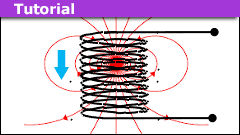 https://www.physicsforums.com/insights/wp-content/uploads/2022/05/model-magent.png
135
240
kuruman
https://www.physicsforums.com/insights/wp-content/uploads/2019/02/Physics_Forums_Insights_logo.png
kuruman2022-06-05 12:48:472022-06-11 07:07:53How to Model a Magnet Falling Through a Solenoid
https://www.physicsforums.com/insights/wp-content/uploads/2022/05/model-magent.png
135
240
kuruman
https://www.physicsforums.com/insights/wp-content/uploads/2019/02/Physics_Forums_Insights_logo.png
kuruman2022-06-05 12:48:472022-06-11 07:07:53How to Model a Magnet Falling Through a Solenoid https://www.physicsforums.com/insights/wp-content/uploads/2022/05/why-can-we-jump.png
135
240
Orodruin
https://www.physicsforums.com/insights/wp-content/uploads/2019/02/Physics_Forums_Insights_logo.png
Orodruin2022-05-30 16:09:362026-02-17 07:46:25How Can We Jump When the Ground Does No Work?
https://www.physicsforums.com/insights/wp-content/uploads/2022/05/why-can-we-jump.png
135
240
Orodruin
https://www.physicsforums.com/insights/wp-content/uploads/2019/02/Physics_Forums_Insights_logo.png
Orodruin2022-05-30 16:09:362026-02-17 07:46:25How Can We Jump When the Ground Does No Work?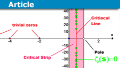 https://www.physicsforums.com/insights/wp-content/uploads/2022/05/Riemann-Hypothesis-History.png
135
240
fresh_42
https://www.physicsforums.com/insights/wp-content/uploads/2019/02/Physics_Forums_Insights_logo.png
fresh_422022-05-21 11:29:542024-12-01 12:24:01The History and Importance of the Riemann Hypothesis
https://www.physicsforums.com/insights/wp-content/uploads/2022/05/Riemann-Hypothesis-History.png
135
240
fresh_42
https://www.physicsforums.com/insights/wp-content/uploads/2019/02/Physics_Forums_Insights_logo.png
fresh_422022-05-21 11:29:542024-12-01 12:24:01The History and Importance of the Riemann Hypothesis https://www.physicsforums.com/insights/wp-content/uploads/2022/05/magnetism-current.png
135
240
Orodruin
https://www.physicsforums.com/insights/wp-content/uploads/2019/02/Physics_Forums_Insights_logo.png
Orodruin2022-05-17 07:56:442022-05-17 08:06:59Symmetry Arguments and the Infinite Wire with a Current
https://www.physicsforums.com/insights/wp-content/uploads/2022/05/magnetism-current.png
135
240
Orodruin
https://www.physicsforums.com/insights/wp-content/uploads/2019/02/Physics_Forums_Insights_logo.png
Orodruin2022-05-17 07:56:442022-05-17 08:06:59Symmetry Arguments and the Infinite Wire with a Current https://www.physicsforums.com/insights/wp-content/uploads/2022/04/cpu-programming.png
135
240
Mark44
https://www.physicsforums.com/insights/wp-content/uploads/2019/02/Physics_Forums_Insights_logo.png
Mark442022-04-23 08:56:072026-02-17 07:45:29Parallel Programming on a CPU with AVX-512
https://www.physicsforums.com/insights/wp-content/uploads/2022/04/cpu-programming.png
135
240
Mark44
https://www.physicsforums.com/insights/wp-content/uploads/2019/02/Physics_Forums_Insights_logo.png
Mark442022-04-23 08:56:072026-02-17 07:45:29Parallel Programming on a CPU with AVX-512 https://www.physicsforums.com/insights/wp-content/uploads/2022/04/programming-gpu.png
135
240
Mark44
https://www.physicsforums.com/insights/wp-content/uploads/2019/02/Physics_Forums_Insights_logo.png
Mark442022-04-16 15:08:292026-02-17 07:43:34CUDA Regression Line: GPU Parallel Programming Guide
https://www.physicsforums.com/insights/wp-content/uploads/2022/04/programming-gpu.png
135
240
Mark44
https://www.physicsforums.com/insights/wp-content/uploads/2019/02/Physics_Forums_Insights_logo.png
Mark442022-04-16 15:08:292026-02-17 07:43:34CUDA Regression Line: GPU Parallel Programming Guide https://www.physicsforums.com/insights/wp-content/uploads/2022/04/hypercube-integral.png
135
240
benorin
https://www.physicsforums.com/insights/wp-content/uploads/2019/02/Physics_Forums_Insights_logo.png
benorin2022-04-14 08:02:002022-05-31 00:36:20A Novel Technique of Calculating Unit Hypercube Integrals
https://www.physicsforums.com/insights/wp-content/uploads/2022/04/hypercube-integral.png
135
240
benorin
https://www.physicsforums.com/insights/wp-content/uploads/2019/02/Physics_Forums_Insights_logo.png
benorin2022-04-14 08:02:002022-05-31 00:36:20A Novel Technique of Calculating Unit Hypercube Integrals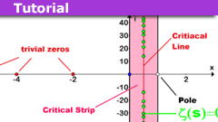 https://www.physicsforums.com/insights/wp-content/uploads/2022/04/Riemann-Hypothesis.png
135
240
fresh_42
https://www.physicsforums.com/insights/wp-content/uploads/2019/02/Physics_Forums_Insights_logo.png
fresh_422022-04-04 14:37:592025-05-28 09:35:34The Extended Riemann Hypothesis and Ramanujan’s Sum
https://www.physicsforums.com/insights/wp-content/uploads/2022/04/Riemann-Hypothesis.png
135
240
fresh_42
https://www.physicsforums.com/insights/wp-content/uploads/2019/02/Physics_Forums_Insights_logo.png
fresh_422022-04-04 14:37:592025-05-28 09:35:34The Extended Riemann Hypothesis and Ramanujan’s Sum https://www.physicsforums.com/insights/wp-content/uploads/2022/03/Hyperbola-1.png
135
240
fresh_42
https://www.physicsforums.com/insights/wp-content/uploads/2019/02/Physics_Forums_Insights_logo.png
fresh_422022-03-28 17:09:062025-07-22 07:32:17The Amazing Relationship Between Integration And Euler’s Number
https://www.physicsforums.com/insights/wp-content/uploads/2022/03/Hyperbola-1.png
135
240
fresh_42
https://www.physicsforums.com/insights/wp-content/uploads/2019/02/Physics_Forums_Insights_logo.png
fresh_422022-03-28 17:09:062025-07-22 07:32:17The Amazing Relationship Between Integration And Euler’s Number https://www.physicsforums.com/insights/wp-content/uploads/2022/03/mermin-device-quantum-entanglement.png
135
240
Mark Stuckey
https://www.physicsforums.com/insights/wp-content/uploads/2019/02/Physics_Forums_Insights_logo.png
Mark Stuckey2022-03-20 08:01:192025-04-17 10:24:07Superdeterminism and the Mermin Device
https://www.physicsforums.com/insights/wp-content/uploads/2022/03/mermin-device-quantum-entanglement.png
135
240
Mark Stuckey
https://www.physicsforums.com/insights/wp-content/uploads/2019/02/Physics_Forums_Insights_logo.png
Mark Stuckey2022-03-20 08:01:192025-04-17 10:24:07Superdeterminism and the Mermin Device https://www.physicsforums.com/insights/wp-content/uploads/2022/02/relativity-rotated-graph.png
135
240
robphy
https://www.physicsforums.com/insights/wp-content/uploads/2019/02/Physics_Forums_Insights_logo.png
robphy2022-02-16 09:02:062022-02-16 21:24:54Relativity on Rotated Graph Paper (a graphical motivation)
https://www.physicsforums.com/insights/wp-content/uploads/2022/02/relativity-rotated-graph.png
135
240
robphy
https://www.physicsforums.com/insights/wp-content/uploads/2019/02/Physics_Forums_Insights_logo.png
robphy2022-02-16 09:02:062022-02-16 21:24:54Relativity on Rotated Graph Paper (a graphical motivation) https://www.physicsforums.com/insights/wp-content/uploads/2022/02/probabilities-virus-testing.png
135
240
PeroK
https://www.physicsforums.com/insights/wp-content/uploads/2019/02/Physics_Forums_Insights_logo.png
PeroK2022-02-06 17:13:532024-08-18 09:37:26Probabilistic Factors Involved in Disease and Virus Testing
https://www.physicsforums.com/insights/wp-content/uploads/2022/02/probabilities-virus-testing.png
135
240
PeroK
https://www.physicsforums.com/insights/wp-content/uploads/2019/02/Physics_Forums_Insights_logo.png
PeroK2022-02-06 17:13:532024-08-18 09:37:26Probabilistic Factors Involved in Disease and Virus Testing https://www.physicsforums.com/insights/wp-content/uploads/2022/01/quantum-mechanics-new-approach.png
135
240
Arnold Neumaier
https://www.physicsforums.com/insights/wp-content/uploads/2019/02/Physics_Forums_Insights_logo.png
Arnold Neumaier2022-01-08 10:33:062024-10-28 12:47:59Quantum Physics via Quantum Tomography: A New Approach to Quantum Mechanics
https://www.physicsforums.com/insights/wp-content/uploads/2022/01/quantum-mechanics-new-approach.png
135
240
Arnold Neumaier
https://www.physicsforums.com/insights/wp-content/uploads/2019/02/Physics_Forums_Insights_logo.png
Arnold Neumaier2022-01-08 10:33:062024-10-28 12:47:59Quantum Physics via Quantum Tomography: A New Approach to Quantum Mechanics https://www.physicsforums.com/insights/wp-content/uploads/2022/01/trig-special-functions.png
135
240
benorin
https://www.physicsforums.com/insights/wp-content/uploads/2019/02/Physics_Forums_Insights_logo.png
benorin2022-01-01 09:25:532022-03-20 08:08:07A Trick to Memorizing Trig Special Angle Values Table
https://www.physicsforums.com/insights/wp-content/uploads/2022/01/trig-special-functions.png
135
240
benorin
https://www.physicsforums.com/insights/wp-content/uploads/2019/02/Physics_Forums_Insights_logo.png
benorin2022-01-01 09:25:532022-03-20 08:08:07A Trick to Memorizing Trig Special Angle Values Table https://www.physicsforums.com/insights/wp-content/uploads/2021/12/setup-raspberry-pi-cluster.png
135
240
Dr Transport
https://www.physicsforums.com/insights/wp-content/uploads/2019/02/Physics_Forums_Insights_logo.png
Dr Transport2021-12-22 09:58:562026-02-17 07:42:23Raspberry Pi Cluster Guide: Parts, MPI & Slurm Tips
https://www.physicsforums.com/insights/wp-content/uploads/2021/12/setup-raspberry-pi-cluster.png
135
240
Dr Transport
https://www.physicsforums.com/insights/wp-content/uploads/2019/02/Physics_Forums_Insights_logo.png
Dr Transport2021-12-22 09:58:562026-02-17 07:42:23Raspberry Pi Cluster Guide: Parts, MPI & Slurm Tips https://www.physicsforums.com/insights/wp-content/uploads/2021/11/Theorema-Primum-tutorial.png
135
240
Neil Parker
https://www.physicsforums.com/insights/wp-content/uploads/2019/02/Physics_Forums_Insights_logo.png
Neil Parker2021-11-27 12:18:052022-03-20 08:09:38An Introduction to Theorema Primum
https://www.physicsforums.com/insights/wp-content/uploads/2021/11/Theorema-Primum-tutorial.png
135
240
Neil Parker
https://www.physicsforums.com/insights/wp-content/uploads/2019/02/Physics_Forums_Insights_logo.png
Neil Parker2021-11-27 12:18:052022-03-20 08:09:38An Introduction to Theorema Primum https://www.physicsforums.com/insights/wp-content/uploads/2021/11/python-sympy-module.png
135
240
Mark44
https://www.physicsforums.com/insights/wp-content/uploads/2019/02/Physics_Forums_Insights_logo.png
Mark442021-11-09 18:48:332021-11-10 10:42:51Python’s Sympy Module and the Cayley-Hamilton Theorem
https://www.physicsforums.com/insights/wp-content/uploads/2021/11/python-sympy-module.png
135
240
Mark44
https://www.physicsforums.com/insights/wp-content/uploads/2019/02/Physics_Forums_Insights_logo.png
Mark442021-11-09 18:48:332021-11-10 10:42:51Python’s Sympy Module and the Cayley-Hamilton Theorem https://www.physicsforums.com/insights/wp-content/uploads/2021/10/spacetime-kerr.png
135
240
ergospherical
https://www.physicsforums.com/insights/wp-content/uploads/2019/02/Physics_Forums_Insights_logo.png
ergospherical2021-10-06 12:53:572021-10-06 12:53:57Geodesic Congruences in FRW, Schwarzschild and Kerr Spacetimes
https://www.physicsforums.com/insights/wp-content/uploads/2021/10/spacetime-kerr.png
135
240
ergospherical
https://www.physicsforums.com/insights/wp-content/uploads/2019/02/Physics_Forums_Insights_logo.png
ergospherical2021-10-06 12:53:572021-10-06 12:53:57Geodesic Congruences in FRW, Schwarzschild and Kerr Spacetimes https://www.physicsforums.com/insights/wp-content/uploads/2021/09/tan-rule-trigonometry.png
135
240
Neil Parker
https://www.physicsforums.com/insights/wp-content/uploads/2019/02/Physics_Forums_Insights_logo.png
Neil Parker2021-09-20 07:49:492024-08-18 09:33:43Physical Applications of the “Tan Rule”
https://www.physicsforums.com/insights/wp-content/uploads/2021/09/tan-rule-trigonometry.png
135
240
Neil Parker
https://www.physicsforums.com/insights/wp-content/uploads/2019/02/Physics_Forums_Insights_logo.png
Neil Parker2021-09-20 07:49:492024-08-18 09:33:43Physical Applications of the “Tan Rule” https://www.physicsforums.com/insights/wp-content/uploads/2021/09/MIT-course-corrections.png
135
240
Derek Bolton
https://www.physicsforums.com/insights/wp-content/uploads/2019/02/Physics_Forums_Insights_logo.png
Derek Bolton2021-09-14 13:24:012024-08-18 09:32:14Corrections to MIT Open Courseware: Systems of Varying Mass
https://www.physicsforums.com/insights/wp-content/uploads/2021/09/MIT-course-corrections.png
135
240
Derek Bolton
https://www.physicsforums.com/insights/wp-content/uploads/2019/02/Physics_Forums_Insights_logo.png
Derek Bolton2021-09-14 13:24:012024-08-18 09:32:14Corrections to MIT Open Courseware: Systems of Varying Mass https://www.physicsforums.com/insights/wp-content/uploads/2021/07/quantum-information.png
135
240
Mark Stuckey
https://www.physicsforums.com/insights/wp-content/uploads/2019/02/Physics_Forums_Insights_logo.png
Mark Stuckey2021-07-25 07:48:352022-01-06 12:03:41How Quantum Information Theorists Revealed the Relativity Principle at the Foundation of Quantum Mechanics
https://www.physicsforums.com/insights/wp-content/uploads/2021/07/quantum-information.png
135
240
Mark Stuckey
https://www.physicsforums.com/insights/wp-content/uploads/2019/02/Physics_Forums_Insights_logo.png
Mark Stuckey2021-07-25 07:48:352022-01-06 12:03:41How Quantum Information Theorists Revealed the Relativity Principle at the Foundation of Quantum Mechanics https://www.physicsforums.com/insights/wp-content/uploads/2021/07/euler-sums.png
135
240
Svein
https://www.physicsforums.com/insights/wp-content/uploads/2019/02/Physics_Forums_Insights_logo.png
Svein2021-07-21 09:56:002022-03-20 08:10:05Investigating Some Euler Sums
https://www.physicsforums.com/insights/wp-content/uploads/2021/07/euler-sums.png
135
240
Svein
https://www.physicsforums.com/insights/wp-content/uploads/2019/02/Physics_Forums_Insights_logo.png
Svein2021-07-21 09:56:002022-03-20 08:10:05Investigating Some Euler Sums https://www.physicsforums.com/insights/wp-content/uploads/2021/07/Quaternions-in-Projectile-Motion.png
135
240
Neil Parker
https://www.physicsforums.com/insights/wp-content/uploads/2019/02/Physics_Forums_Insights_logo.png
Neil Parker2021-07-15 06:49:122026-02-05 06:46:17Quaternions in Projectile Motion
https://www.physicsforums.com/insights/wp-content/uploads/2021/07/Quaternions-in-Projectile-Motion.png
135
240
Neil Parker
https://www.physicsforums.com/insights/wp-content/uploads/2019/02/Physics_Forums_Insights_logo.png
Neil Parker2021-07-15 06:49:122026-02-05 06:46:17Quaternions in Projectile Motion https://www.physicsforums.com/insights/wp-content/uploads/2021/01/quantum-double-slit.png
135
240
James Stone
https://www.physicsforums.com/insights/wp-content/uploads/2019/02/Physics_Forums_Insights_logo.png
James Stone2021-07-01 11:55:182026-01-22 06:48:47Quantum Mechanics and the Famous Double-slit Experiment
https://www.physicsforums.com/insights/wp-content/uploads/2021/01/quantum-double-slit.png
135
240
James Stone
https://www.physicsforums.com/insights/wp-content/uploads/2019/02/Physics_Forums_Insights_logo.png
James Stone2021-07-01 11:55:182026-01-22 06:48:47Quantum Mechanics and the Famous Double-slit Experiment https://www.physicsforums.com/insights/wp-content/uploads/2021/06/safety.png
135
240
jack action
https://www.physicsforums.com/insights/wp-content/uploads/2019/02/Physics_Forums_Insights_logo.png
jack action2021-06-26 16:08:312026-02-17 07:40:55Safety Factors: Why Forums Avoid Design Advice Online
https://www.physicsforums.com/insights/wp-content/uploads/2021/06/safety.png
135
240
jack action
https://www.physicsforums.com/insights/wp-content/uploads/2019/02/Physics_Forums_Insights_logo.png
jack action2021-06-26 16:08:312026-02-17 07:40:55Safety Factors: Why Forums Avoid Design Advice Online https://www.physicsforums.com/insights/wp-content/uploads/2021/06/LCEVC-8k-tv.png
135
240
Bill Hobba
https://www.physicsforums.com/insights/wp-content/uploads/2019/02/Physics_Forums_Insights_logo.png
Bill Hobba2021-06-19 18:00:082026-02-17 07:40:25LCEVC and EVC: Efficient Video Encoding Guide for 8K
https://www.physicsforums.com/insights/wp-content/uploads/2021/06/LCEVC-8k-tv.png
135
240
Bill Hobba
https://www.physicsforums.com/insights/wp-content/uploads/2019/02/Physics_Forums_Insights_logo.png
Bill Hobba2021-06-19 18:00:082026-02-17 07:40:25LCEVC and EVC: Efficient Video Encoding Guide for 8K https://www.physicsforums.com/insights/wp-content/uploads/2021/06/solving-projectile-motion.png
135
240
kuruman
https://www.physicsforums.com/insights/wp-content/uploads/2019/02/Physics_Forums_Insights_logo.png
kuruman2021-06-08 16:19:492024-08-18 09:27:50How to Solve Projectile Motion Problems in One or Two Lines
https://www.physicsforums.com/insights/wp-content/uploads/2021/06/solving-projectile-motion.png
135
240
kuruman
https://www.physicsforums.com/insights/wp-content/uploads/2019/02/Physics_Forums_Insights_logo.png
kuruman2021-06-08 16:19:492024-08-18 09:27:50How to Solve Projectile Motion Problems in One or Two Lines https://www.physicsforums.com/insights/wp-content/uploads/2021/04/blackboard.png
135
240
fresh_42
https://www.physicsforums.com/insights/wp-content/uploads/2019/02/Physics_Forums_Insights_logo.png
fresh_422021-04-21 16:20:232024-08-18 09:26:5910 Math Things We All Learnt Wrong At School
https://www.physicsforums.com/insights/wp-content/uploads/2021/04/blackboard.png
135
240
fresh_42
https://www.physicsforums.com/insights/wp-content/uploads/2019/02/Physics_Forums_Insights_logo.png
fresh_422021-04-21 16:20:232024-08-18 09:26:5910 Math Things We All Learnt Wrong At School https://www.physicsforums.com/insights/wp-content/uploads/2021/04/Fourier-Series-Rieman-Zeta-Function.png
135
240
stevendaryl
https://www.physicsforums.com/insights/wp-content/uploads/2019/02/Physics_Forums_Insights_logo.png
stevendaryl2021-04-09 06:35:322025-08-29 06:59:41Computing the Riemann Zeta Function Using Fourier Series
https://www.physicsforums.com/insights/wp-content/uploads/2021/04/Fourier-Series-Rieman-Zeta-Function.png
135
240
stevendaryl
https://www.physicsforums.com/insights/wp-content/uploads/2019/02/Physics_Forums_Insights_logo.png
stevendaryl2021-04-09 06:35:322025-08-29 06:59:41Computing the Riemann Zeta Function Using Fourier Series https://www.physicsforums.com/insights/wp-content/uploads/2021/04/tolman-law-beginner.png
135
240
Demystifier
https://www.physicsforums.com/insights/wp-content/uploads/2019/02/Physics_Forums_Insights_logo.png
Demystifier2021-04-02 07:48:092022-05-15 12:08:13Tolman Law in a Nutshell
https://www.physicsforums.com/insights/wp-content/uploads/2021/04/tolman-law-beginner.png
135
240
Demystifier
https://www.physicsforums.com/insights/wp-content/uploads/2019/02/Physics_Forums_Insights_logo.png
Demystifier2021-04-02 07:48:092022-05-15 12:08:13Tolman Law in a Nutshell https://www.physicsforums.com/insights/wp-content/uploads/2021/03/physics-cannonball-projectile.png
135
240
Neil Parker
https://www.physicsforums.com/insights/wp-content/uploads/2019/02/Physics_Forums_Insights_logo.png
Neil Parker2021-03-29 05:56:022024-08-18 09:25:00Maximizing Horizontal Range of a Projectile
https://www.physicsforums.com/insights/wp-content/uploads/2021/03/physics-cannonball-projectile.png
135
240
Neil Parker
https://www.physicsforums.com/insights/wp-content/uploads/2019/02/Physics_Forums_Insights_logo.png
Neil Parker2021-03-29 05:56:022024-08-18 09:25:00Maximizing Horizontal Range of a Projectile https://www.physicsforums.com/insights/wp-content/uploads/2021/03/electromagnetic-computations-2.png
135
240
Paul Colby
https://www.physicsforums.com/insights/wp-content/uploads/2019/02/Physics_Forums_Insights_logo.png
Paul Colby2021-03-18 08:17:582024-09-02 09:21:04A Numerical Electromagnetic Solver Using Duality
https://www.physicsforums.com/insights/wp-content/uploads/2021/03/electromagnetic-computations-2.png
135
240
Paul Colby
https://www.physicsforums.com/insights/wp-content/uploads/2019/02/Physics_Forums_Insights_logo.png
Paul Colby2021-03-18 08:17:582024-09-02 09:21:04A Numerical Electromagnetic Solver Using Duality https://www.physicsforums.com/insights/wp-content/uploads/2021/03/Electric-Field-Seen-by-an-Observer.png
135
240
robphy
https://www.physicsforums.com/insights/wp-content/uploads/2019/02/Physics_Forums_Insights_logo.png
robphy2021-03-13 09:41:232023-08-11 08:07:27The Electric Field Seen by an Observer: A Relativistic Calculation with Tensors
https://www.physicsforums.com/insights/wp-content/uploads/2021/03/Electric-Field-Seen-by-an-Observer.png
135
240
robphy
https://www.physicsforums.com/insights/wp-content/uploads/2019/02/Physics_Forums_Insights_logo.png
robphy2021-03-13 09:41:232023-08-11 08:07:27The Electric Field Seen by an Observer: A Relativistic Calculation with Tensors https://www.physicsforums.com/insights/wp-content/uploads/2021/02/valentines-reflections-graphs.png
135
240
Neil Parker
https://www.physicsforums.com/insights/wp-content/uploads/2019/02/Physics_Forums_Insights_logo.png
Neil Parker2021-03-01 08:23:212024-08-18 09:22:41Valentine’s Reflections: Mathematical Matters of the Heart
https://www.physicsforums.com/insights/wp-content/uploads/2021/02/valentines-reflections-graphs.png
135
240
Neil Parker
https://www.physicsforums.com/insights/wp-content/uploads/2019/02/Physics_Forums_Insights_logo.png
Neil Parker2021-03-01 08:23:212024-08-18 09:22:41Valentine’s Reflections: Mathematical Matters of the Heart https://www.physicsforums.com/insights/wp-content/uploads/2021/02/bayesian-statistics-part-4.png
135
240
Dale
https://www.physicsforums.com/insights/wp-content/uploads/2019/02/Physics_Forums_Insights_logo.png
Dale2021-02-17 09:24:092024-08-18 09:21:43Posterior Predictive Distributions in Bayesian Statistics
https://www.physicsforums.com/insights/wp-content/uploads/2021/02/bayesian-statistics-part-4.png
135
240
Dale
https://www.physicsforums.com/insights/wp-content/uploads/2019/02/Physics_Forums_Insights_logo.png
Dale2021-02-17 09:24:092024-08-18 09:21:43Posterior Predictive Distributions in Bayesian Statistics https://www.physicsforums.com/insights/wp-content/uploads/2021/02/electromagnetic-computations.png
135
240
Paul Colby
https://www.physicsforums.com/insights/wp-content/uploads/2019/02/Physics_Forums_Insights_logo.png
Paul Colby2021-02-14 19:46:562024-11-24 11:57:31How to Use Duality in Computational Electromagnetic Problems
https://www.physicsforums.com/insights/wp-content/uploads/2021/02/electromagnetic-computations.png
135
240
Paul Colby
https://www.physicsforums.com/insights/wp-content/uploads/2019/02/Physics_Forums_Insights_logo.png
Paul Colby2021-02-14 19:46:562024-11-24 11:57:31How to Use Duality in Computational Electromagnetic Problems https://www.physicsforums.com/insights/wp-content/uploads/2022/08/impossible-triangles.png
135
240
Jameson
https://www.physicsforums.com/insights/wp-content/uploads/2019/02/Physics_Forums_Insights_logo.png
Jameson2021-01-28 10:50:352026-02-17 07:39:42Ambiguous SSA Case in Triangles — Law of Sines Explained
https://www.physicsforums.com/insights/wp-content/uploads/2022/08/impossible-triangles.png
135
240
Jameson
https://www.physicsforums.com/insights/wp-content/uploads/2019/02/Physics_Forums_Insights_logo.png
Jameson2021-01-28 10:50:352026-02-17 07:39:42Ambiguous SSA Case in Triangles — Law of Sines Explained